Blank Books EP-01 concept
( A )
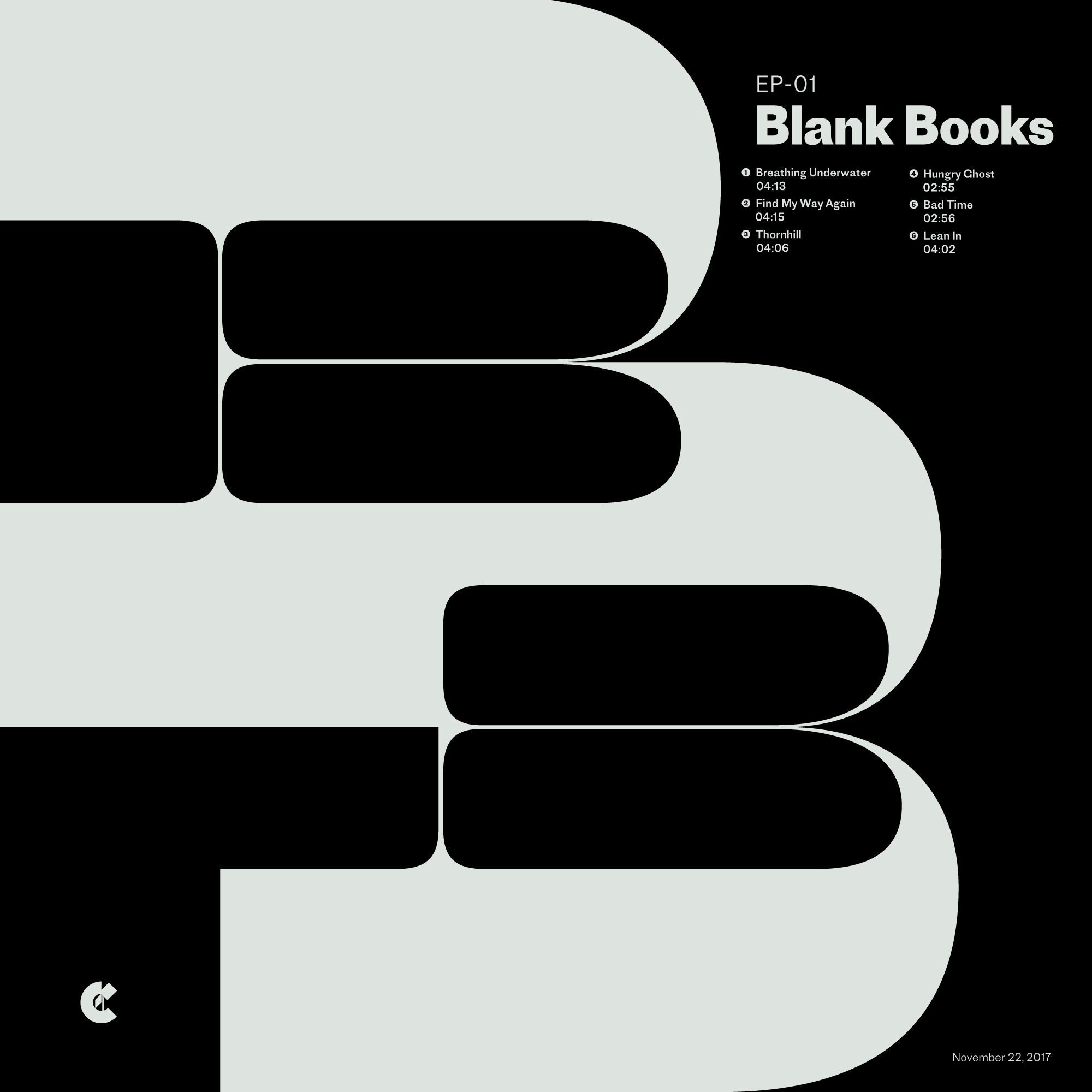
The goals with this exploration were twofold: first, to play with Maelstrom, which I was in the process of reviewing for the Font Review Journal, and second to play with music packaging, a medium I’ve rarely had the opportunity to touch. The subject I chose was Blank Books new EP, which is fronted by my favorite musician, Aaron Sprinkle.
( B )
Exercises like this have proven invaluable to me as means of learning about typefaces, mediums and exploring new aesthetics.
( C )
- Designed 2017
- Current play-count for this EP is over 60.
- Support the album
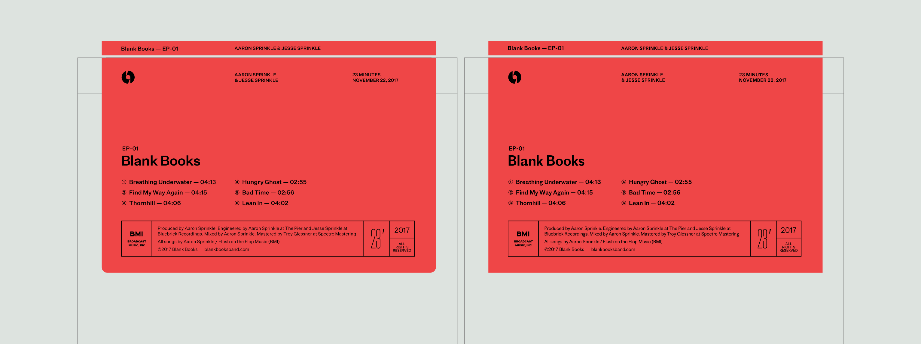
The initial design
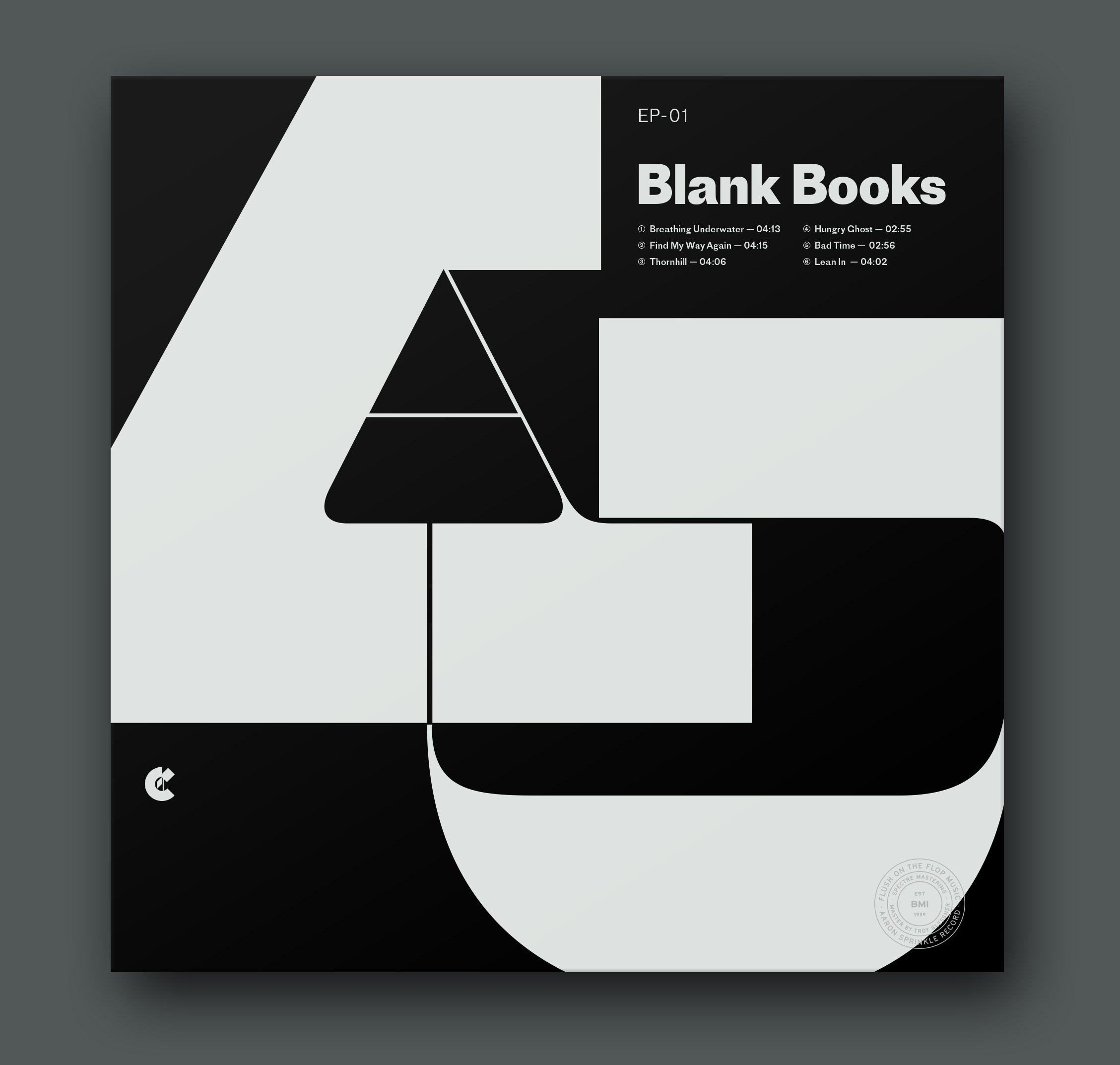
This was the initial exploration I created, as I was getting a feel for the typefaces I wanted to use and how I wanted to position Maelstrom within the square.
I initially tried the heaviest weight of Proto Grotesk for fear that anything less would get overpowered by the scale and weight of Maelstrom’s thickest strokes. I think the wickedly big and blocky tail on”a” of the lighter weight of Proto Grotesk made it a better partner for the massive slabs on Maelstrom, so that’s what is in the final version.
This is definitely an instance where I am glad I kept exploring with the same design elements instead of settling for what I came up with first. I have a tendency for “done is better than perfect,” but with personal projects there’s the added freedom to linger on an idea until you feel satisfied.
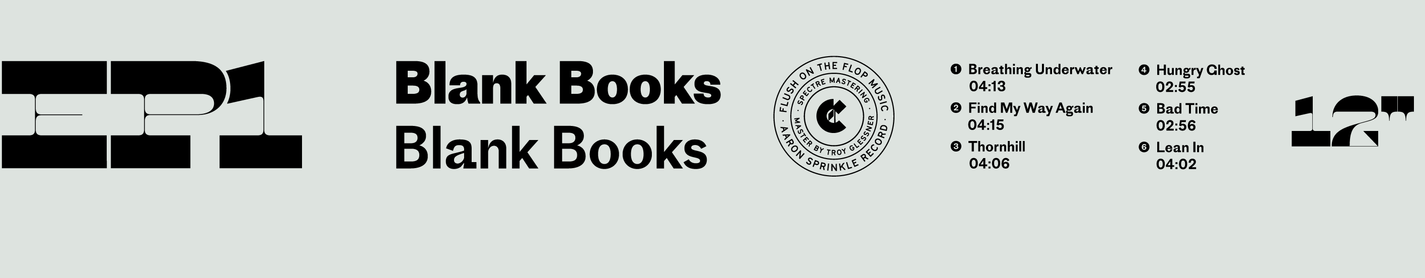
- A few of the sketches as I tried to figure out the right places to insert color into the design.
The final version
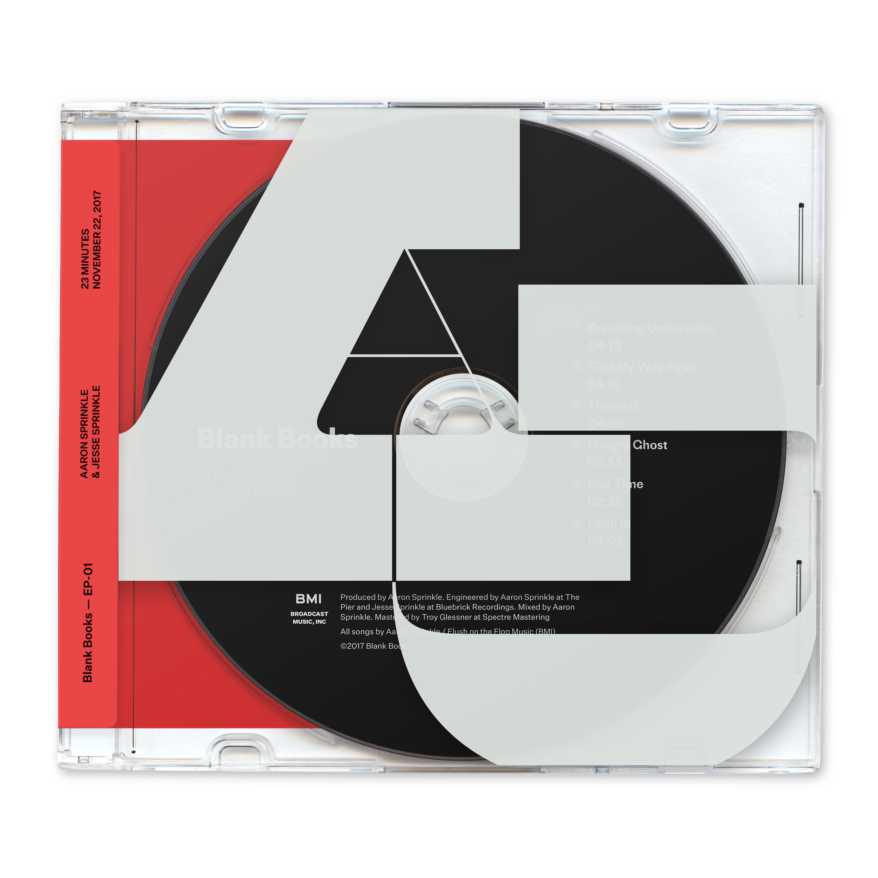
As much as I enjoy working in black & white, I wanted to explore color and playing with layering and transparency, which felt like a great opportunity to use the strengths of Maelstrom in a way few others had done. I pulled the “AJ” lockup onto a jewel case with a white decal, moved the song list and title to the CD itself, and I added another layer of materials (and the hit of color) by using a sticker across the spine.
The idea of making something with so many mixed media reminds me of the way I work on projects for the Eephus League, where I make an effort to combine papers and printing processes to maximize the tactile impact of an object.
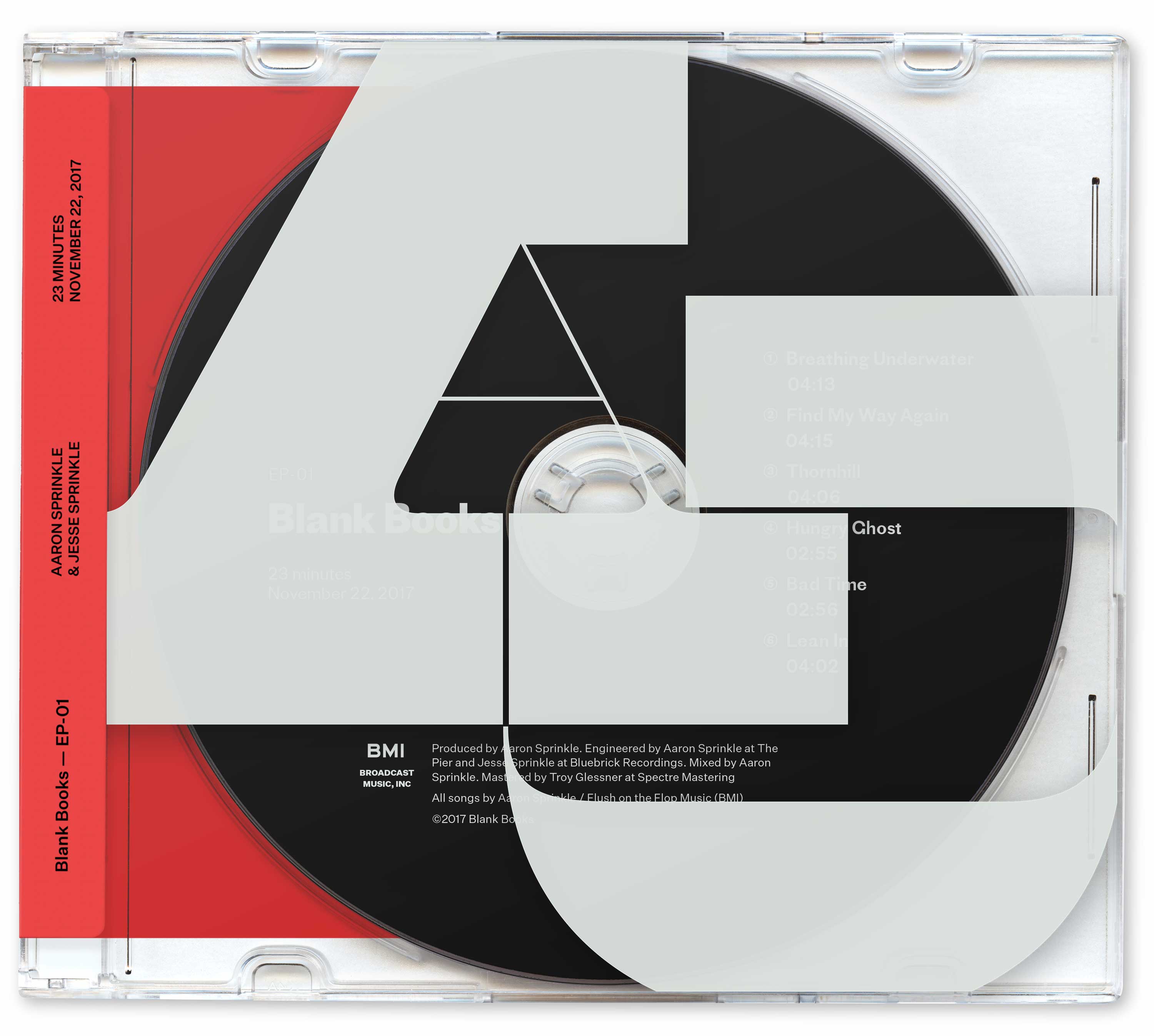
Because a sticker is, by design, an imposed element instead of one that feels intrinsic to the presentation, I wanted it to have a neutral, almost narrator-like voice. When it was set in Proto Grotesk, the sans used elsewhere in the design, it felt more like an extension of the design, and the sticker treatment felt flashy instead of utilitarian.
When I switched the typeface to Untitled Sans, I got the detached voice I wanted. Untitled Sans lends the design the straightforward, neutral tone I wanted it to have while also being completely functional and a pleasure to read.
tumblr-dry
This piece has probably proliferated more than anything else I’ve made in my career. I expect low-quality print-outs to be taped to my tombstone whenever I pass into the great beyond. I’ve also been surprised at the number of people who don’t catch that it’s faked. I purchased a high-res stock image of a jewel case and carefully spliced it apart. It’s relatively convincing at smaller sizes!