The Font Review Journal
( A )
Typefaces take years of time and experience to craft, but there is so rarely any thoughtful analysis around new releases, even from the type designers themselves. I’m always disappointed when I go to research the creation of a font and can’t find anything other than a single paragraph of text explaining its existence. There’s often a communication chasm between practicing designers and the type designers that craft the typefaces that are vital to their work. The FRJ hopefully bridges that gap.
It’s also my attempt to explain the value of typefaces to anyone, regardless of their comfort with typography. I want to focus on concrete, objective observations that designers of any skill level can understand while at the same time keeping the writing approachable and fun.
( B )
The Font Review Journal is comprised of essays that analyze typefaces throughout history, based on their own formal merits, their connections to type design history, and their usage by designers. The goal is to create a clearer picture as to what makes each of these typefaces unique, and to tie these learnings to the real-world applications they resulted in.
The end result is a greater understanding between type designers and visual designers, and the relationship between typeface development and stylistic evolution over time.
( C )
- Started in 2017
- Over 100,000 people have visited the site and read a review
The structure
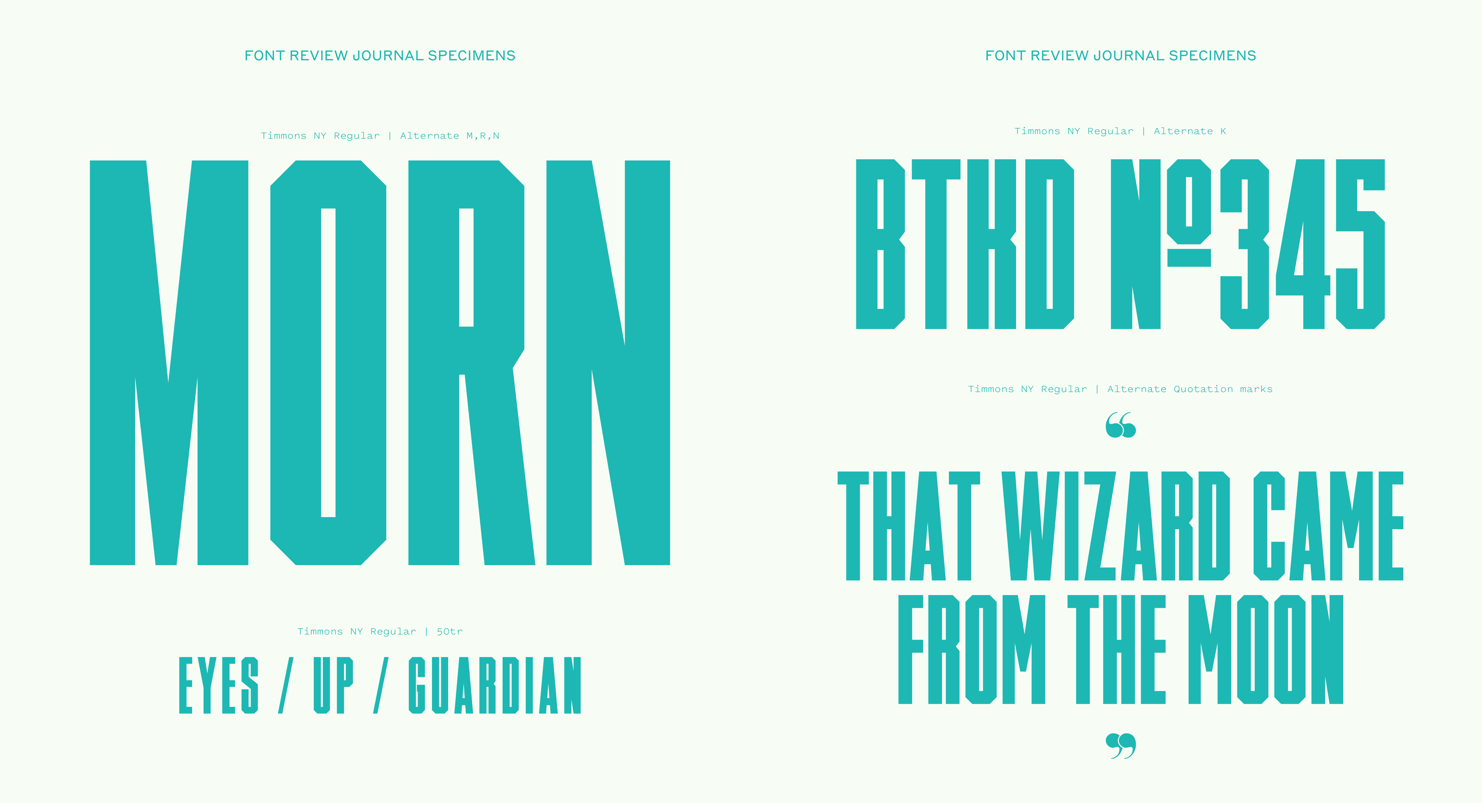
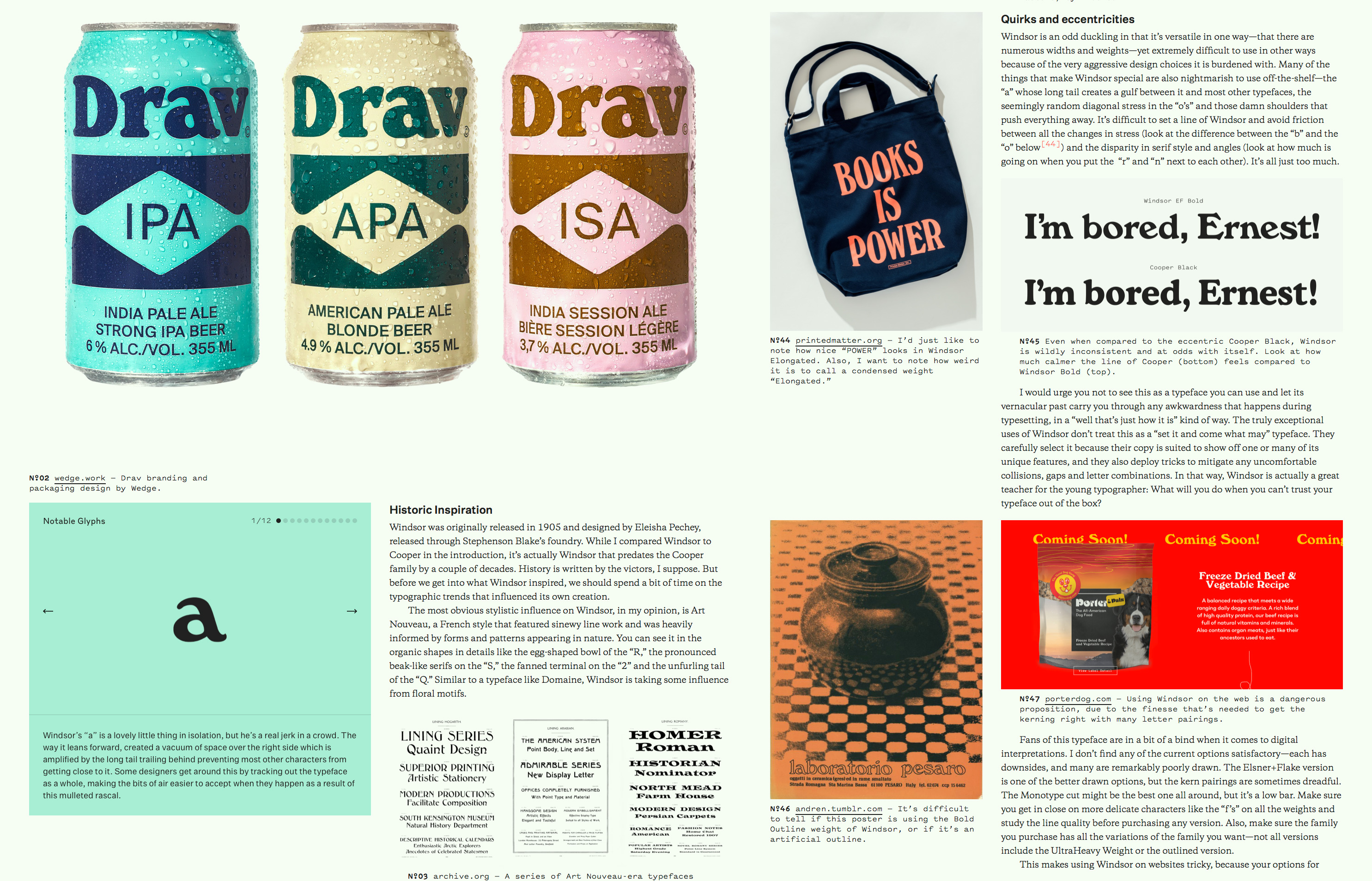
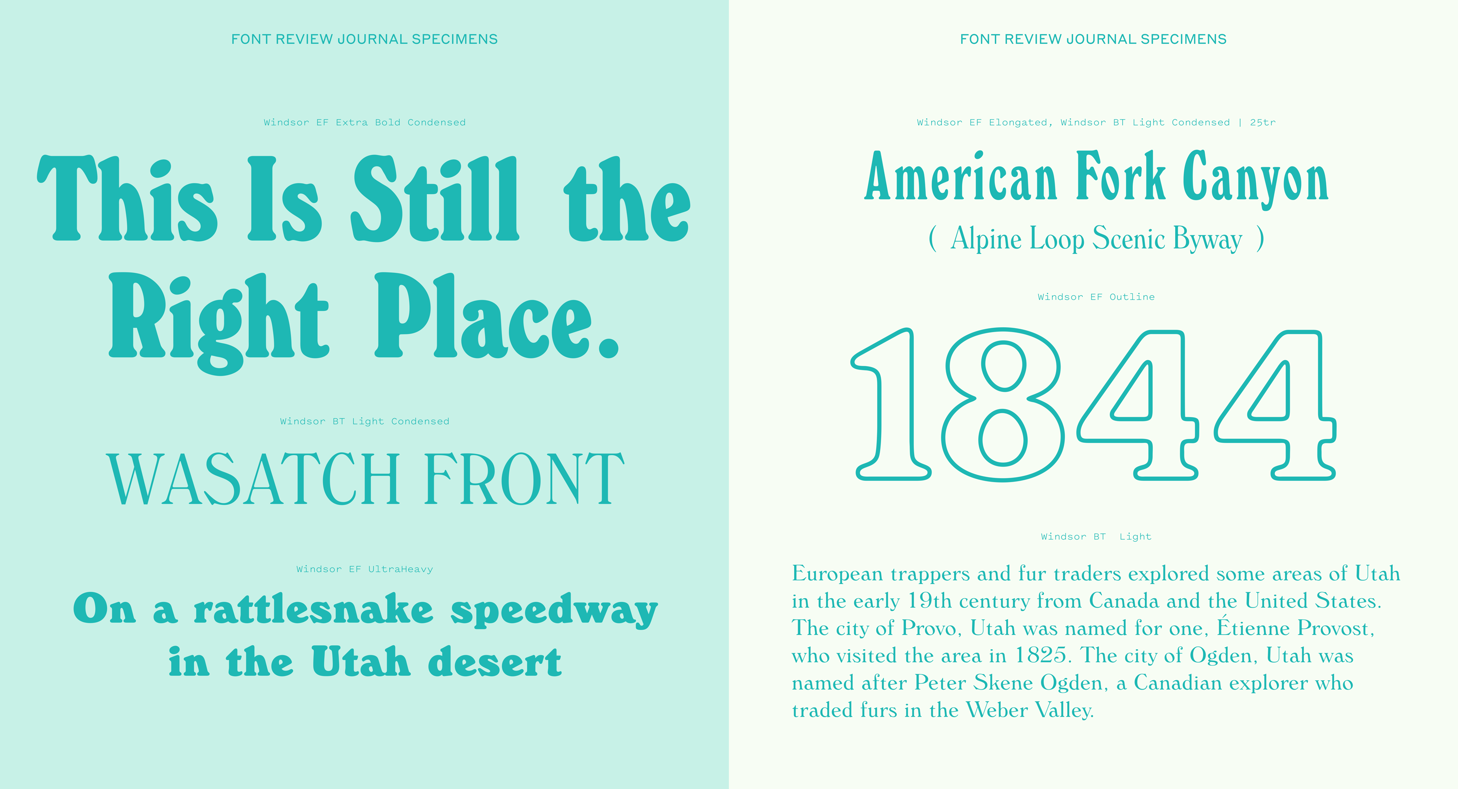
The reviews all follow the same basic format. There’s an introduction that speaks to why the typeface was chosen, followed by a section focusing on the historic influences on the typeface (or in lieu of that, the defining design details). The bulk of each review focuses on the specific strengths of the typeface and uses real-world examples to illustrate specific characteristics and trends in how designers use the font. Finally, there is a section to address any quirks or eccentricities of the font you should be aware of. In addition to the main text, there is a selection of notable glyphs that I find interesting in each typeface.
The reviews vary in length, but tend to fall between 2-4,000 words. The longest review (Windsor) clocks in at just over 6,100 words and has 47 cited illustrations. A review can take anywhere between 20-40 hours to research, write and produce.
I wanted the site to allow for a multi-column experience so I could have illustration-dense articles and also accommodate images of a variety of sizes. Because of this, I went with an asymmetrical presentation of the text to give myself a “wide” column and a “narrow” one. All of the images are captioned and cited with links back to the source when available. Because the images are crucial to the points being made in the text, I needed a citation system to clearly reference images in the main body of the text. Each citation links to an anchor tag where the appropriate image is placed, allowing you to easily find them as you read.
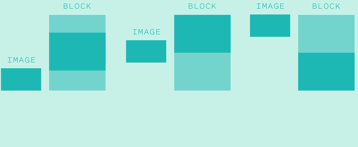
The site is built in “blocks” for either full width images or a section of the right column of text, and each block can either have a single image on the left, a slideshow (solely used for Notable Characters) or no image at all. Any of the left-handed images can be aligned to the top, middle or bottom of each block. This gives me the freedom to craft layouts that feel natural but are still controlled by an easy-to-use system.
Someday I’d love to rebuild the site with CSS Grid, which would allow for even more options for how the two columns relate to each other.
The Notable Glyphs section of the review is something I usually save for the end, after I’ve written the first draft of the main essay. There’s usually a few obvious selections at the top of my mind, and I spend time digging through the glyph palette search for more options across the weights and widths of the typeface. Occasionally, switching context to the glyphs sparks a thoughts that ends up feeding back into the main text of the review.

There have been several instances during the course of writing a review where I’ve had the spark of an idea for a use of a typeface, such as animating the different modules that make up a typeface like Text.