Leading Design at Medium
( A )
I led the design organization at Medium, branching the product design group with design research, as well as establishing an in-house brand and editorial design team. This unification of the different design practices is unique, and was a draw for both myself and many of the designers who joined the company over the course of the year. Media companies at Medium’s scale have a unique opportunity to have brand, content and product inform each other, rather than be separated by the walls of org division that plague larger institutions.
( B )
While at Medium, I scaled the design team from 4 to 11, with designers located across both coasts. Most of the work shown below is executed by that talented group. These examples are a smattering of some of the work that shipped during my tenure, and I’ll continue to add more here as more of the work comes to fruition.
( C )
- Head of Design, 2018
A more nuanced approach to author and story
Medium’s editor keeps the area where the user writes sacred—every effort is made to prevent unexpected changes to what the user has composed in the editor vs. what they will see when they publish. It needs to feel organic and seamless. One of the challenges that has emerged as Medium’s complexity has increased is that this sanctity of the “meat” of the story has resulted in a “hamburger” effect with respect to the chrome of Medium—we had to stack all the context, navigation and controls for the story above and below the portion that was owned by the editor. For example, when Medium first added the concept of “metered” stories and the paywall, it had to add that context at the top of the story, and vertical real-estate was lost.
We wanted to start making steps to make some of the contextual elements of Medium’s chrome, like the author lockup, behave contextually depending on how the writer chooses to craft their story’s elements. Depending on the appearance or order of elements in a story (whether or not the image comes before the title, if the story has a subtitle, etc) the author lockup now adapts and appears inline, along with the star denoting its meter status.
This accomplishes a few things: It prevents the author from getting skipped over and forgotten, tying their presence more closely to the story itself, it saves vertical space and brings the reader into the story faster, and finally it brings Medium a little bit closer to that goal of a smart writing surface that flexes to what you wish to do with it as an author.
Designer Sarah Klearman made an exhaustive list of all possible top-of-story configurations to make sure we maintained consistent behavior and covered the dozens of edge cases that could crop up in the editor.
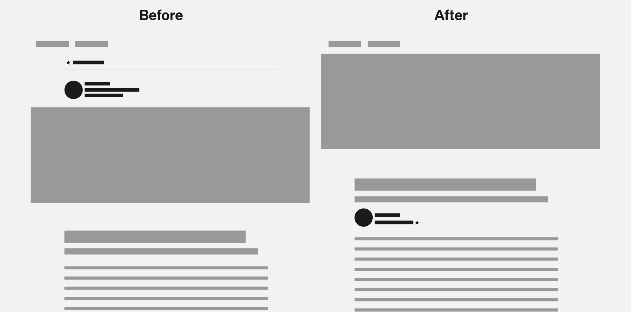
- The result gets readers into the story faster and creates a tighter correlation between the author and the story.
Facelift
One of the initiatives I led while at Medium was to unify the product’s visual language with Medium’s brand language. When Medium first introduced its paywall and rebranded, an effort was made to make “Medium’s brand voice” separate and distinct from the voice of the stories themselves. As Medium was moving into presenting itself as a media company and publisher in addition to being a writer platform, I felt it was the right time to start to remove some of those borders, starting by unifying the typefaces used across marketing and product surfaces.
The first change was swapping headlines across the site to Zerfallen, a jagged serif which feels familiar to the pointed Noe in Medium’s wordmark but is more versatile in application. This simple change made a dramatic impact in the presentation of stories on the site, moving the tone away from mass-blogging and towards something more literary.
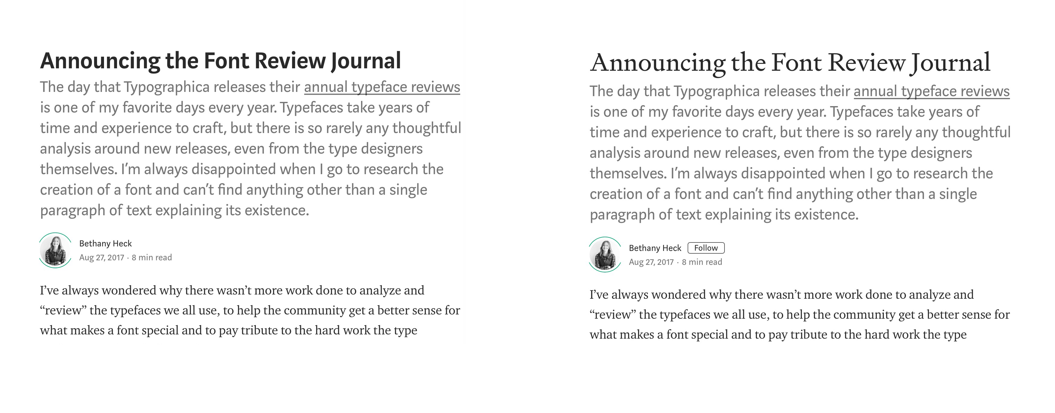
Because Medium is a type-driven platform, changing any typeface is a herculean effort, and designers Andrew Johnson and Sarah Klearman worked hand-in-hand with developers to ensure the change-over was smooth. You’ll see more of Zerfallen in Medium’s brand materials over the course of 2019.
The right amount of hierarchy
Medium’s “feature chunk” is the showcase for the best of what’s on Medium. In its first iteration, the module was a complex blend of hierarchy that mimicked a magazine layout. However, in practice the complexity led to confusion about which headline belonged to which image, the image-less posts performed significantly worse than those with images, and the whole thing took up a lot of vertical real estate. There were 4 different story presentations just within this module, and 3 different image aspect ratios.
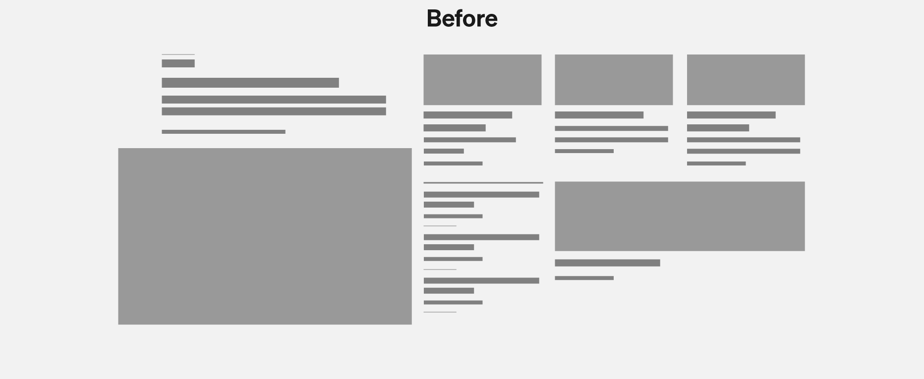
Designer Carolyn Yocum took this feedback and other research findings and significantly simplified the structure of the feature chunk. It sacrifices the imageless stories in exchange for clearer hierarchy and eliminated one story presentation variation, making the module more scannable.
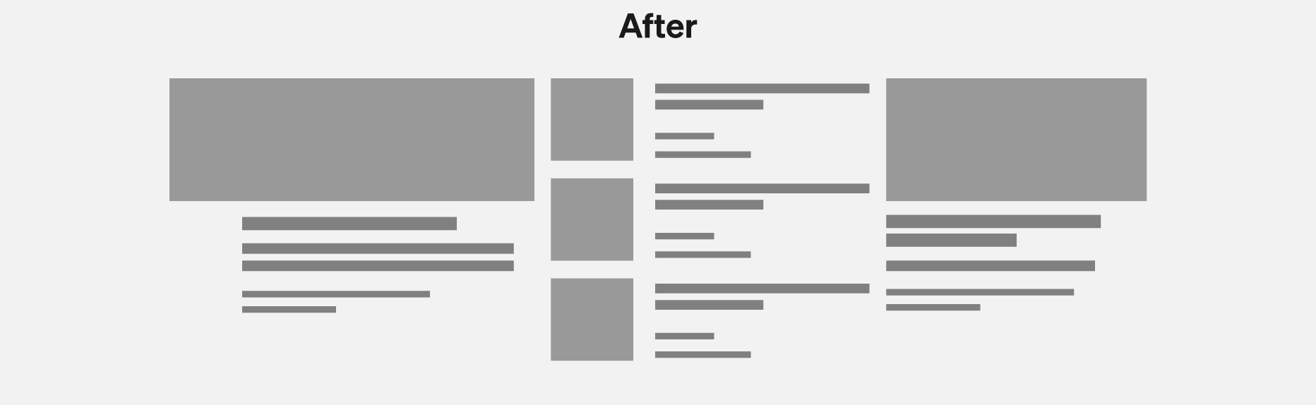
In this case, less was more.
We also worked on systems to expand on previously built work to allow for more theming opportunities for posts—allowing for stories in a larger Collection to carry through more colors and signifiers that tie them to the stories they are most closely related to. It was important that our best stories, both commissioned and contributed by platform writers, were given a clear sense of “place” for readers inside of the massive sea of mixed content on Medium.
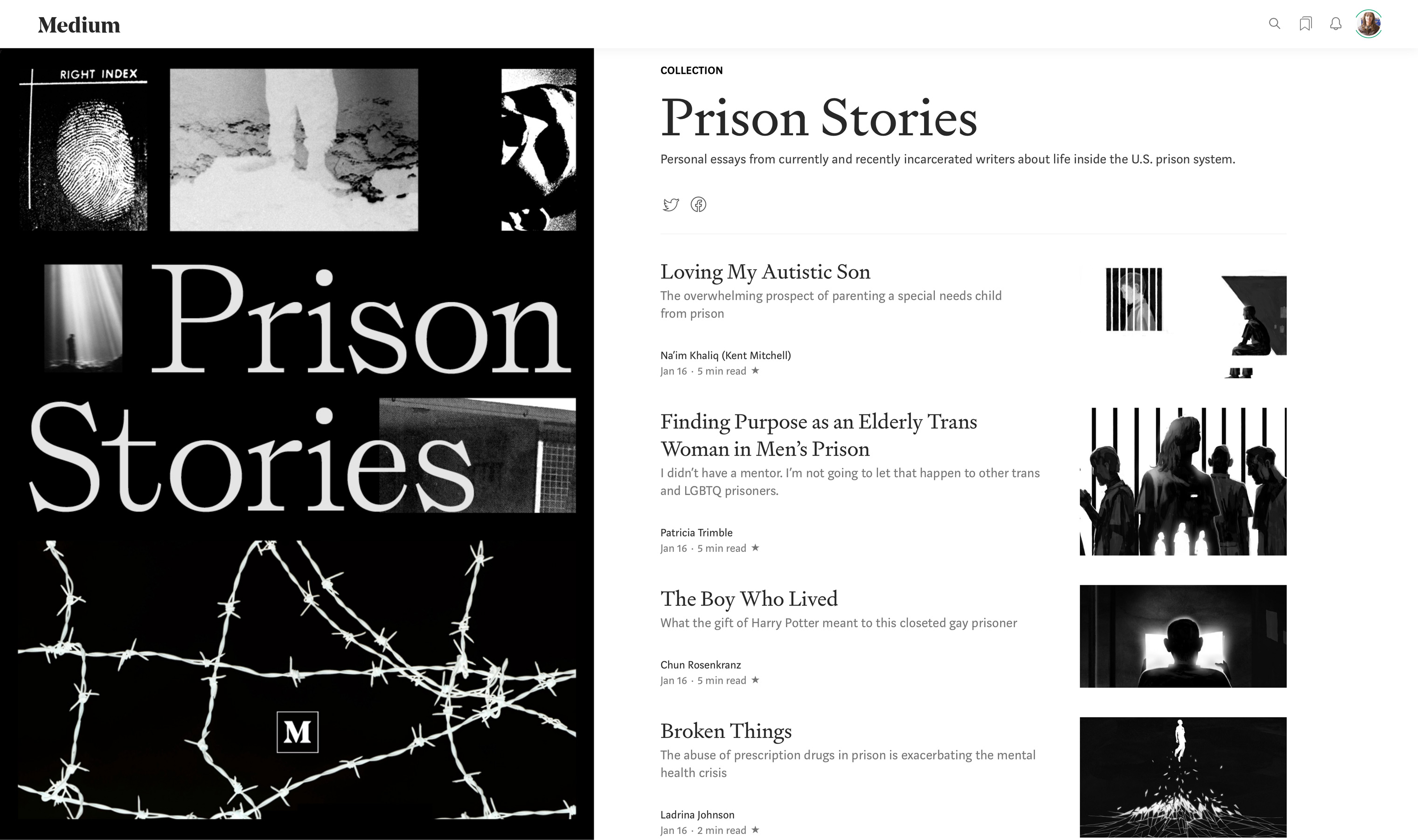
Collections of stories
Medium invested heavily in the concept of “collections” in 2018, which was a product framework for grouping stories that we revamped in early 2018 and used for our themed “monthly magazines.” One of the main drivers for staffing up the brand team was because I wanted to push to do the collection art in-house, instead of outsourcing the art to contractors. This was not only a wonderful way to gather related stories in the same framework, it allowed the designers to create beautiful art that often trickled down into the art direction for the stories housed inside.
Establishing an Art Direction practice
Medium significantly ramped up its editorial efforts in 2018, and that was an opportunity for design to step in and take over art direction responsibilities. Every month, a different designer on the Brand team took lead in setting themes and aesthetics for our monthly magazines, and commissioned art accordingly. For many of the designers, this was their first time performing art direction duties at a media company, but the results are stunning. I was always amazed by the artists our designers selected for stories, and the way they collaborated with them to ensure the best results.
All art commissioned by Ryan Hubbard, Renald Louissaint, Noah Baker and Dora Godfrey.
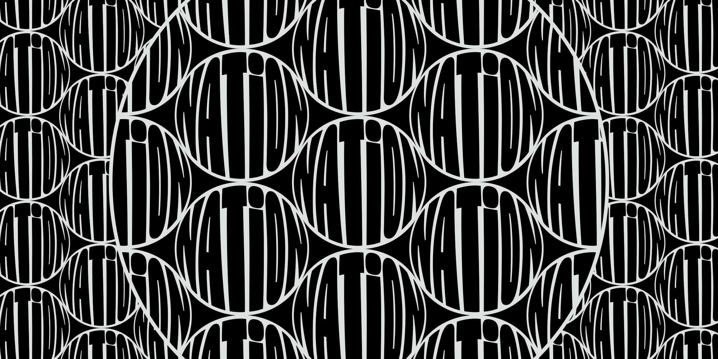
Words that Matter
Dora Godfrey led the art direction for Words that Matter in 2018, selecting from a group of typographic artists to represent the most important words of the year.