
Audience experience at Vox Media
( A )
I was the Executive Design Director of the Audience Experience team at Vox Media from 2016-2017. Any surface, on platform or off, where a reader might encounter a story from one of our brands was my responsibility. Success in this role meant collaboration across our platform team, the centralized brand team, as well as each editorial staff and their design groups.
Most of the projects shown here were focused on an initiative to use Chorus’s capabilities to better showcase the brand language for each of the Vox Media properties, with a specific focus on Mobile.
( B )
Vox has grown into a massive company, and one of my focuses as the Executive Design Director over this group was to improve transparency and communication across the many subdivided design teams at the company, as well as to work alongside the rest of design leadership to create clarity in responsibilities and ownership for each group.
( C )
- Executive Design Director, 2016-2017.
Life after Unison
The team wrapped a massive endeavor in 2017—all Vox Media properties were moved onto the same front-end system, known as Unison. As Vox Media added sites over time, they were often built bespoke, which was fast and allowed for a lot of individual expression between sites. However, over time this lack of unity created strains on productivity and limited the benefits that any one site made to that site alone.
Unison was created as the front-end counterpart to Chorus, Vox Media’s CMS. Design Director Yesenia Perez-Cruz and the rest of the team translated the existing brands into the Unison framework, and performance and productivity gains were seen across the board.
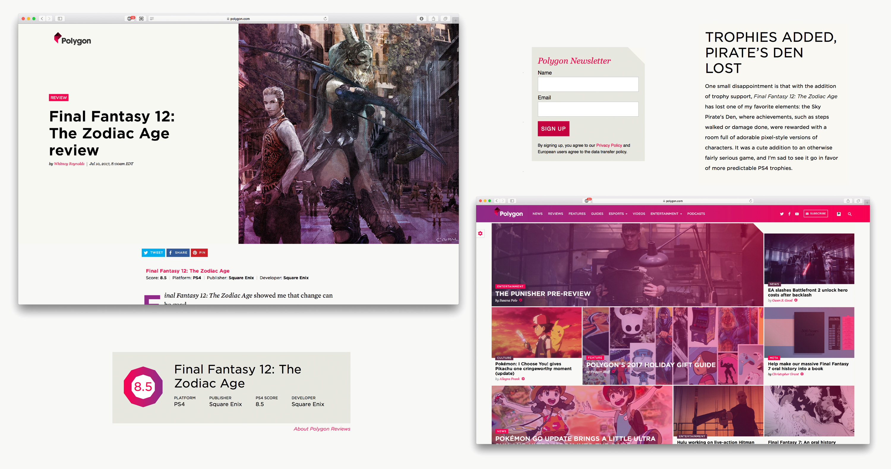
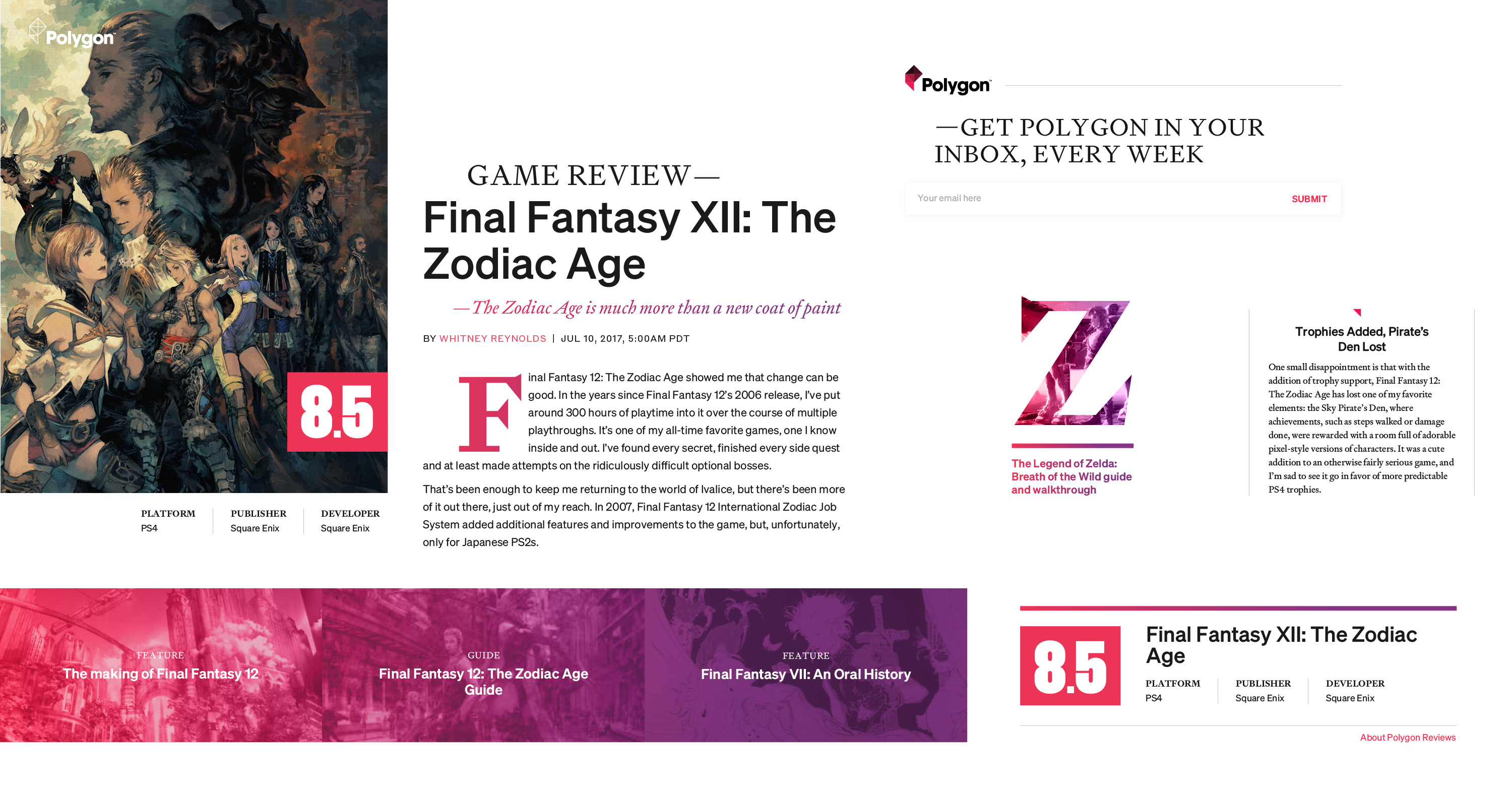
Once the unification was complete, I wanted to push the brand expression across the platform farther, using the shared components of Unison in a smart way, while also making pointed, specific additions for each brand as needed. For example, if a site like Polygon needs a module for game scores and summaries, let’s use that as a point for expressive design that reinforces the brand’s voice.
We wanted to thoroughly understand each brand, their audience, and what they expected from each brand. Our articles needed to feel purposeful and user-directed on every platform, with no superfluous elements. At the end of these explorations our article pages needed feel less like re-skinned elements from a common CMS and more like complete experiences driven from the core of each brand’s identity.
I started this process by creating a “brand guideposts” document, which translated the core principles and visual signifiers for each brand, documented surfaces where we could push our brand expression further, and paired moodboards with sketches of proposals of what each of these brands could feel like on the platform with a few changes.
For example, Polygon had a few existing visual signifiers: it used triangles throughout the design to harken to its logo, featured a punchy pink to convey a modern tone and reflect the playful nature of games, paired a clean sans-serif typefaces with a classic serif to merge old and new, and relied on gradients of pink to purple to punch up key typographic elements in articles.
Taking these components and remixing them, we could create a brand presence that was significantly more pointed, specific and unique—a clearer reflection of what makes Polygon such a wonderful home for gaming content that is sharp, and never reductive or pandering.
We went through the process of scrubbing the typography and revamping the brand presence for each of Vox Media’s 8 brands, working hand-in-hand with the core brand team to find a balance of their vision and what we felt we could accomplish confidently on the Unison platform.
We needed to acknowledge that our brands each have unique audiences and editorial voices, and our frameworks should be adaptable to reflect those variables. We wanted to create designs that support the specifics of the content, writing style and tone of voice for each brand.
At the same time we were undertaking this effort, there was an increased push around starting and maintaining newsletters across many of the brands, which gave us an excellent surface where we could be “brand-forward” and inject personality into the experience of reading a story. We also expected that a more considered visual presentation to these calls to action would increase signup rates.
Mobile navigation
We also set out to improve our mobile article experiences, with the goal of improving our page depth and recirculation metrics. We wanted to create a performant experience that gave users on mobile the best possible experience and leveraged the unique capabilities of mobile devices.
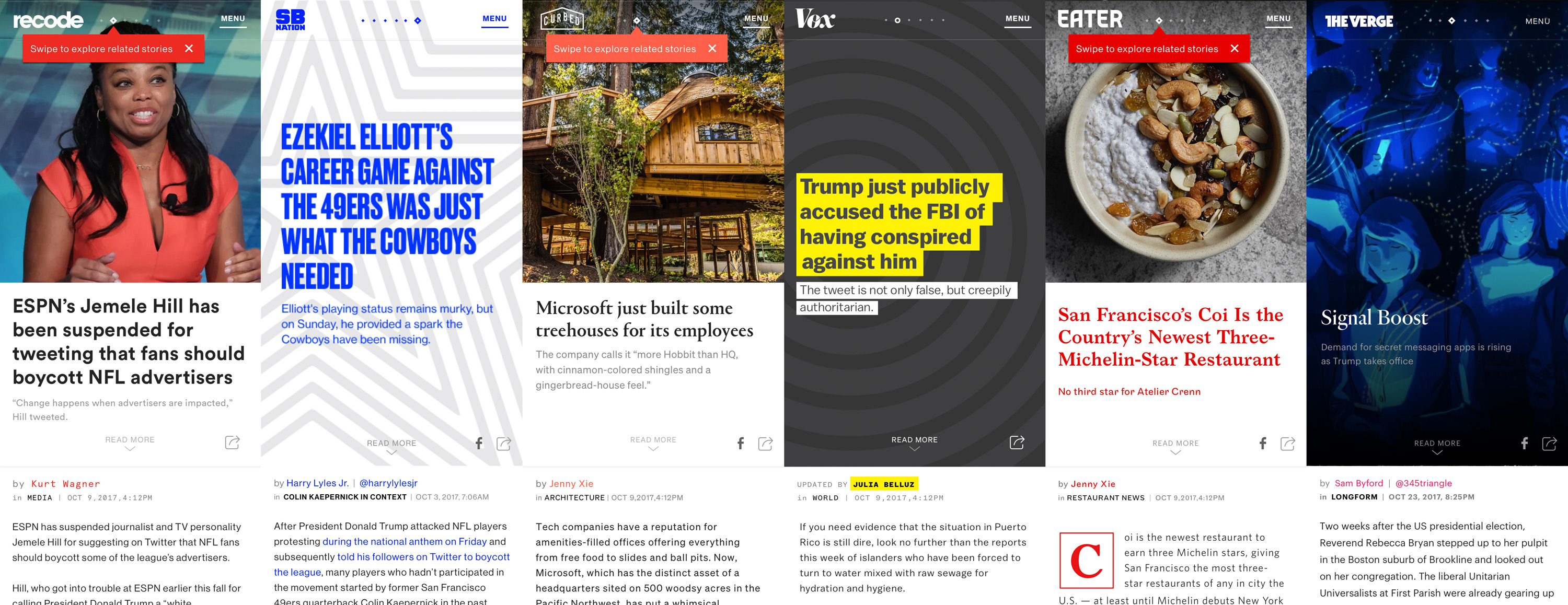
The goal of this work was not to abandon the responsive web, but to do more to cater to what is frequently the platform our readers are using to consume our content. We created a framework that allowed for swiping through stories at any point in an article, which meant we needed to create initial view “cards” that combined all the most relevant imagery and info about a story at a glance.
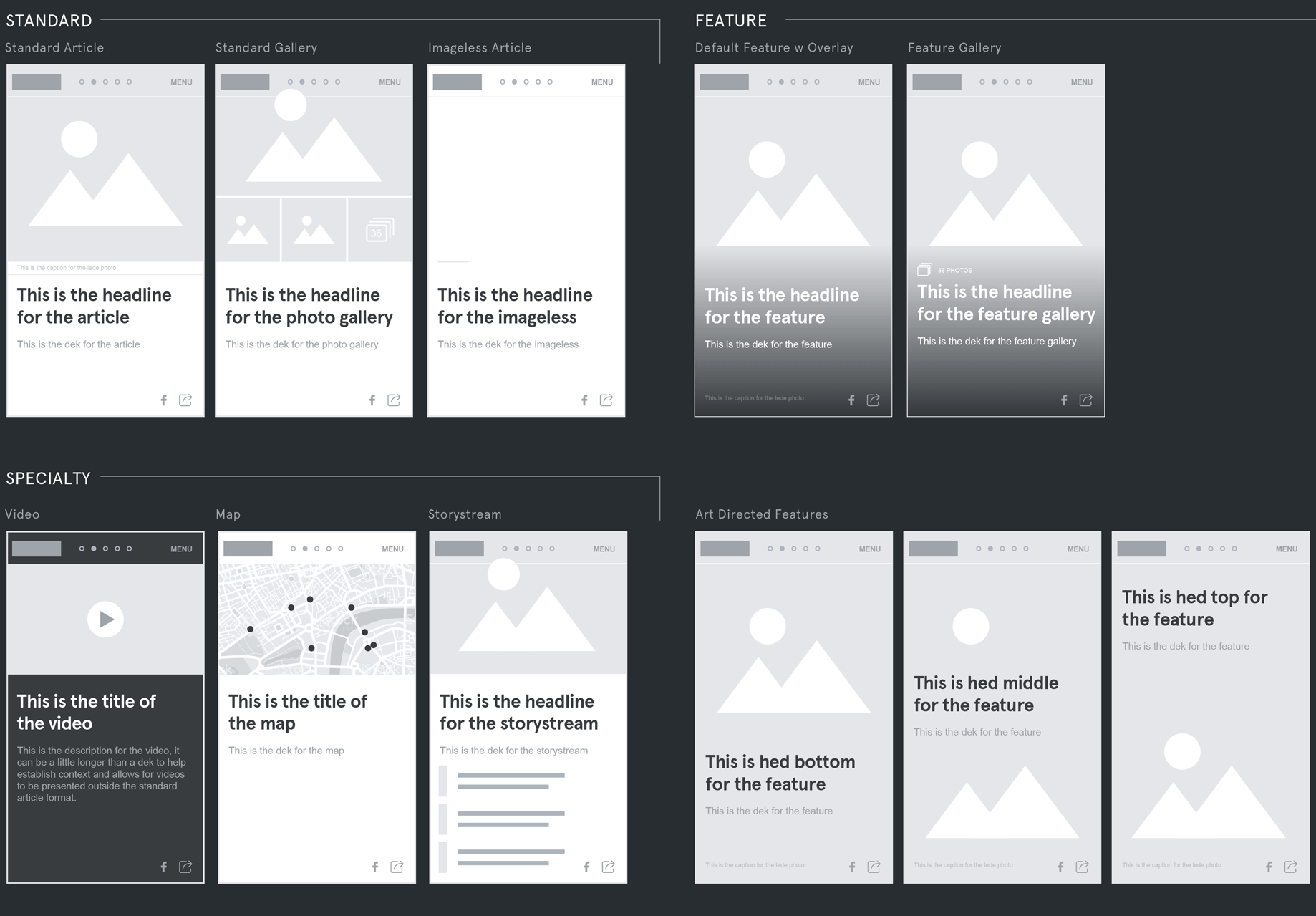
- Shown above: A blend of stories, features and imageless stories with a “card” header system.
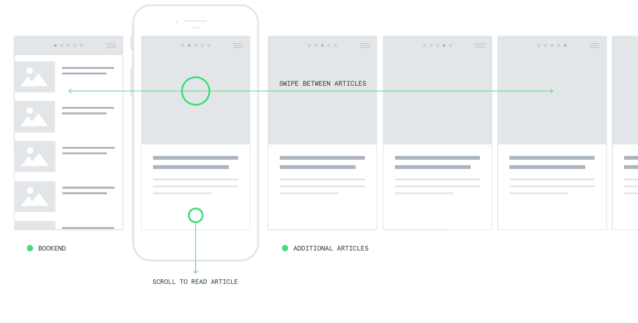
We tested various concepts, eventually landing on a concept that combined swiping between related stories and a “bookend” screen, which served as a hub page and directed the reader to a bigger pool of related content.
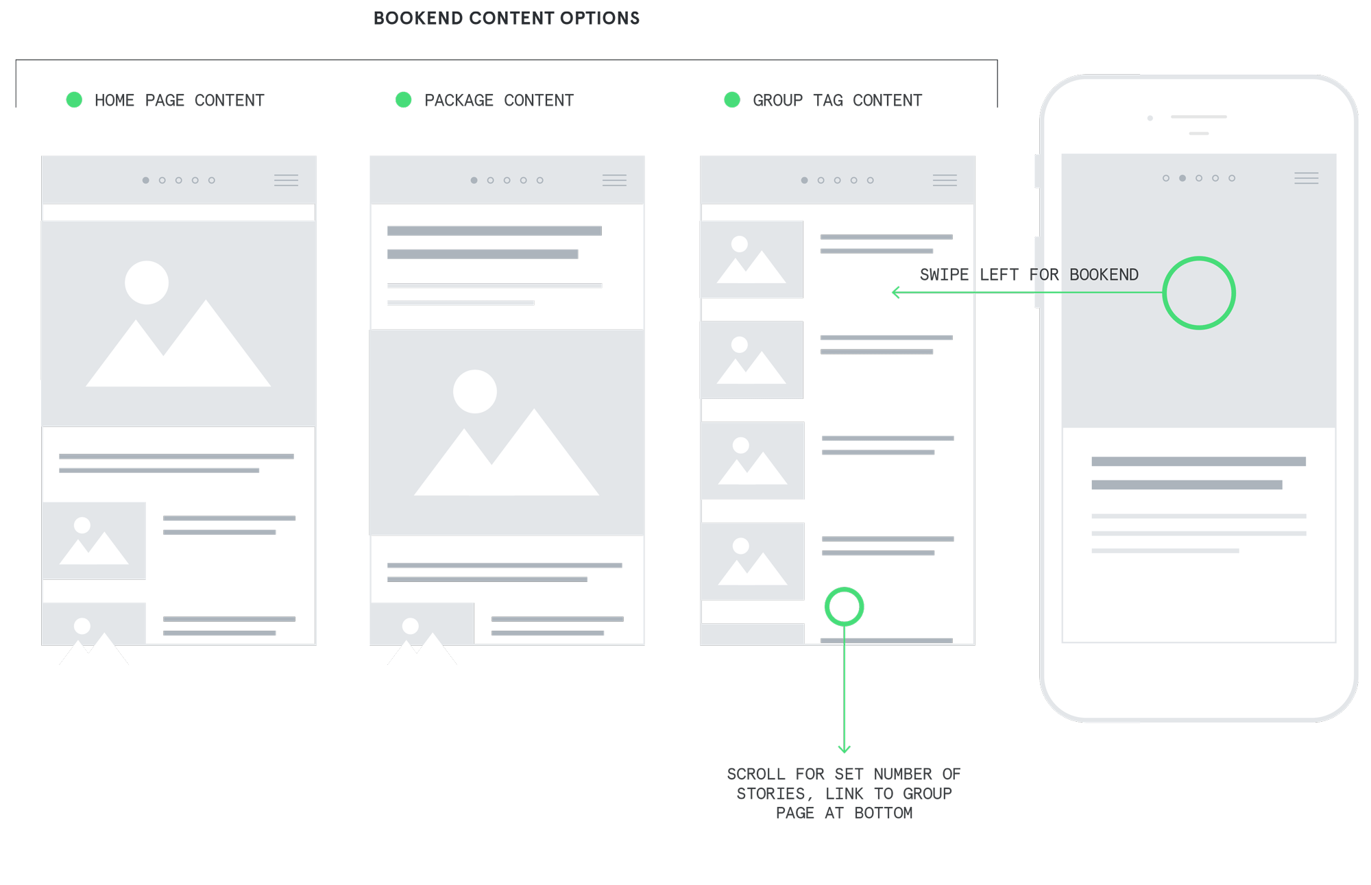
The bookend card occupied the first spot in the carousel, allowing a user to swipe left to access it from any new article page, or the user could discover it after looping through the four next-up articles in the carousel. The bookend would display content from the group tag, the package the article belongs to, or replicate the homepage.
The value of the bookend was that it allows the user to very easily get a higher level view of the content available, or to navigate back and forth through a packaged content experience, allowing the kind of “dip in and out” browse experience that is very difficult to accomplish on mobile.
Card system
Each article would “tease” itself with a card format. Using this screen- height presentation allowed us to delay loading the article until a users starts to scroll down, making the experience feel faster and allowing us to use the swipe framework effectively.
There were multiple stylization options for cards which allow brands to leverage any feature artwork they’ve created while still leaving flexible options for landscape imagery or articles without artwork at all.
Mobile doesn't have to be a compromise
As more and more web traffic was coming into our sites via mobile devices, it was crucial that we update our presentations to feel mobile-native and away from a feeling of compromise or “good enough.” The updated typography systems and card format paired together allowed us to create instantly impactful designs that felt deserving of the mobile format.
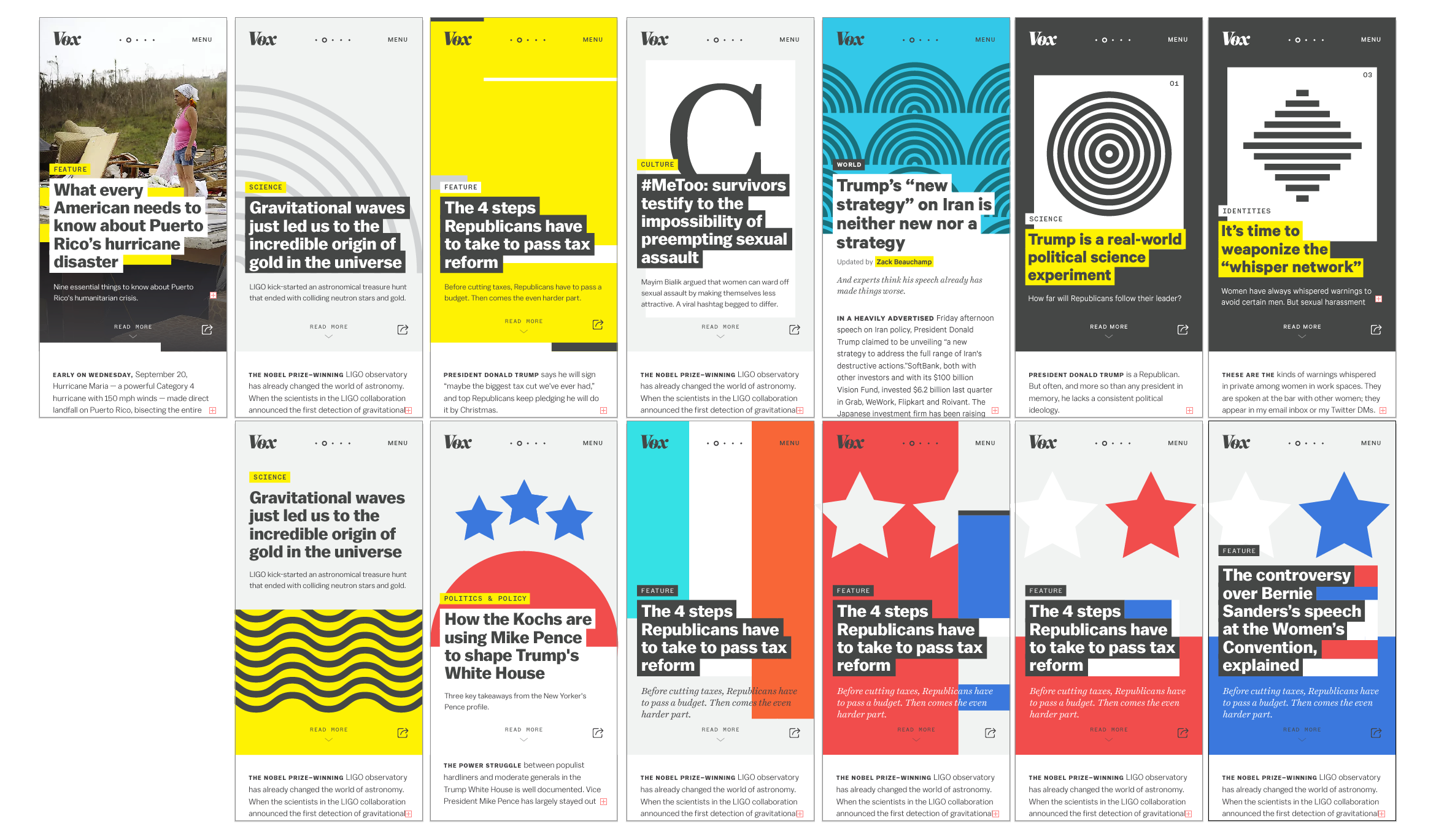
- Shown below: Sketches for polygon.com, designed by Andrew Johnson.
Imageless cards are to be used when high-quality artwork can’t be attained for an article. We would rather show no image than a sub-par image, and these cards are designed to treat the lack of imagery as an opportunity for brand expression.
Along with color and typography, these cards reinforce the reader’s sense of place and strengthen our brand presence on mobile, where it is so often lost. The imageless headers were an excellent challenge for the team to establish distinct but flexible visual kits to allow us to use these abstracted representations in a way that struck the right balance between anonymity and relevance to the story.
- Shown above: Sketches for image-less cards for Vox.com, designed by Drew Rios.
The end result
The final UX combined going deeper into a subject with coming up to a higher level for context, allowing for instant-access navigation across a site from any point in a story. The initiative was a blend of brand, visual expression and user-focused experiences that would have put Vox Media at the forefront of mobile-web browse experiences.
- Special thanks to Yesenia Perez-Cruz, Sanette Tanaka Sloan, Jared Fanning, Andrew Johnson and Drew Rios for their fantastic work on all of these initiatives.