The Eephus League
( A )
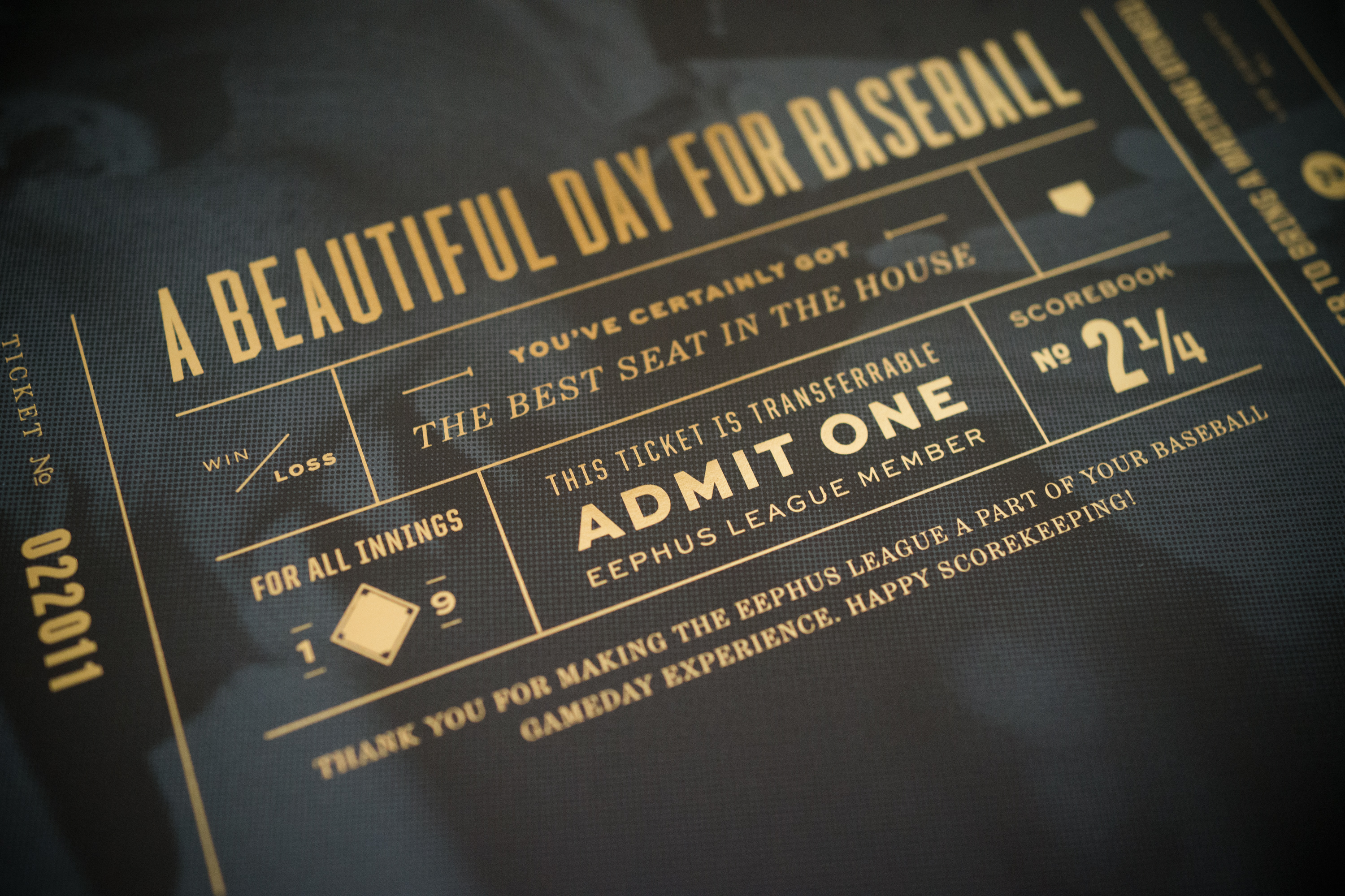
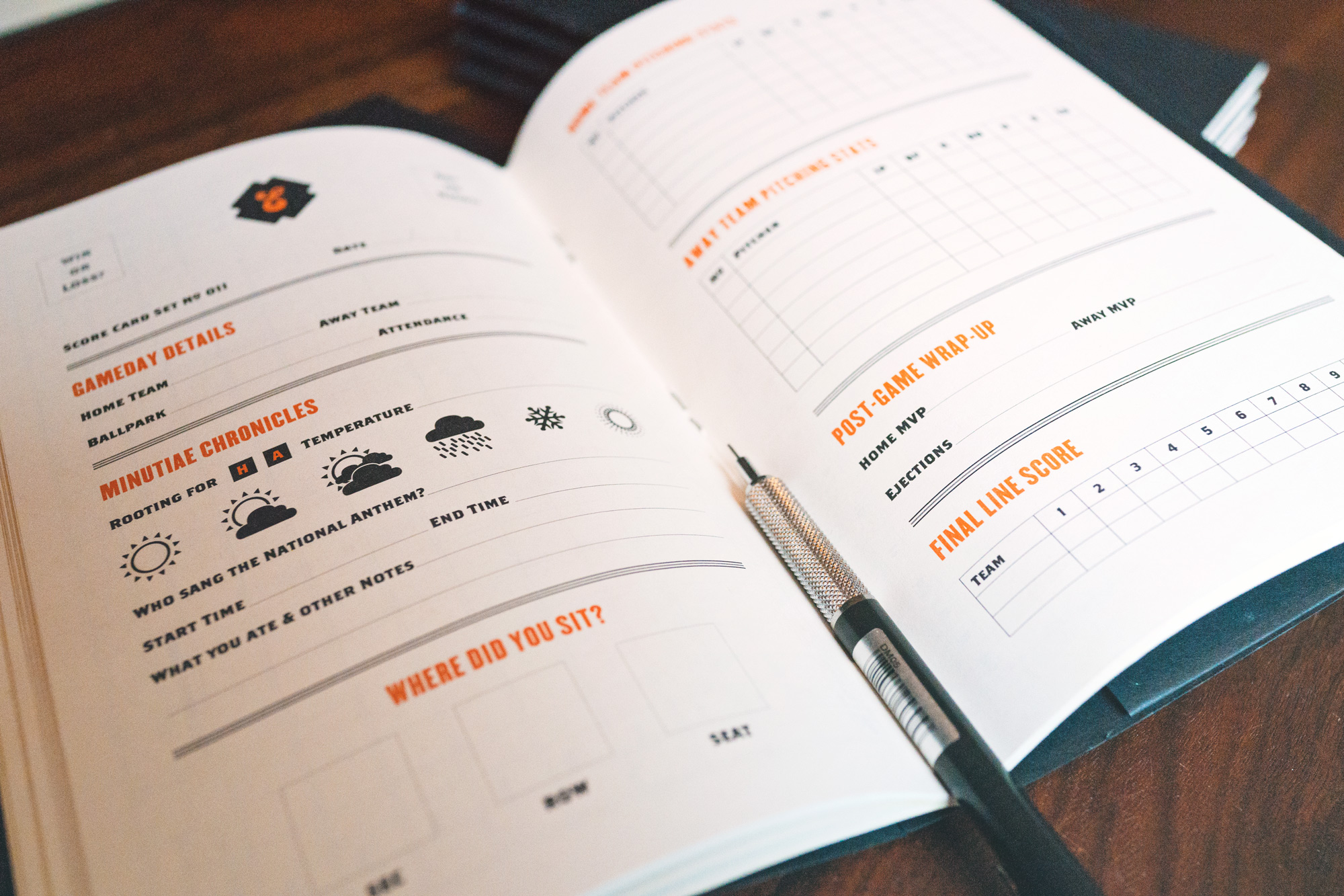
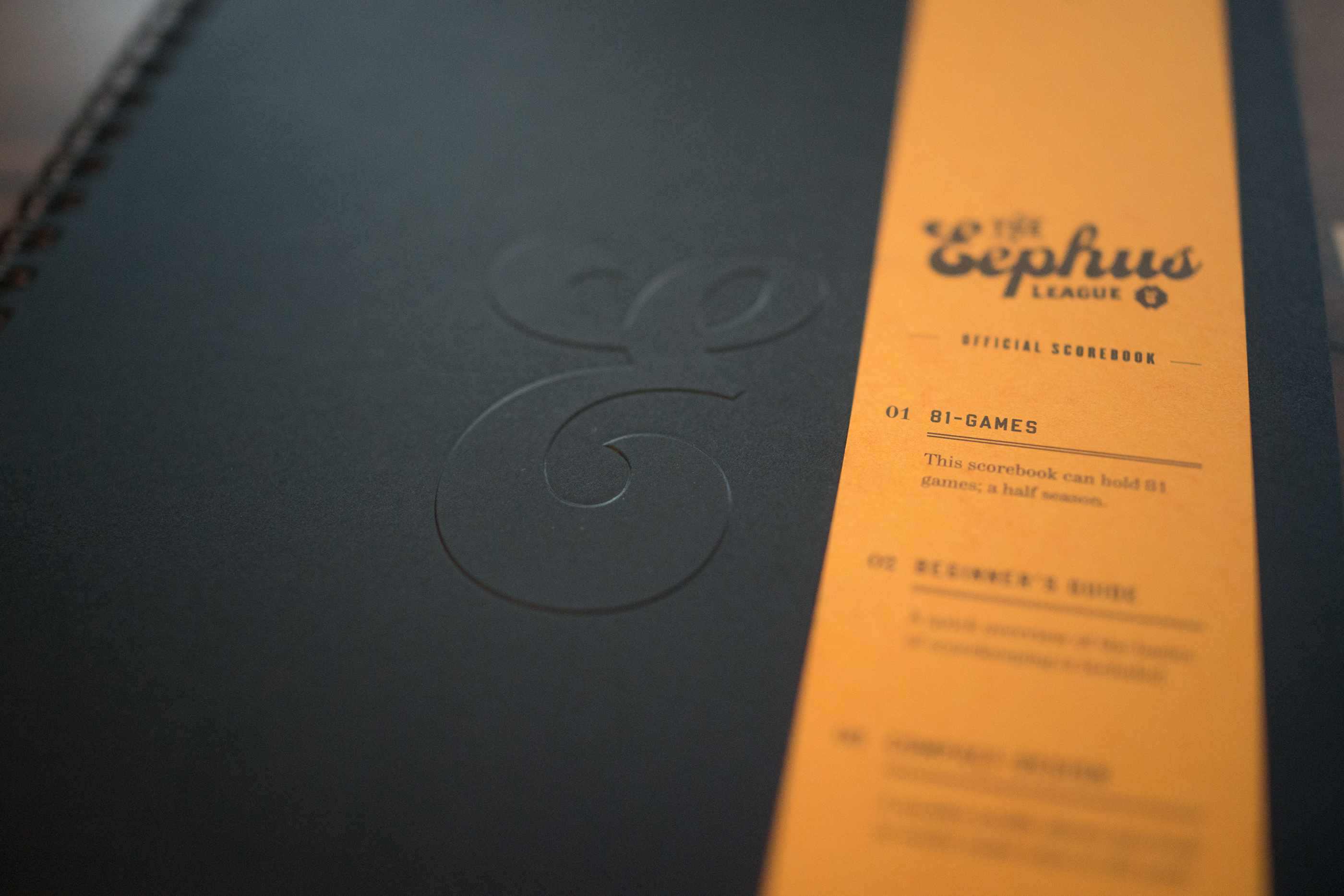
The Eephus League of Baseball Minutiae was my senior thesis project at Auburn University. Though originally focused on a website that gathered pieces of baseball trivia, a successful Kickstarter for the scorebooks I designed as part of the project has morphed the Eephus League for the better. The prompt I gave myself was: if Moleskine made a scorebook, what would it look like? Could you change people’s perception of scorekeeping with good design? I hope that I have and that a new generation of fans is getting excited about scorekeeping.
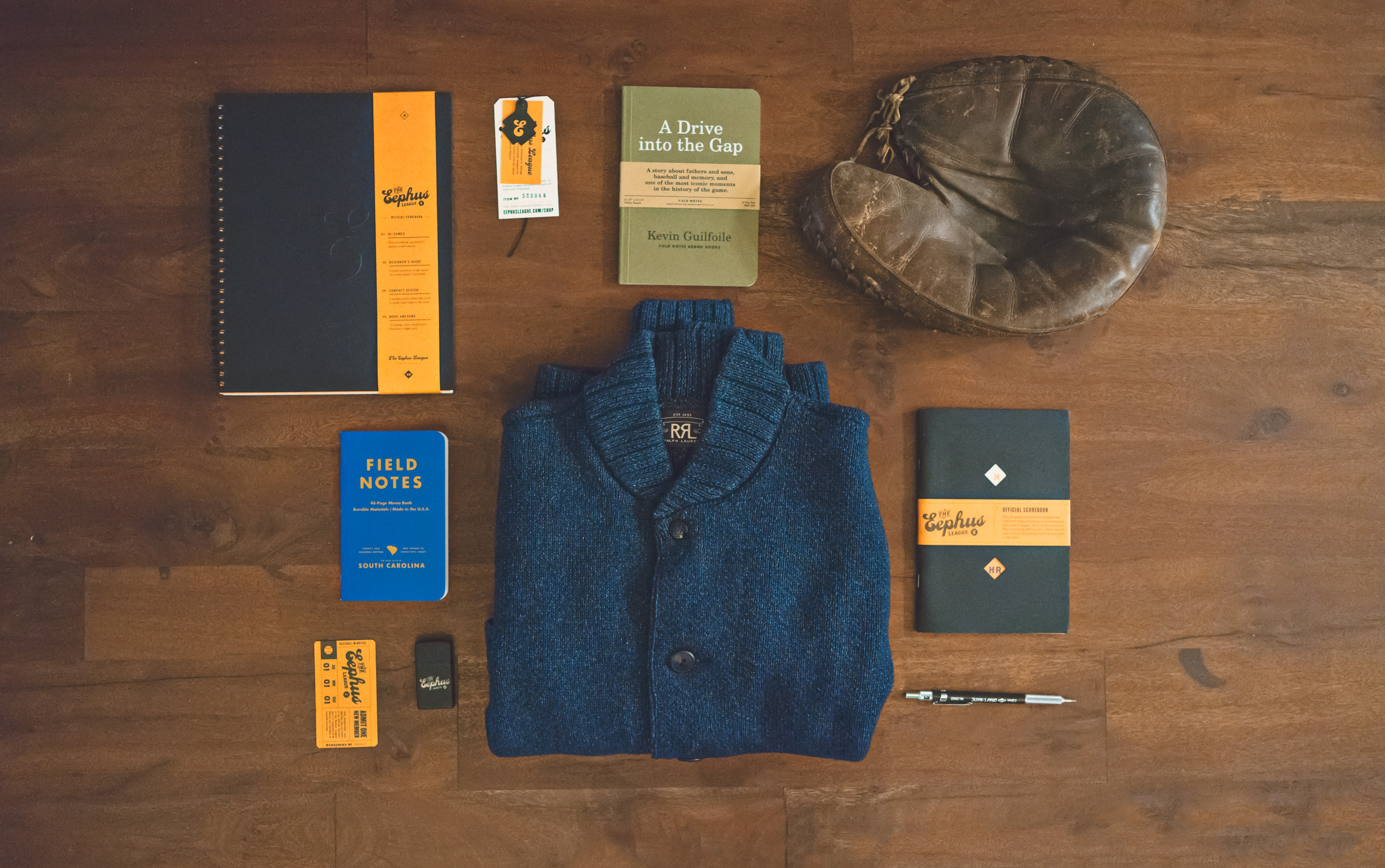
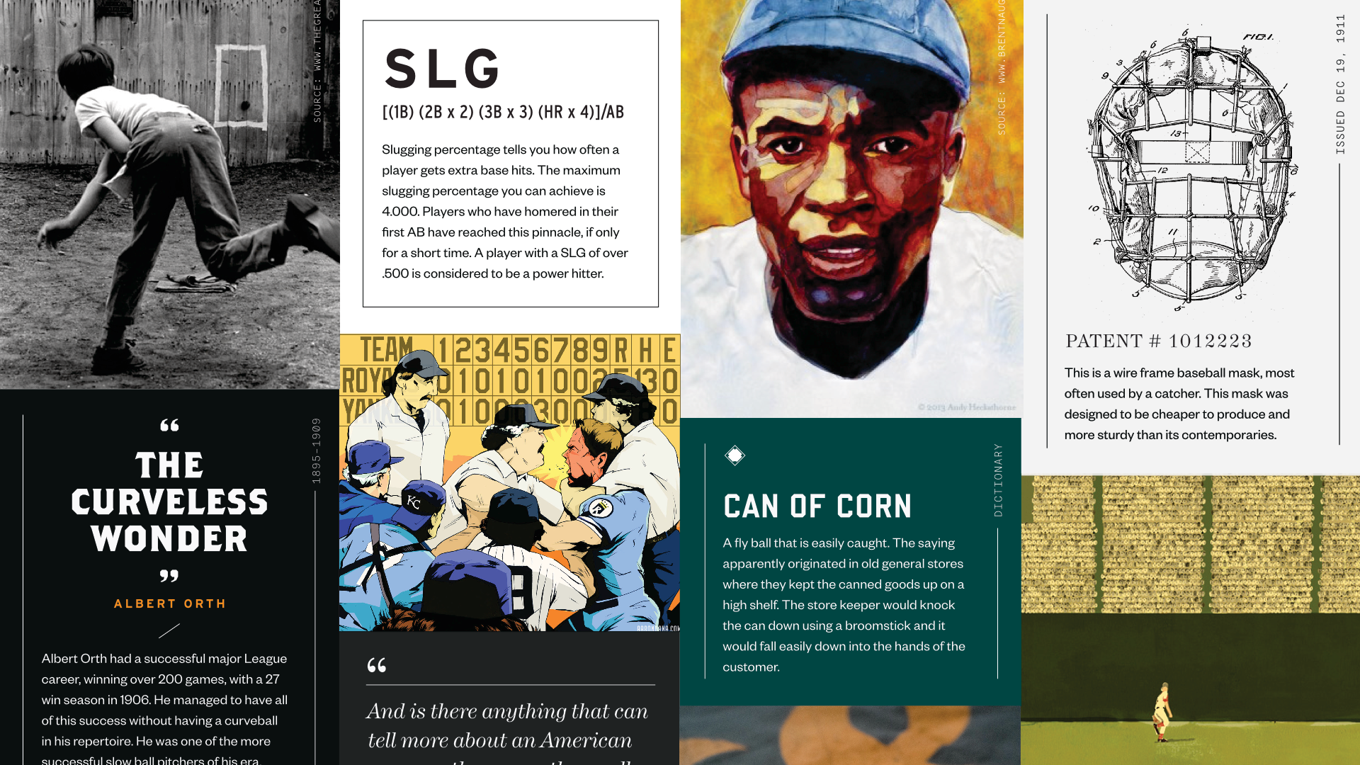
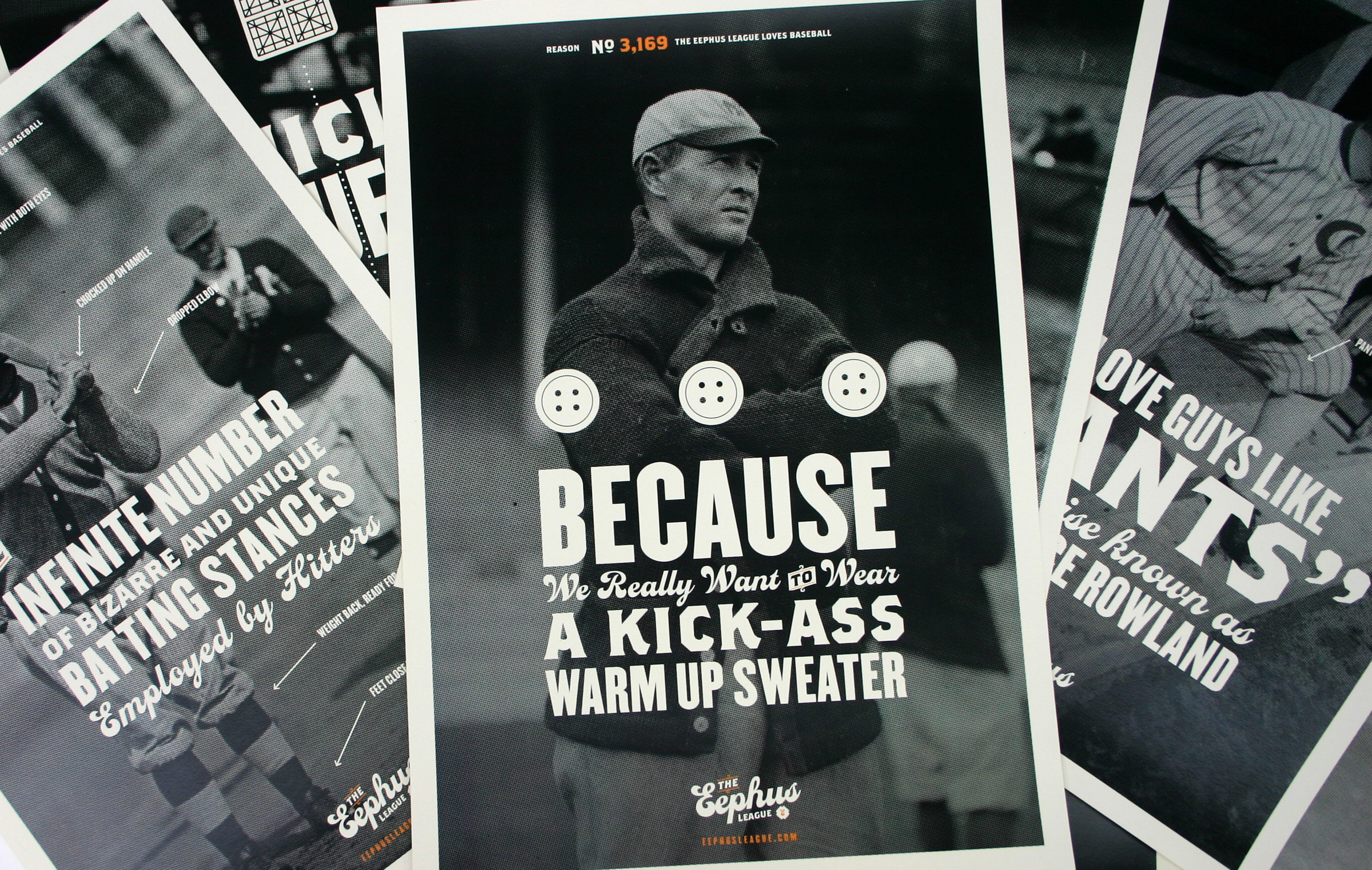
Thousands have kept score using Eephus League scorebooks, hundreds of them learning to keep score for the very first time with them. The Eephus League also had other print components, including a book containing various pieces of baseball history, statistics and trivia, and several posters celebrating baseball’s eccentricities and history.
The Eephus League has been written about in WIRED, The New Yorker, New York Magazine, Gizmodo, ESPN, and SB Nation, amongst many others.
( B )
The name is referencing the infamous “Eephus” pitch, a slow pitch designed to throw off the timing of a hitter. Several of my professors raised an eyebrow at the name when they learned about it, and I countered that if you didn’t know what an Eephus pitch was, the site likely wouldn’t interest you. One of the most common compliments I receive about the brand is how much baseball fans love the name.
Dozens of international baseball fans choose the Eephus League scorebooks as their weapon of choice. Who says only Americans care about baseball?!
( C )
- Project began in 2010
- Visit the Eephus League website, or check out the Kickstater.
- Printed by Davis Direct in Montgomery, Alabama
The early pieces
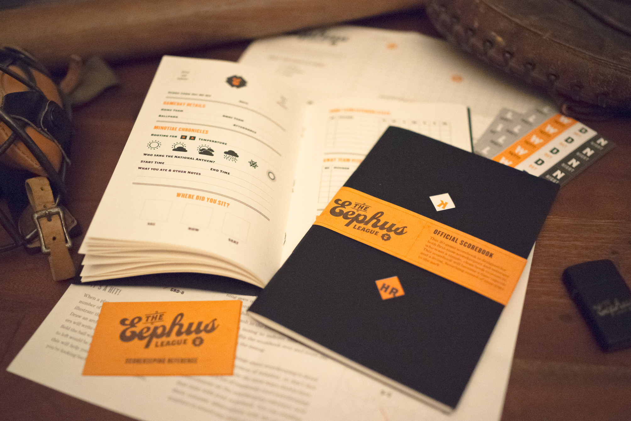
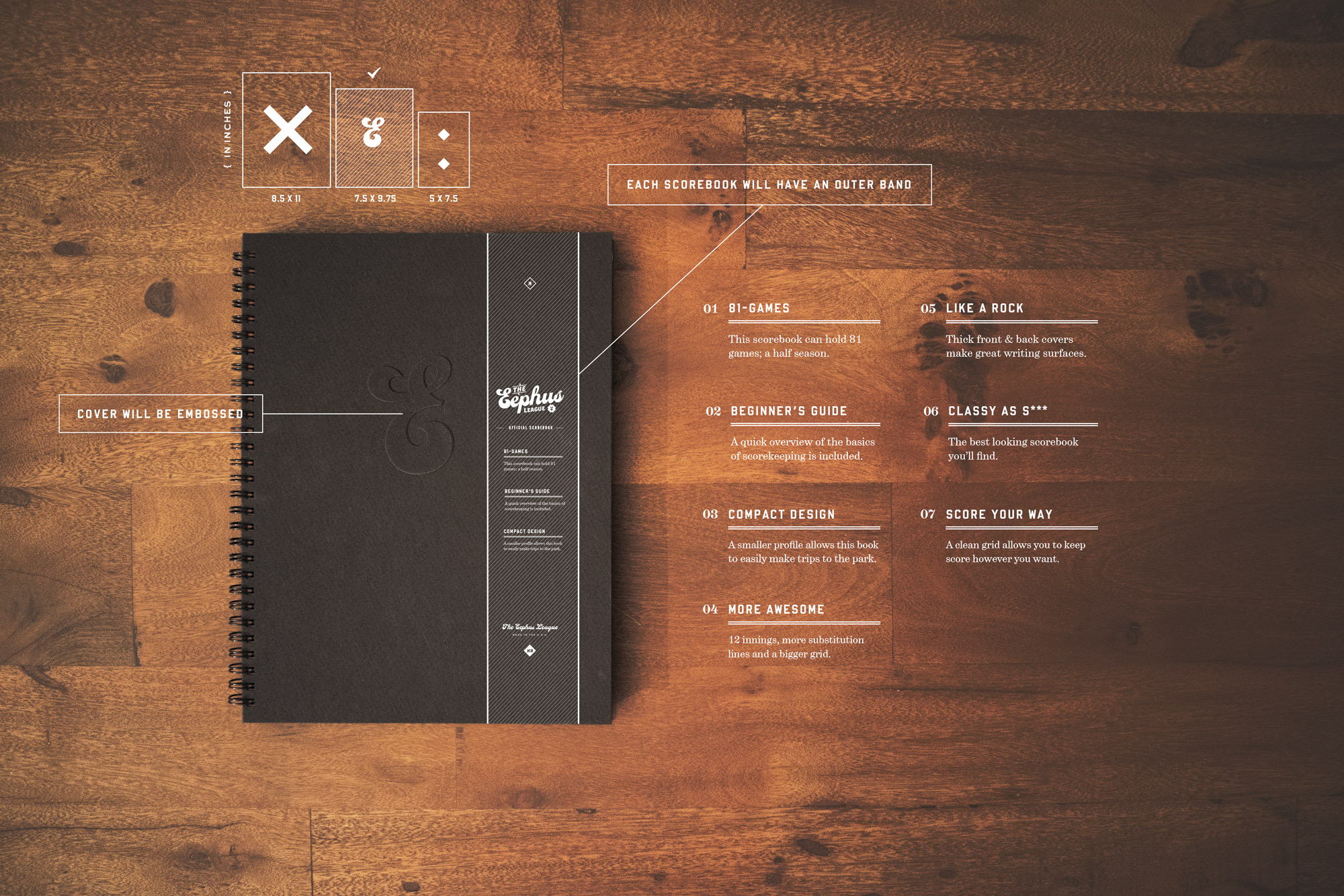
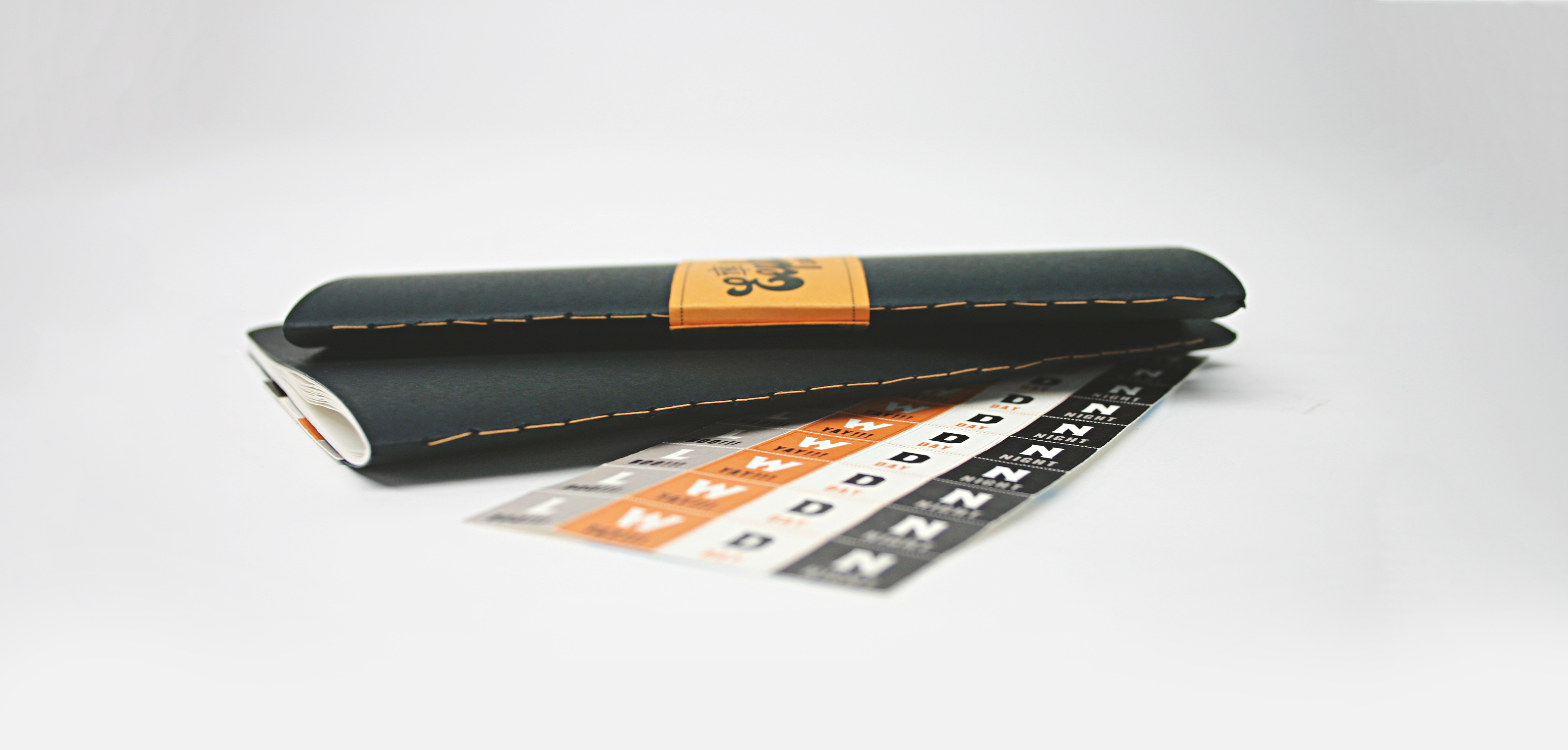
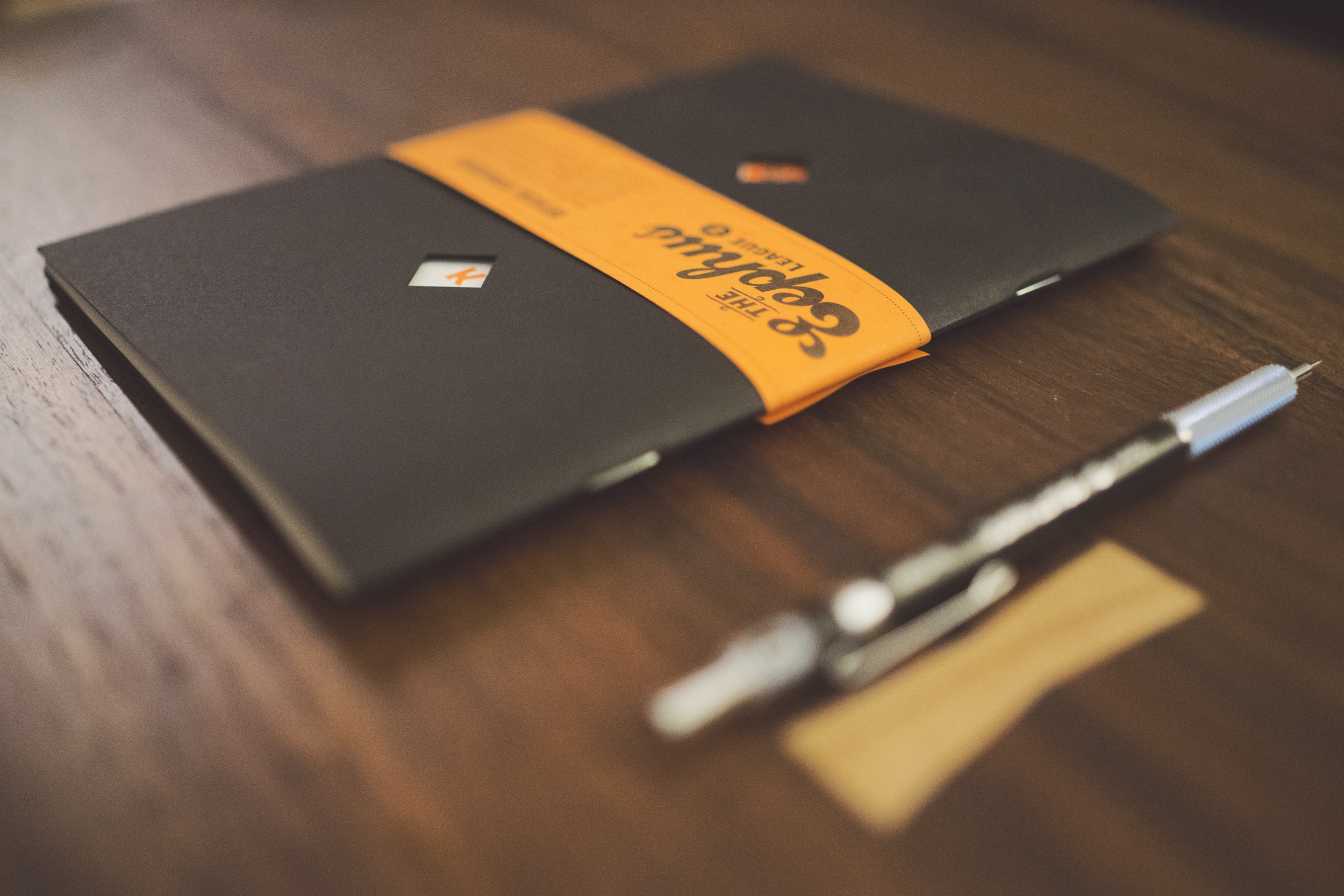
These are a few of the pieces I created for the Eephus League as a part of my Senior thesis at Auburn. While the bulk of my time was spent conceptualizing and creating the website, I didn’t want my table at the student show to just be a computer monitor and a mouse, so I filled the rest of my semester with making books, packaging and, fatefully, a scorebook.
- The original scorebooks that I sewed the binding for resulted in my only major accident as a design student. It involved a plastic thimble, a collapsed eye of a needle, and a punctured thumb.
- I asked Eephus League visitors to send in photos of how they score a single, which I used in the campaign video to illustrate the variety in the way different people keep score.
Where it all started
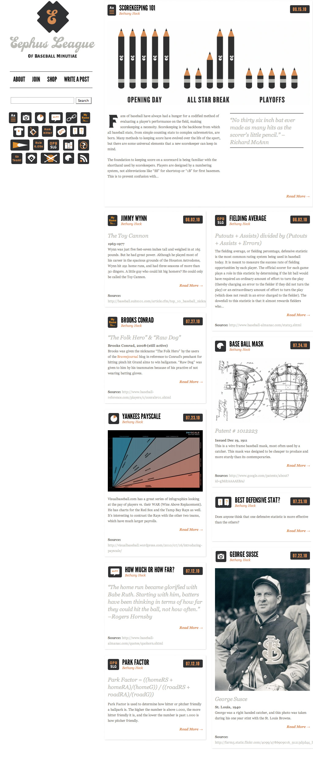
The backbone of the project was originally the Eephus League website, a community driven blog where baseball fans could upload photos, share stories and view information about all of the miscellanea and minutiae that make baseball such a rich part of American lore. The site automatically formatted the different categories of posts in a uniform way, allowing the site to be visually consistent despite having multiple authors. This concept is carried through into the site today, with much more expressive styling.
The Eephus League website gave me an excuse to spend dozens of hours researching all sorts of nooks and crannies of the things that emerge around and because of baseball, which I then documented on the site in what was essentially a community-sourced tumblr.
The site also served as a platform for me to communicate with people who enjoyed the site and were interested in the products I was trying to get funded (this was in the early days of my social media usage). Back in the day when you would announce something on your website and trust that enough people would see it!
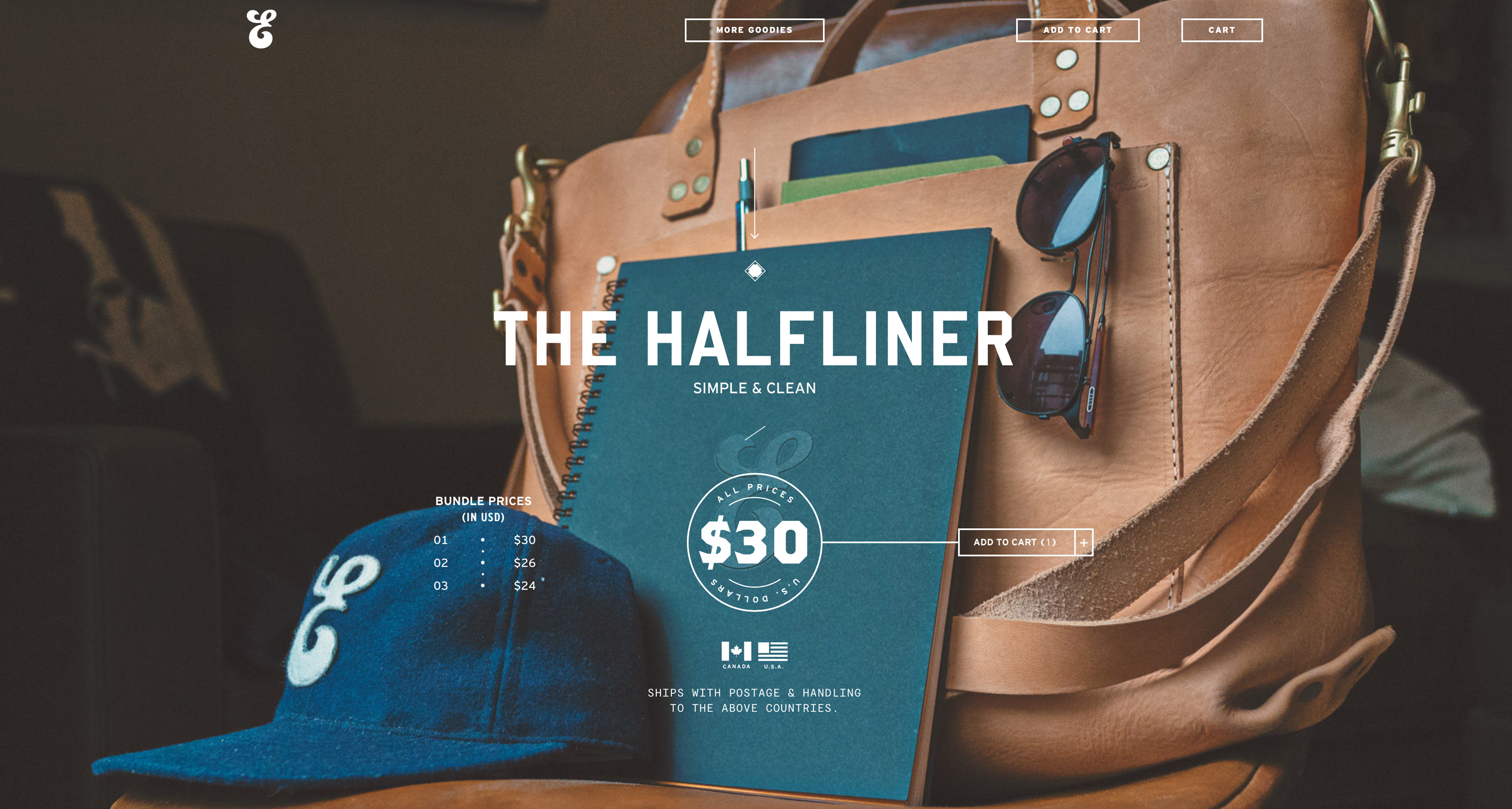
The main function of the site now is to house the Eephus League shop, where the merchandise produced through the Kickstarter campaigns is still sold.
Friends at the park
By far the most gratifying part of the experience of running the Eephus League is seeing the evidence of the books being a part of someone’s adventure at the ballpark. Every person’s scorebook is a reflection of their personality, and their notations are bespoke, just like handwriting. I’ve heard many stories of people spotting other fans in the park who are using using one of the scorebooks, and they’ll take the time to say hello and form a new connection.
The Eephus League Magazine
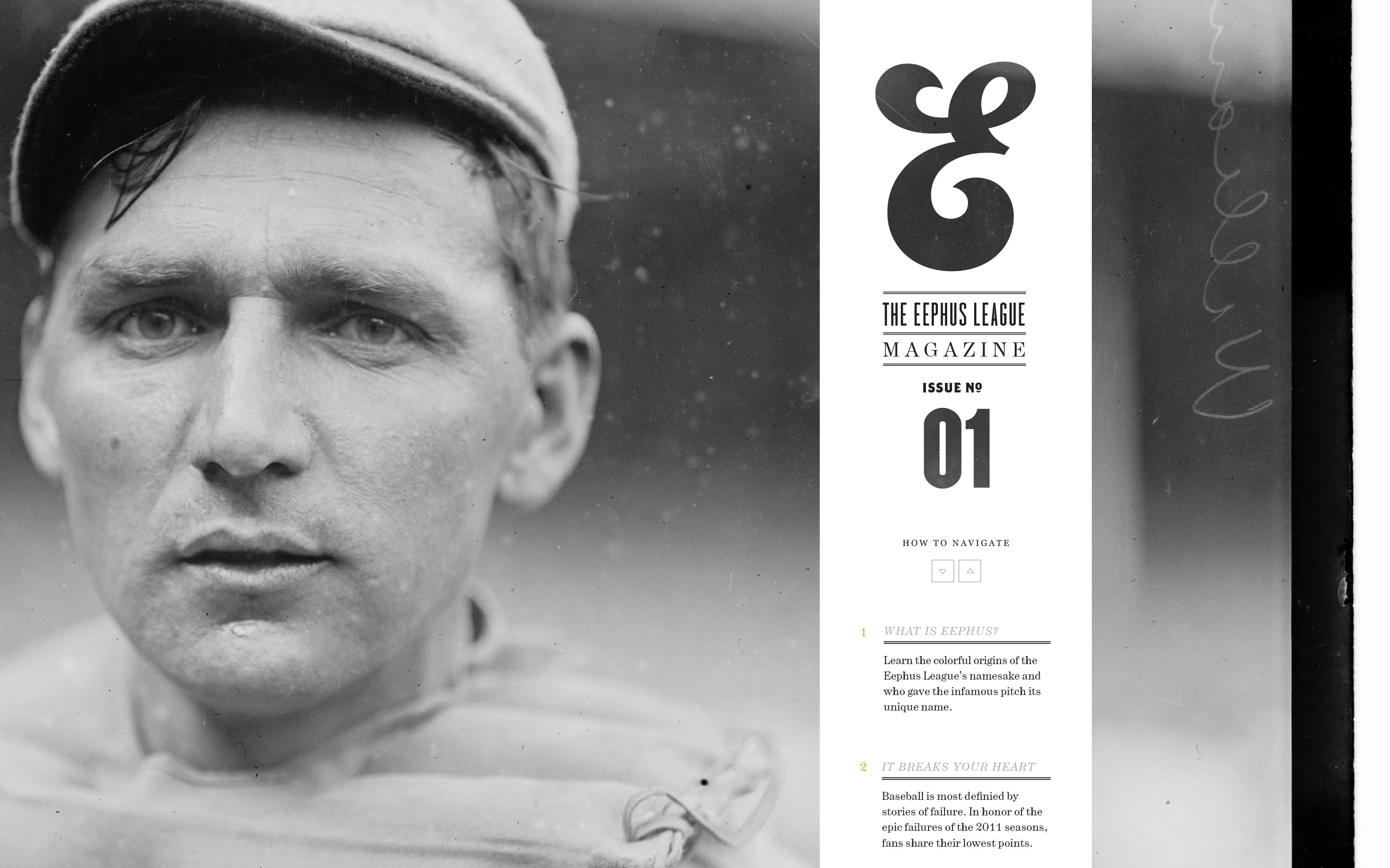
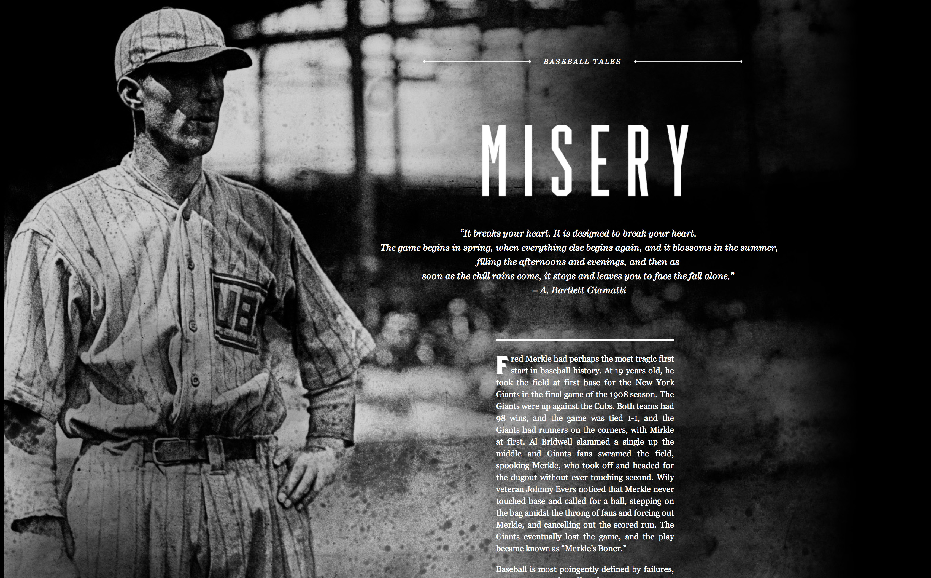
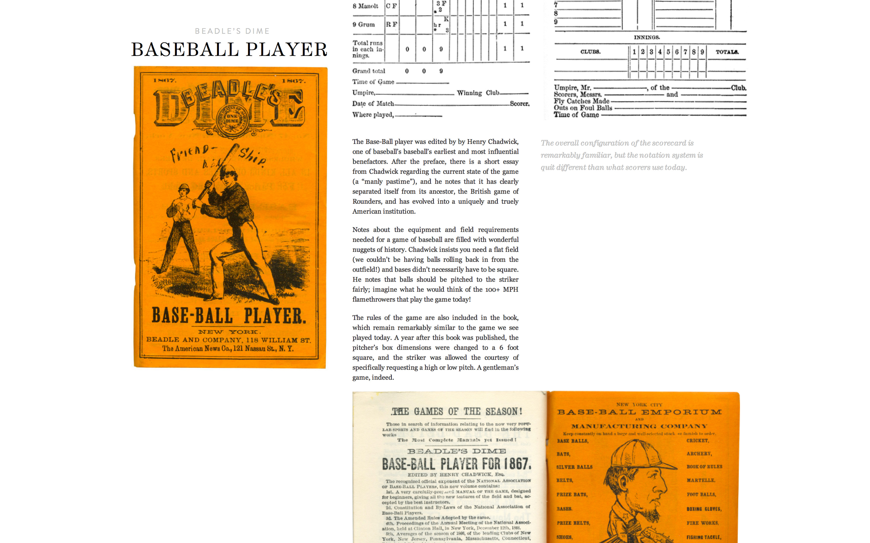
The Eephus League Magazine was an experiment in long form web experiences based off the coding framework of Ian Coyle’s gorgeous Edits Quarterly website. I had designed the piece as an actual printed magazine, then on a whim spent a weekend converting it into this format. Coyle’s use of “paging” and parallax was the closest thing I had seen to mimicking the pacing and tangible experience of reading a book. Obviously I’m not the only one who was affected by his work, because within the next year longform had become a staple of editorial sites across the web, leading to experiences like “Snowfall” and many other lush examples from other media publishers.
Continuous improvement
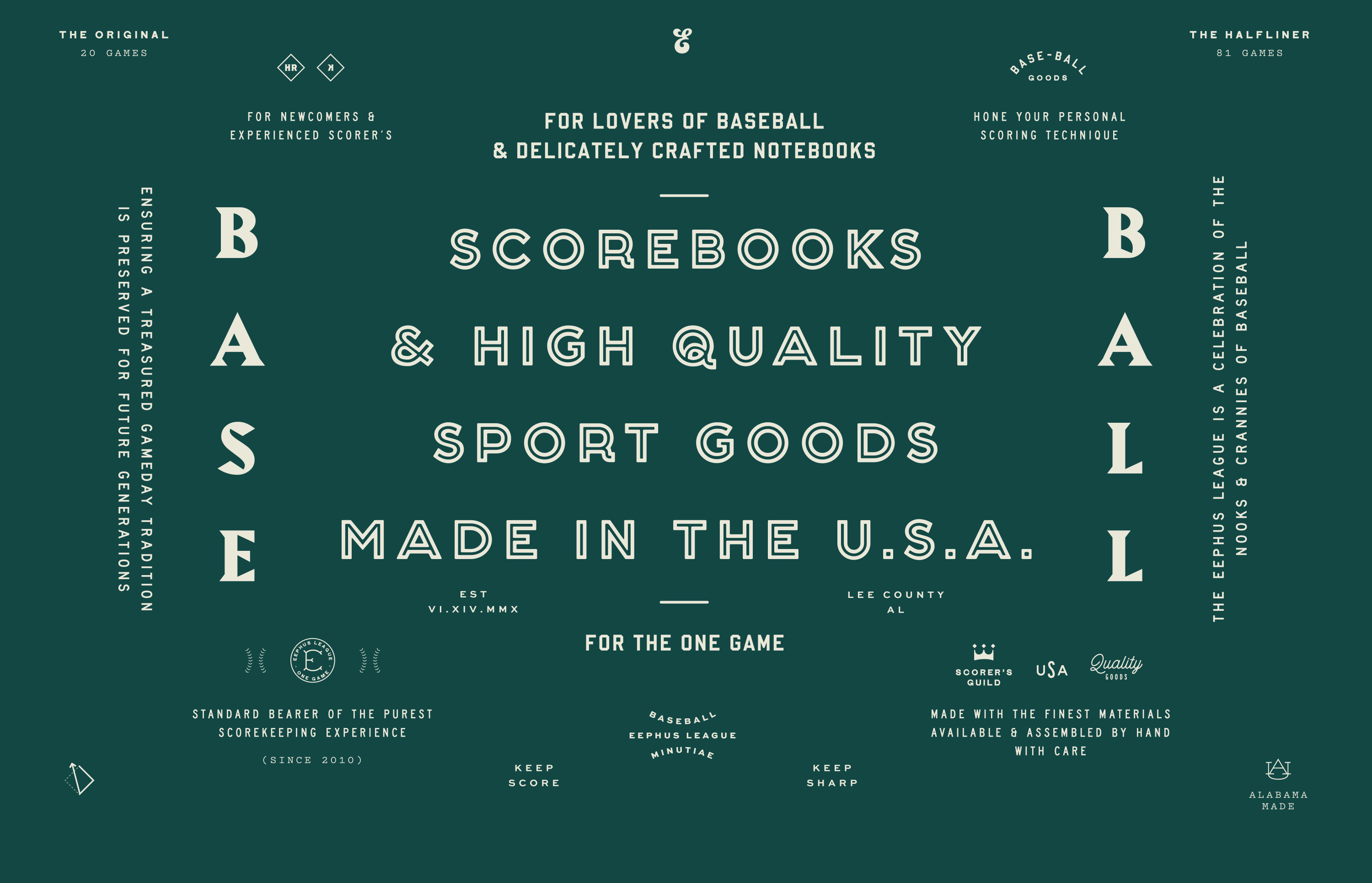
I’ve been working on the Eephus League for nearly a decade now, and it’s grown along with me. It’s always a platform I can use when I want to try new ideas and aesthetics while still giving myself some parameters on what is and isn’t on-brand. I’m glad I didn’t set rigid rules as I started about the typefaces and colors that would carry forward, and I’ve found the spirit of the Eephus League to be rather durable and malleable to different appearances over time.
