Fontacular 2016
( Strike 1 )
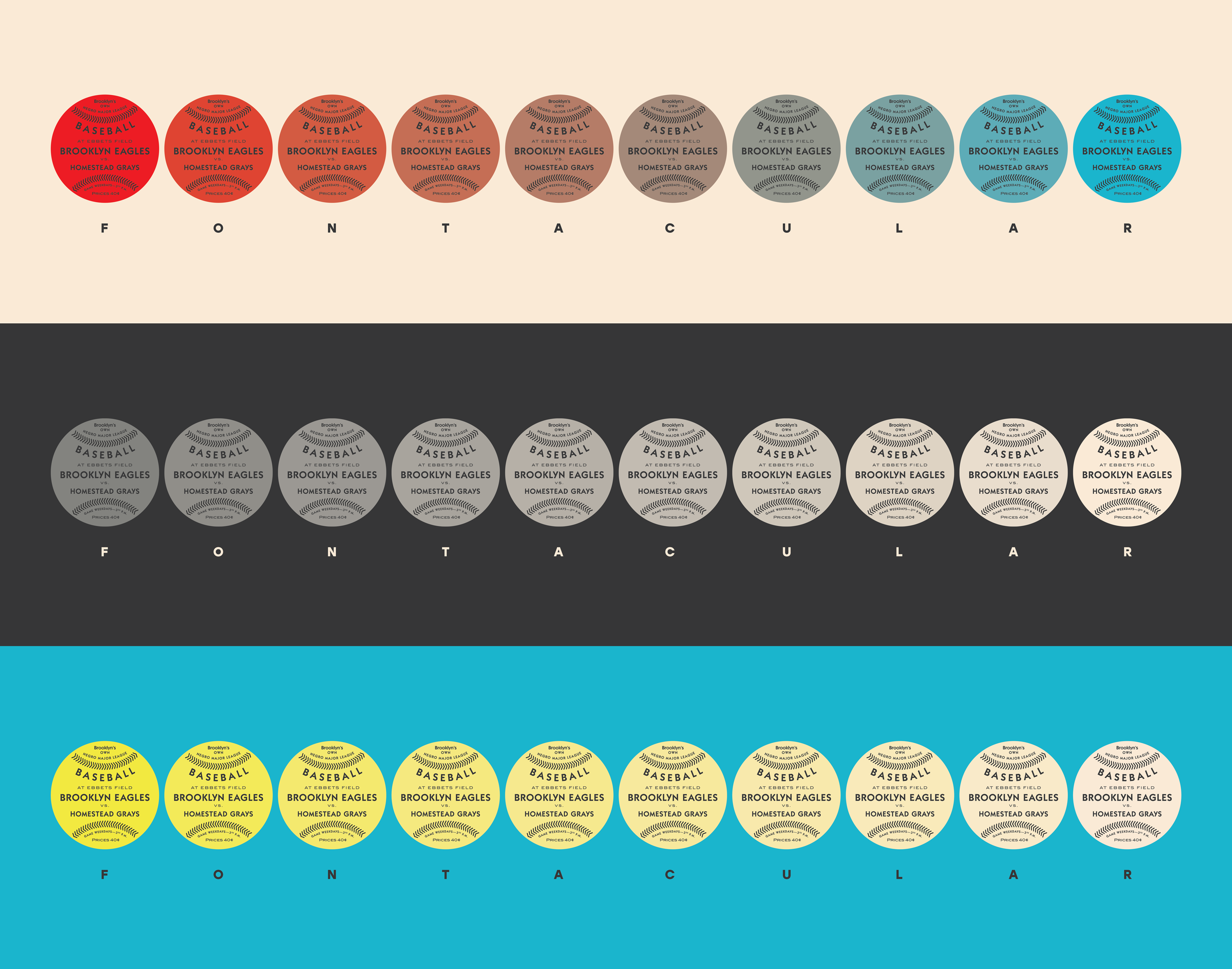
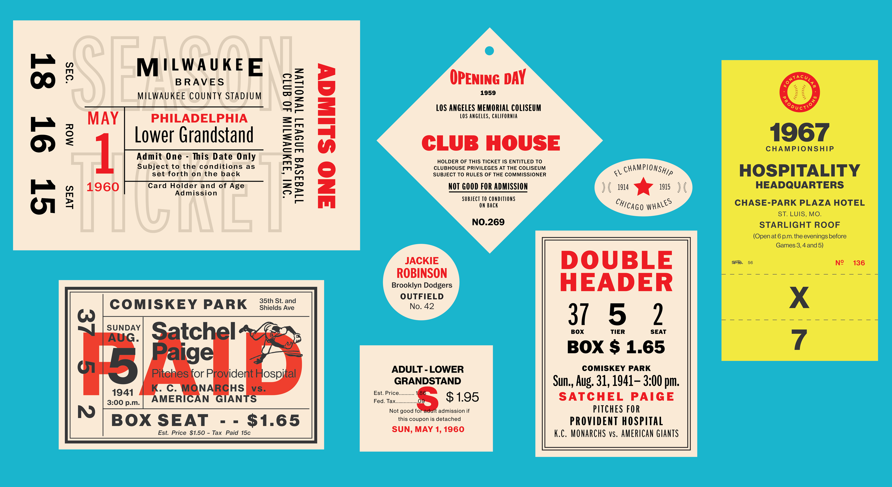
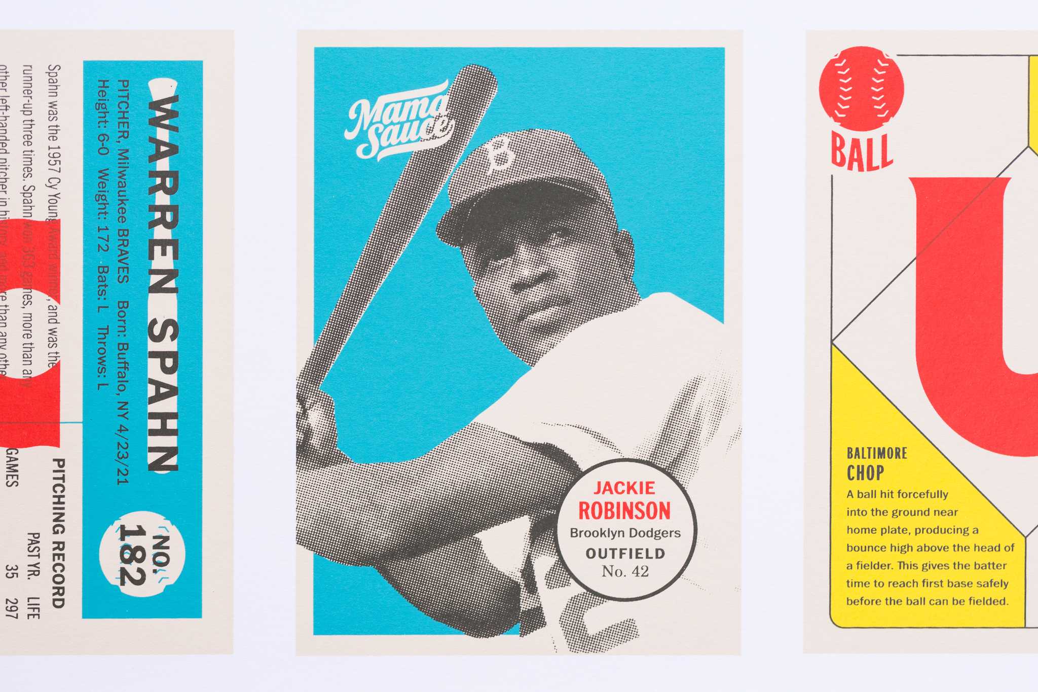
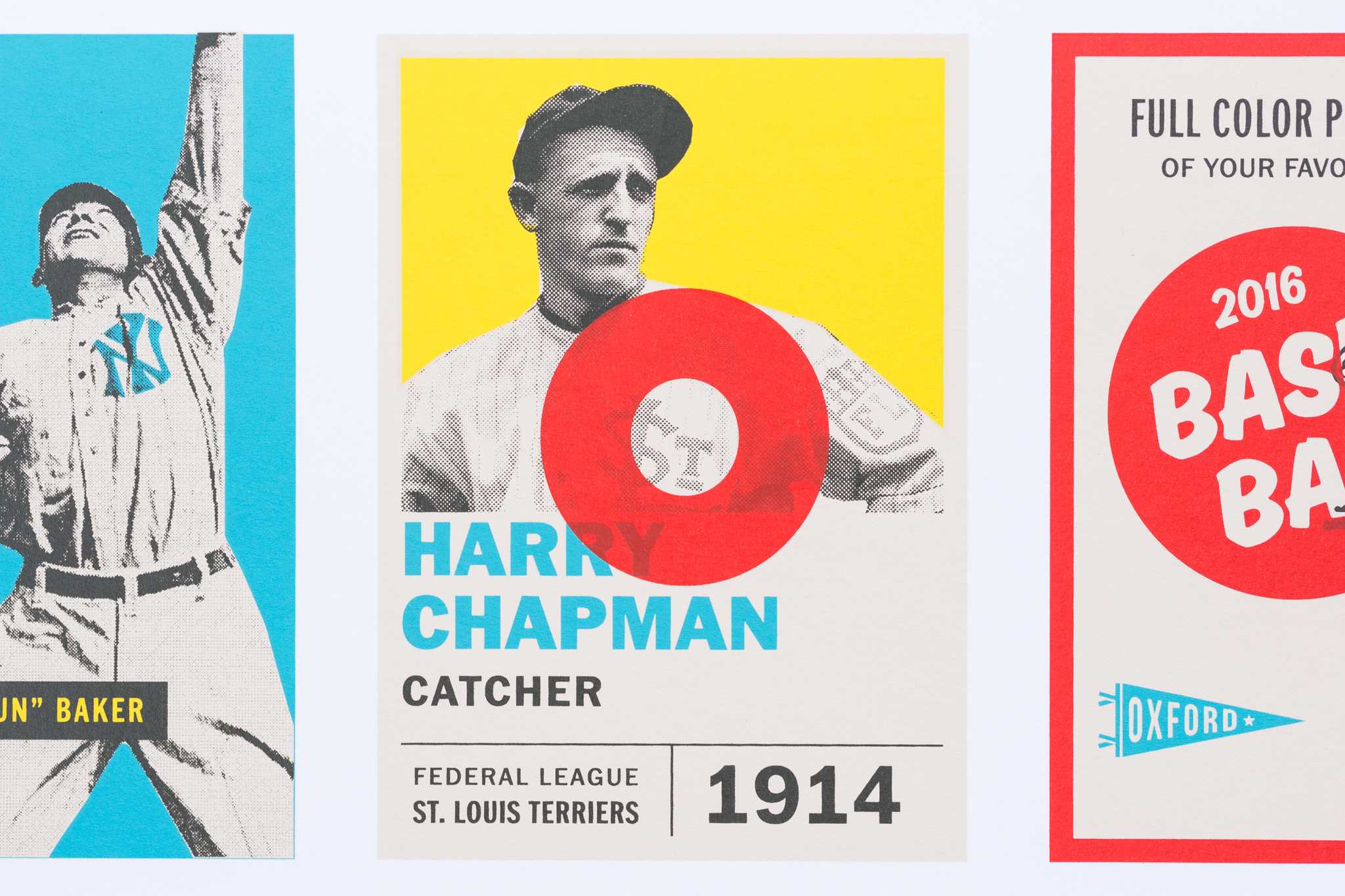
Baseball and typography are two of my favorite subjects, and I was grateful for the opportunity to use the playground of Fontacular to create baseball-themed promotional materials for Monotype’s annual sale. I spent a week pulling out research materials for classic baseball cards and other ephemera, made a list of concepts to try, then went to town.
( Strike 2 )
The campaign consisted of banners promoting specific typefaces as well as a 5-color screen-printed poster (printed beautifully by Mama’s Sauce). My goal with the project was to make sure I was serving the best use cases for each typeface that was featured, and that all the promo images was very type-forward and kept the typefaces themselves as the focus.
( YOU'RE OUT )
- Designed 2016
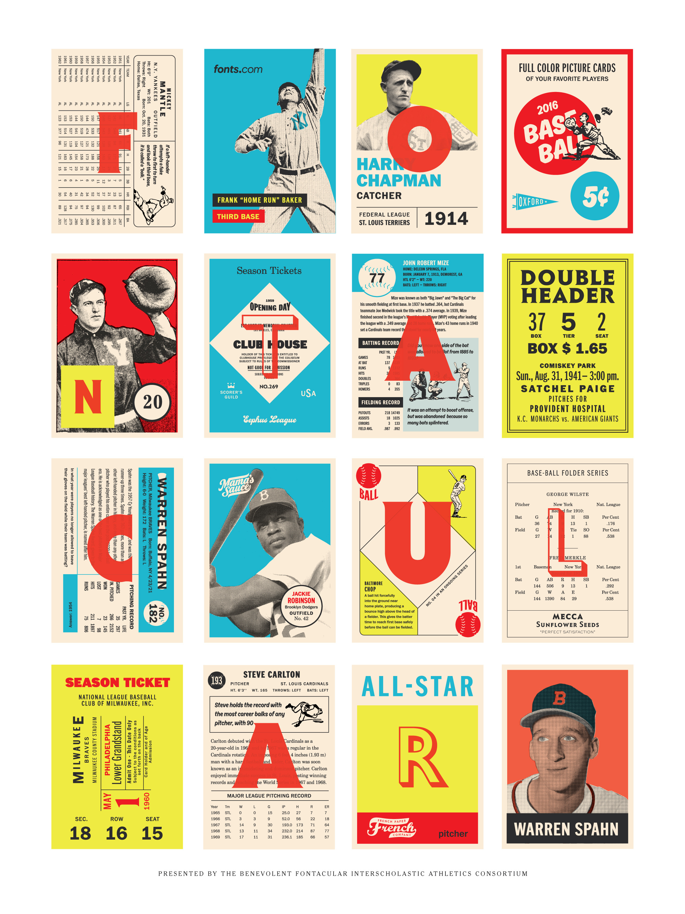
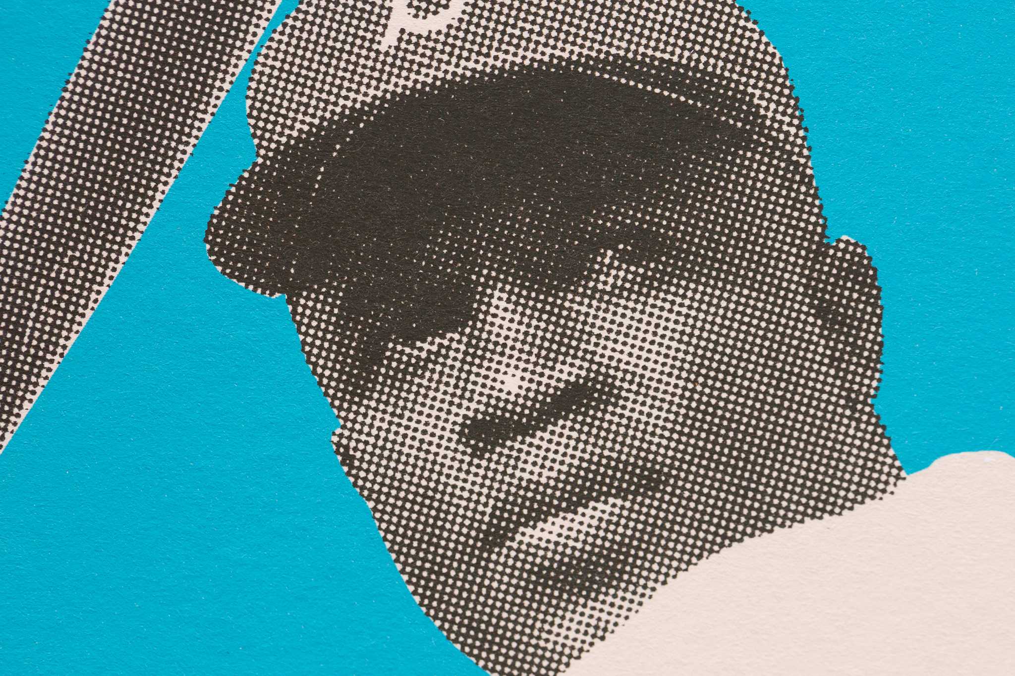
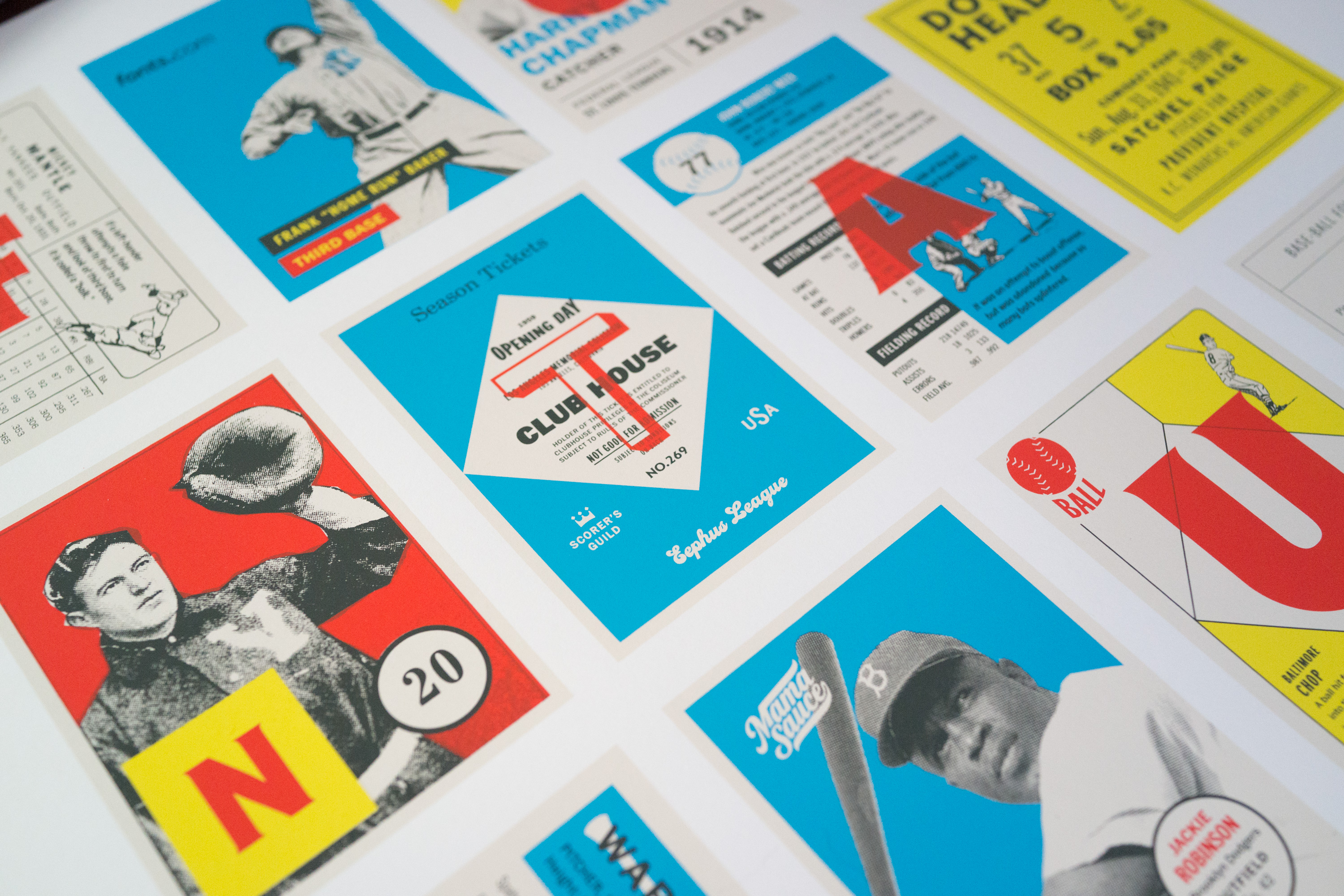
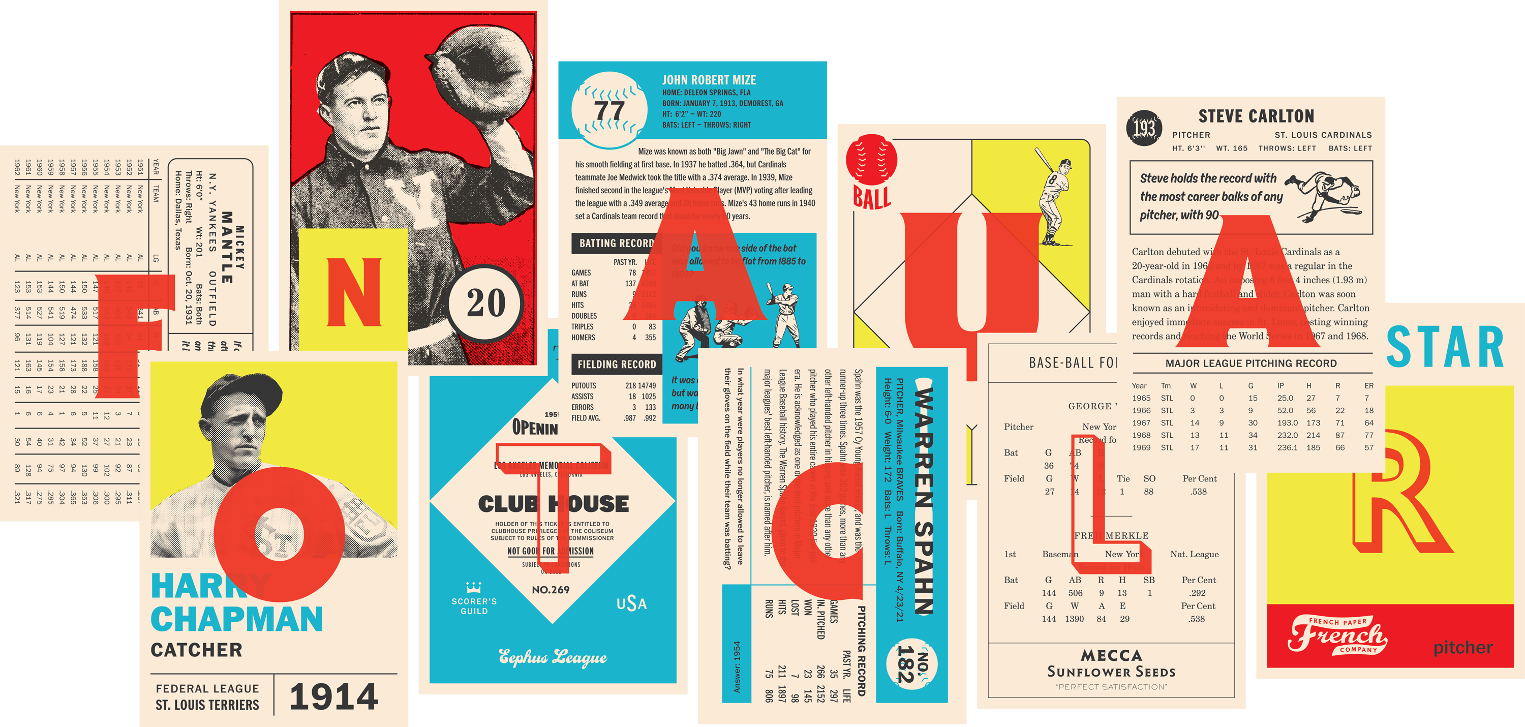
I got the idea for the poster from a Heads of State poster I have that’s composed of Great Gatsby themed business cards. I struggle with coming up with poster designs, and using a series of cards to make up the design allowed me to reference baseball cards and also help me get over my own creative humps. I loved the idea of using the cards for the backbone of the design then overlaying them with large type to spell out the message of the poster. It was a fun study in micro and macro design.