Microsoft Power BI
( A )
Microsoft Power BI allows users to take mounds of data and transform them into beautiful interactive visuals and reports. As the Creative Lead for Microsoft Power BI, I was responsible for recruiting, marketing, branding, UX and visual design for all parts of the product. If that sounds like a broad scope of responsibilities—it was! Our design team more than doubled in size in my time at the company and I was proud of our output and the significantly improved collaboration between design and the other disciplines while I was there.
( B )
Not every job is the kind of place where users will write poems about the features that you build, but Power BI was exactly that type of job. Building tools that help people do their jobs is one of the most satisfying types of work I’ve had the pleasure to take on.
( C )
Role: Design Lead
2016-2017
Power BI: An Overview
Power BI is a data analytics platform that spans a Desktop application, a web service, and a mobile app. When I joined in January 2016, the web service was in its infancy, and the Desktop tool was in the process of being overhauled with more power features. My goals were to lead recruiting to increase the size of the design org from 8 to 30, to oversee the design development of the entire suite of products, and to rebrand the product to distance it from its Excel roots.
What follows are snippets of a few of the efforts I led and contributed to in my time at the company. I’ve found it strangely difficult to summarize my time at Power BI due to the wide-range of projects and initiatives I was involved in. Let this serve as a summary of the highlights, and if you’re curious for more details, I’m happy to expound in person.
Power BI Style Guide
I worked with our prototyping team and the Power BI developers to craft a style guide for Power BI, which contains the library of common components used in the product and expands out to design principles for the design team to follow, as well as UX guidance on usage and implementation for every piece used in the product, from form elements to typography and entire screen configurations.
The style guide was vital for both our developers and our designers, giving us a shared kit of parts to work from and ensures consistency within our designs. This framework was adopted by additional suites in the Power line and it used across multiple teams at the company today.
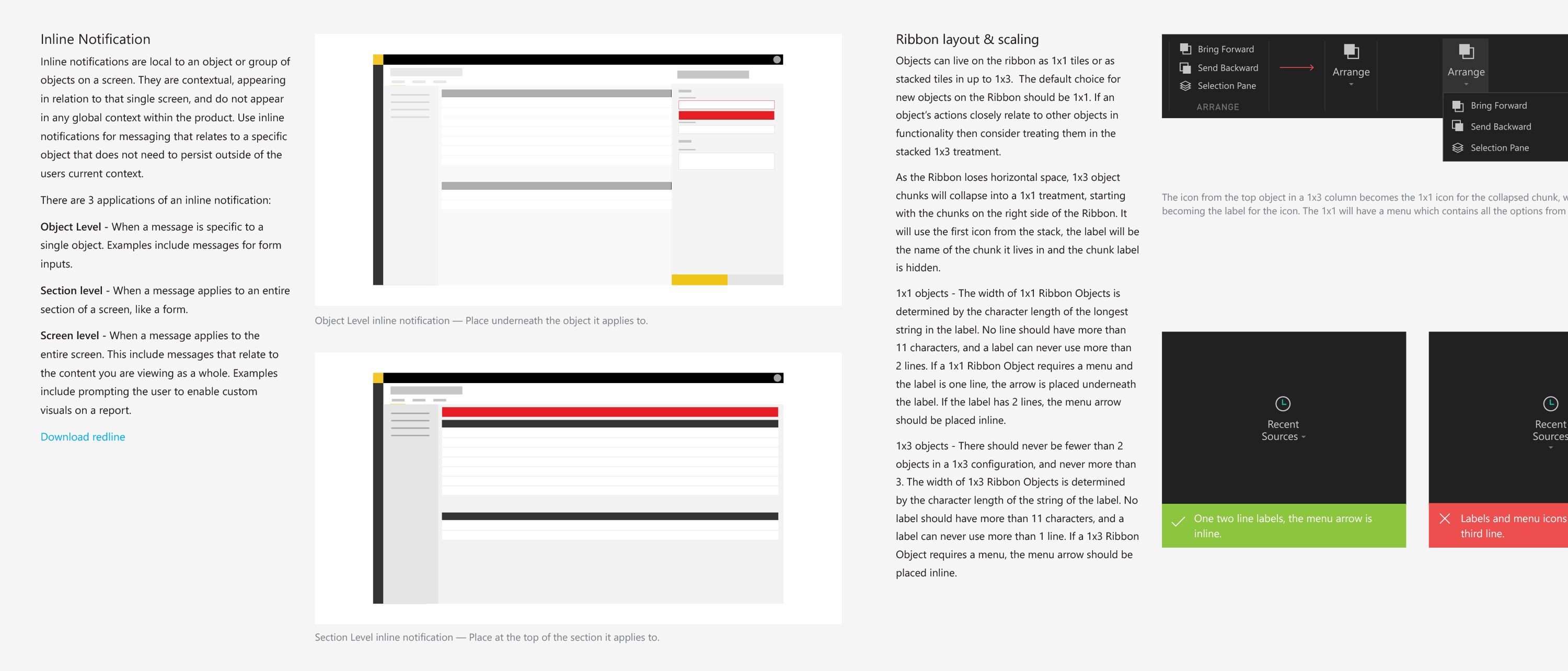
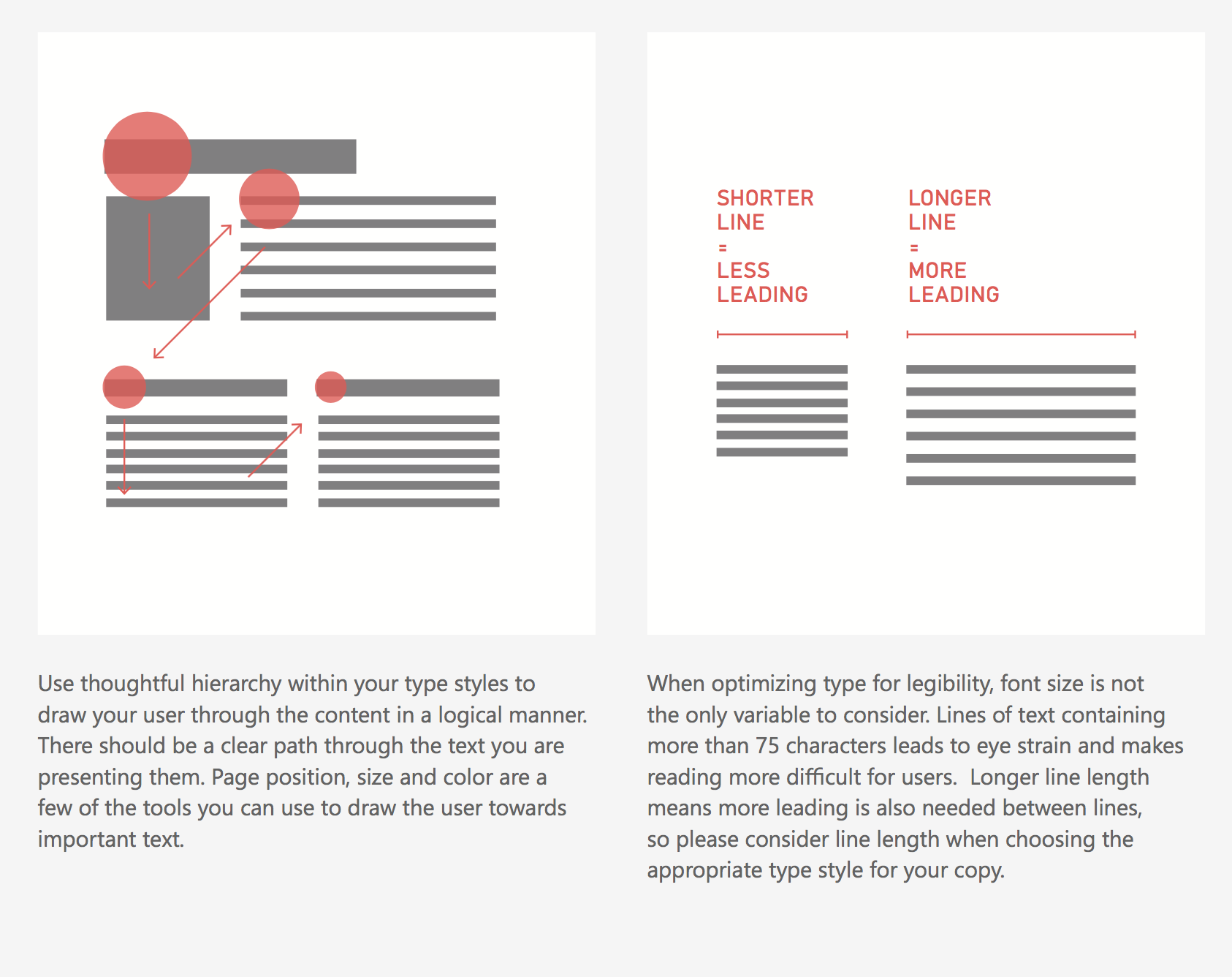
The Style Guide also served as a home for product design principles and general advice about typography, accessibility, and UX best practices. The Power BI design team was composed of designers who ranged from folks who had worked at Microsoft for decades, to young designers working on their first product team. The Style Guide was a way to help reach consensus on common paradigms and industry standards.
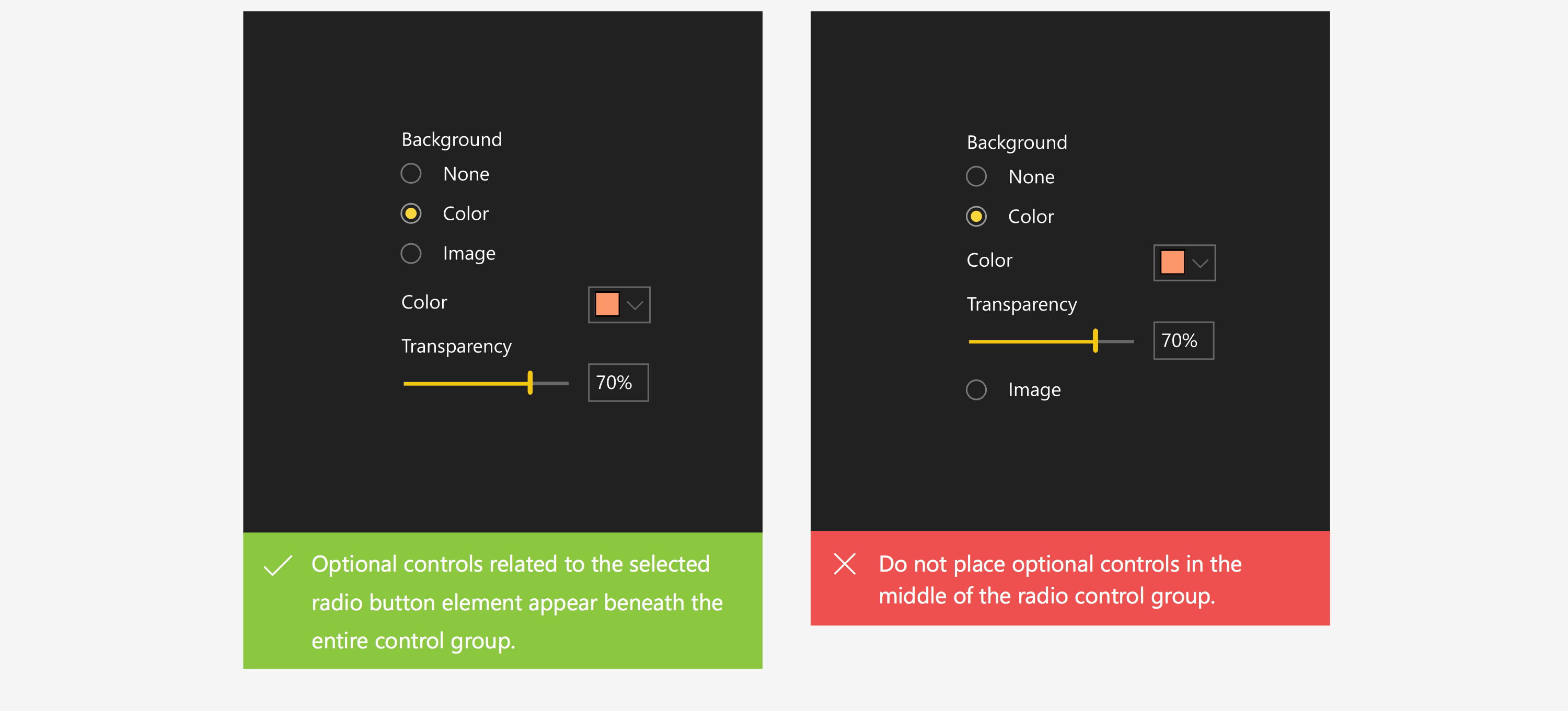
In addition to documenting components and their usage, I crafted do/do not scenarios for many elements in the style guide, to help illustrate best practice and prevent easily avoided pratfalls. The Style Guide was both documentation and education.
Macro vs. micro
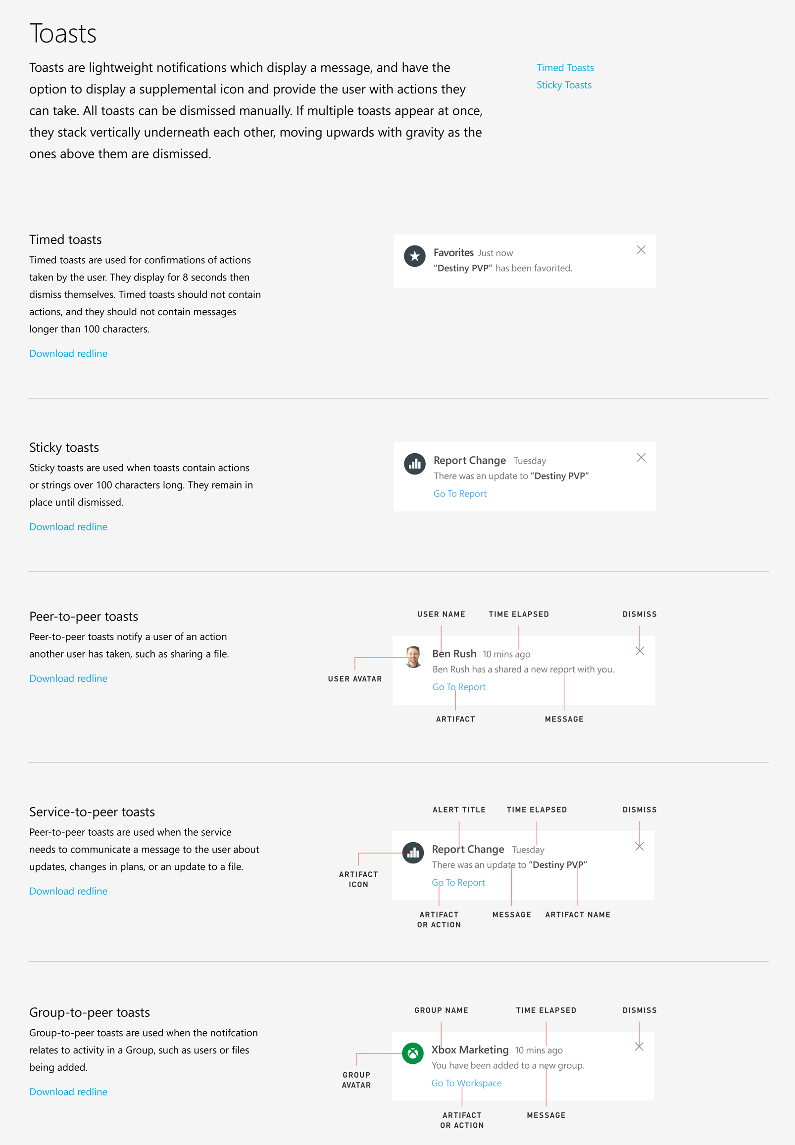
It was important to me that the Style Guide not be simply be comprised of single UI elements, but also more molecular pieces that need to be used across the experiences in the product. We often had inconsistent experiences in terms of the surfaces we used for flows in-product (when to use a toast vs. a dialog, for example), and the Style Guide served as a way to set standards on what to do moving forward.
I was surprised to learn at the time that such guidance wasn’t in place at Microsoft, so I took advice from other product groups to inform the suggestions made for Power BI. We significantly reduced the variables attached to Toasts (we used to have 4 different timer options for how long a Toast would remain visible before self-dismissing). This reduced complexity in product development and set a consistent pattern of expected behaviors for users.
Advanced filtering
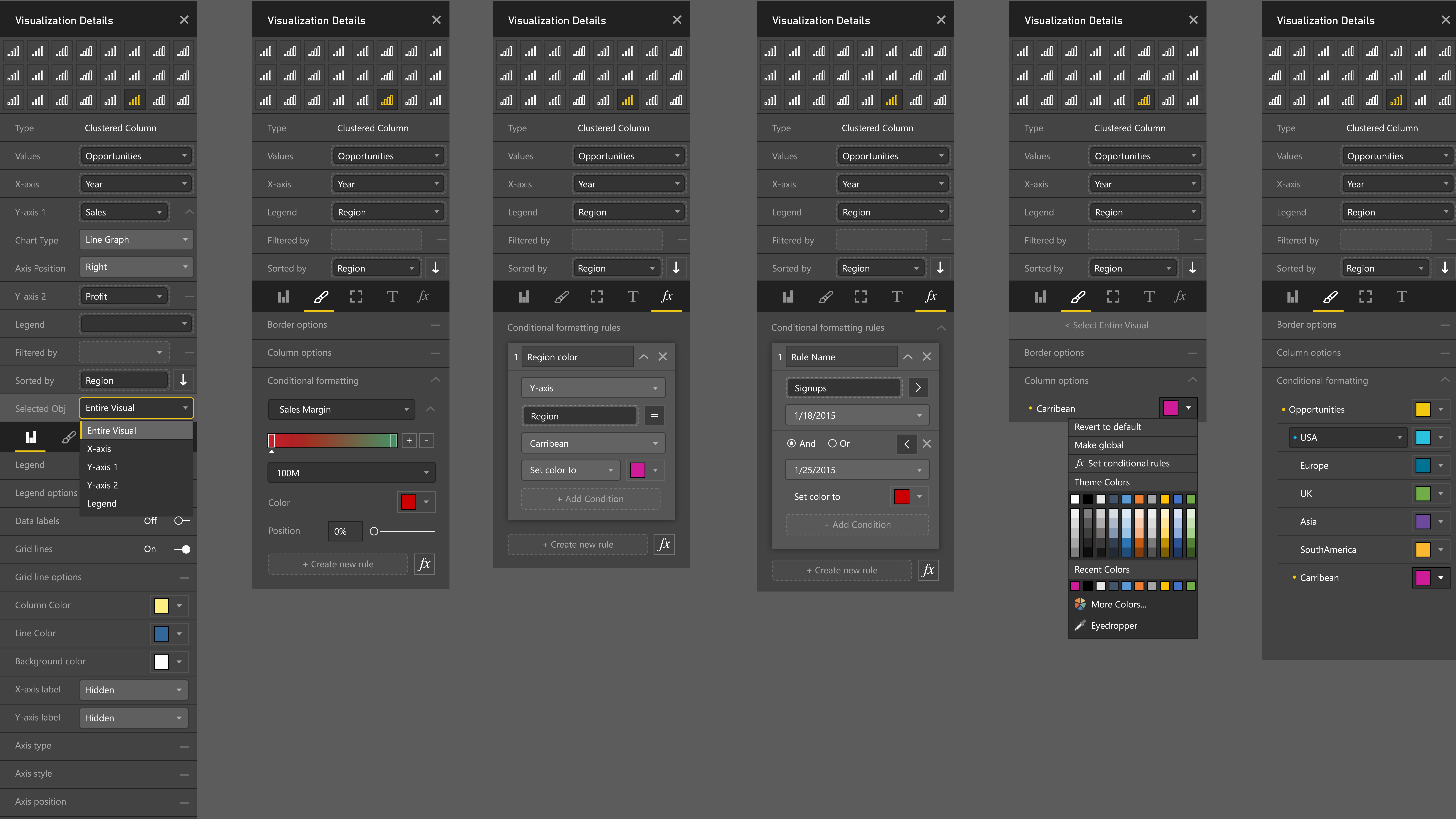
Capabilities like formatting specific elements on a visual and advanced filtering were new territory for the product when I joined, and there was tight collaboration between myself and our PM and Devs to make sure these advanced technical features landed gracefully as we approached our GA date. This was a wonderful way to dig into the powerful capabilities of Power BI and learn on the job.
These advanced filtering options allowed for greater contextual control over formatting—if a value reached a certain threshold it could change color, for example, or the infamous “Coke is Red” use case, where a field such as a brand should always be represented in a specific color.
UI overhaul
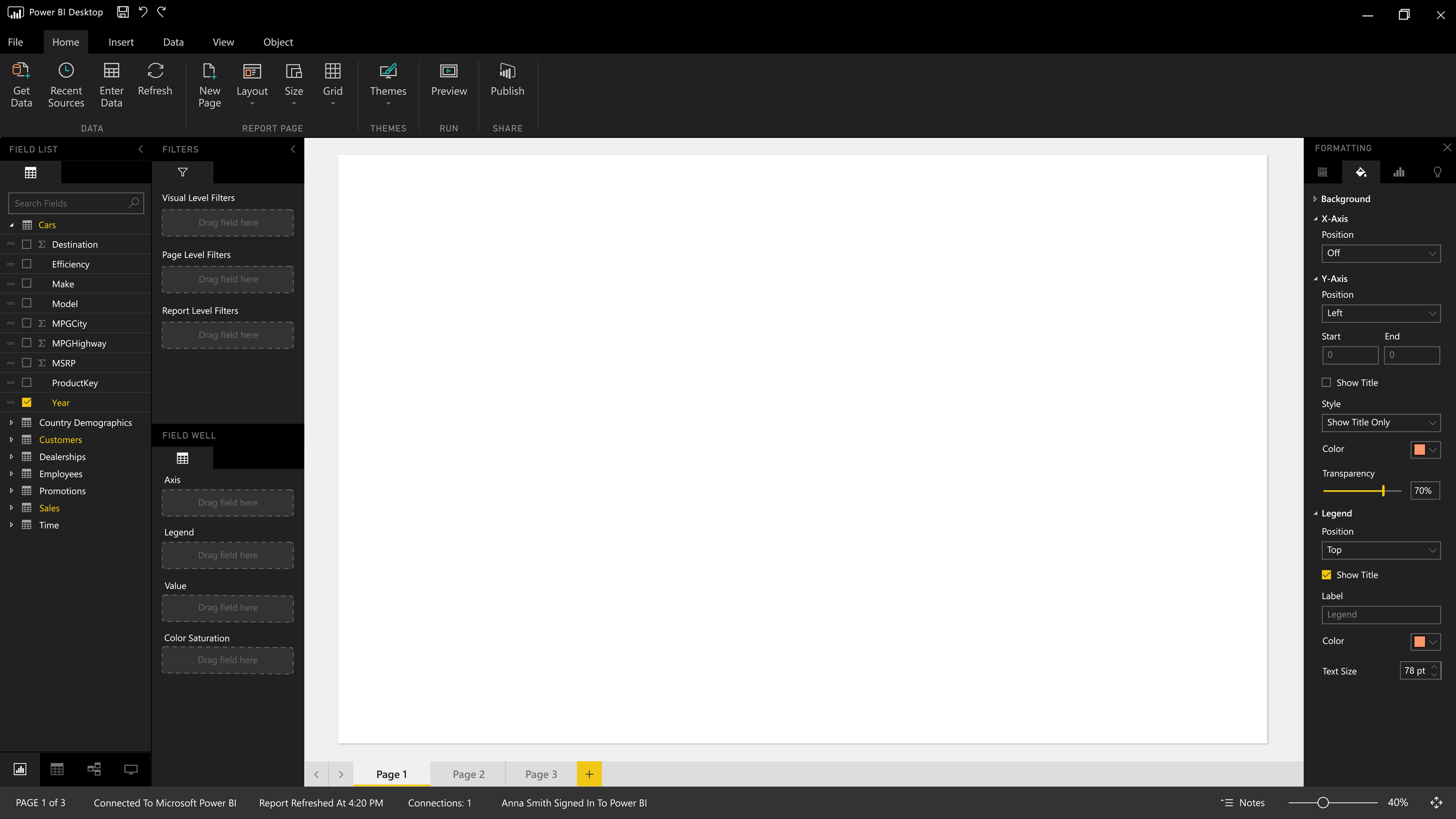
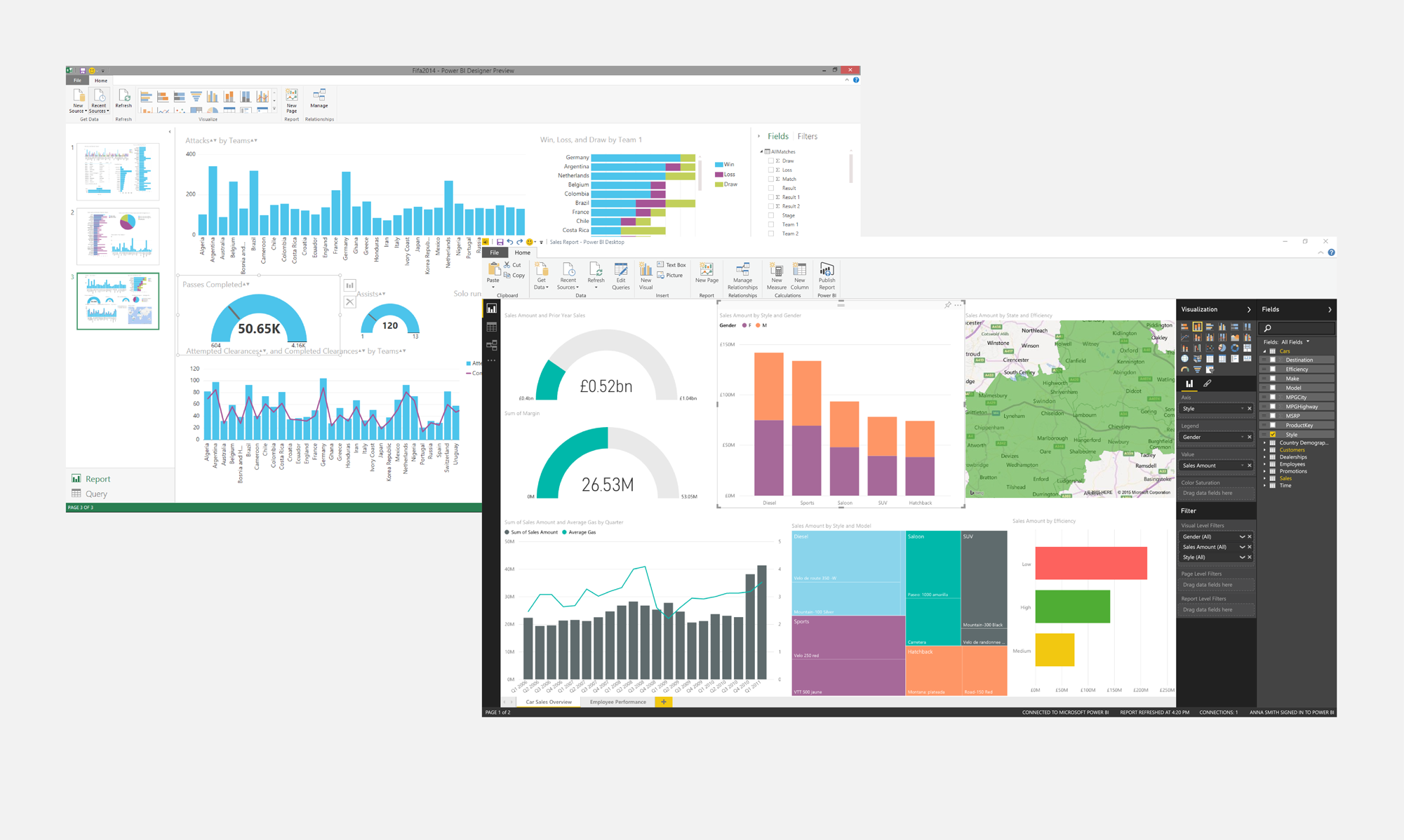
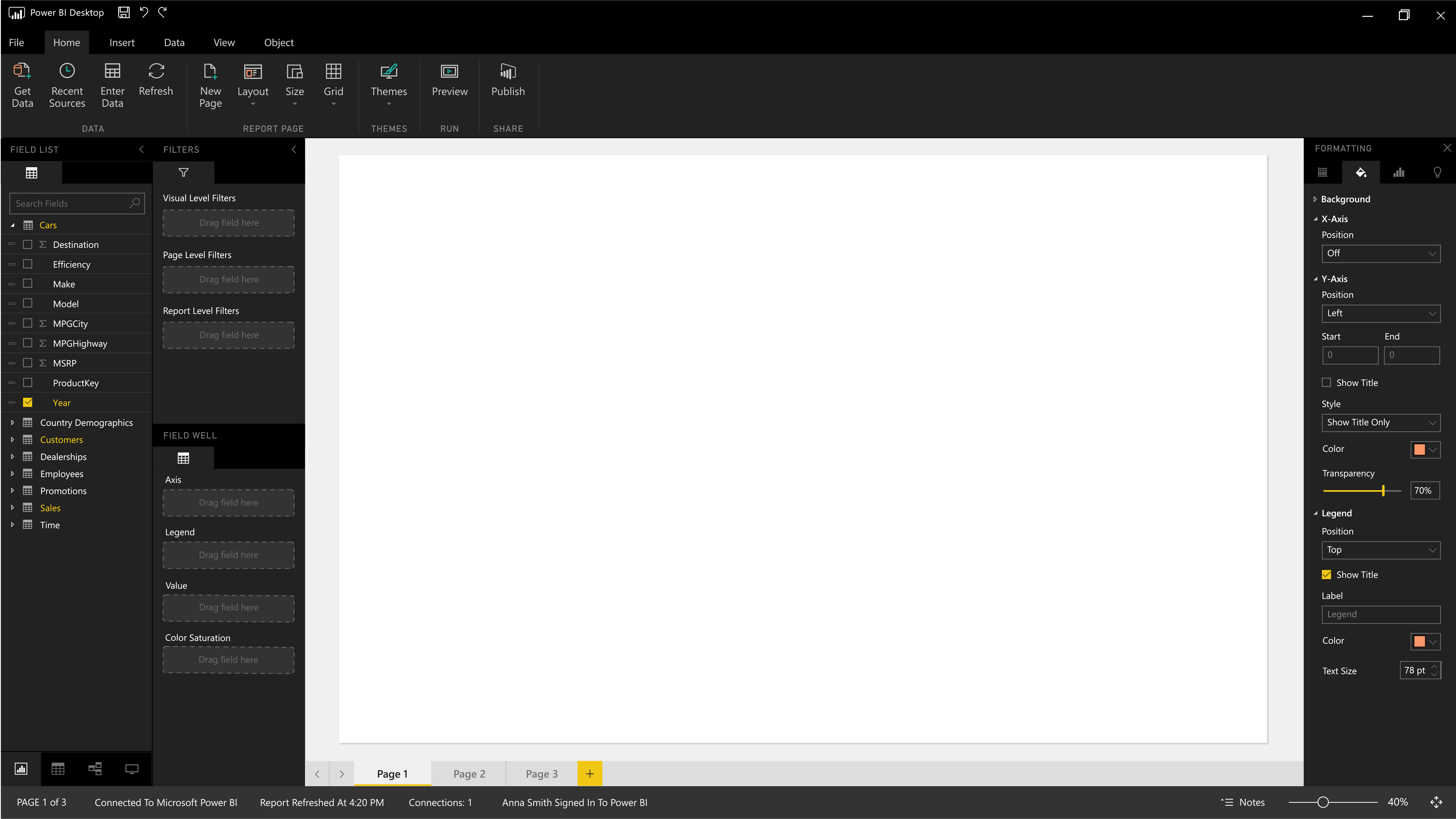
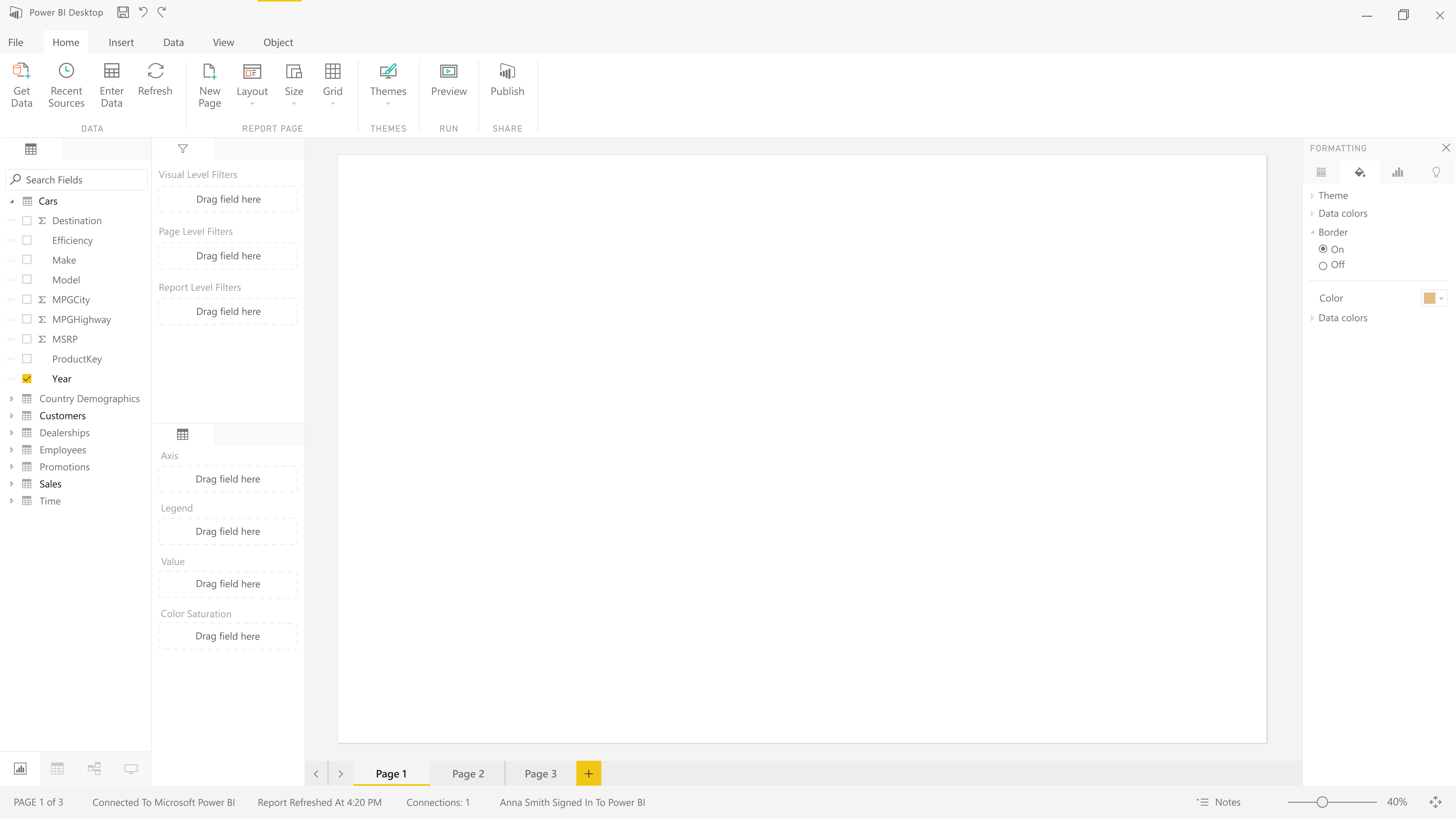
We were able to add a significant number of features to the Desktop application by release, but there were opportunities to push the design further. The engineers saw an opportunity to move away from an older framework for the Ribbon (which only allow for light UI and forced us to house certain controls in the panes, rather than the Ribbon) to something open-source and web-friendly, which would allow for vector icons and was an excellent opportunity to clean up both the UI visual language as address user feedback on the UX of the product.
By devoting the time and effort to improve the UX and design of our chrome we will be presenting our users with a unified experience that not only feels distinctly Windows, but utilizes familiar Office paradigms to utilize our users familiarity with the Office suite. The simplification in the number of colors used in the chrome makes key pieces of the UI more distinctive, and also opened the door for theming.
Chrome real estate
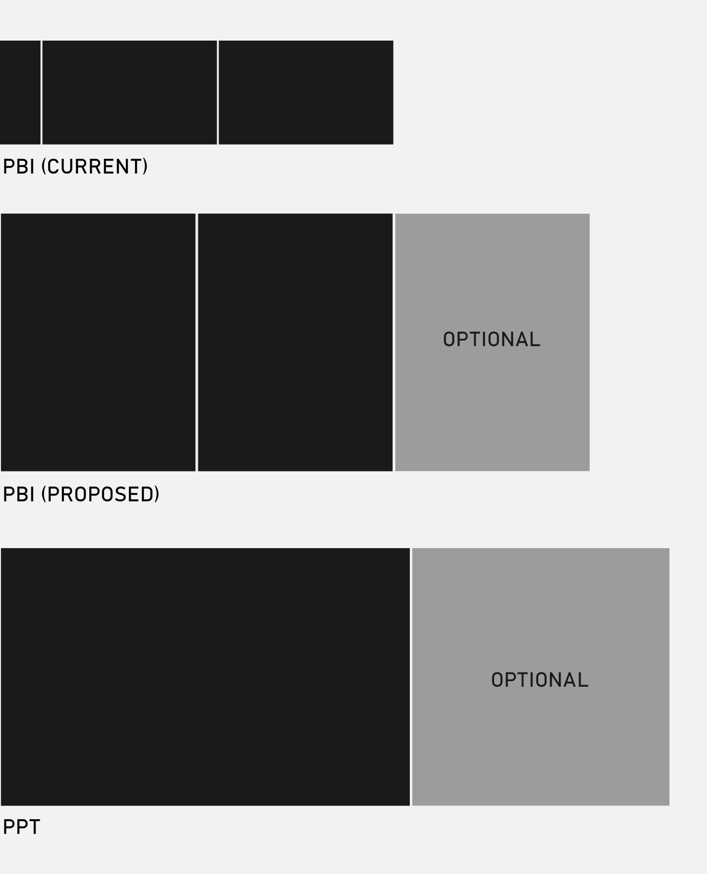
Because screen real estate is at a premium in advanced software, it was important that we defend our choice to add a third, contextual pane to the UI. By moving the view switcher to the bottom on the data pane, we were able to make our two data panes slightly wider, giving the content more room to breathe.
Even with all 3 panes visible, the Chrome takes up fewer horizontal pixels that Powerpoint when the slide and formatting panes are both open at their default width.
Competitive analysis like this contextualized our decisions and reminded everyone that just because a UI change feels drastic internally, when compared to the broader software landscape it might be completely within the norm.
Pane UX improvements
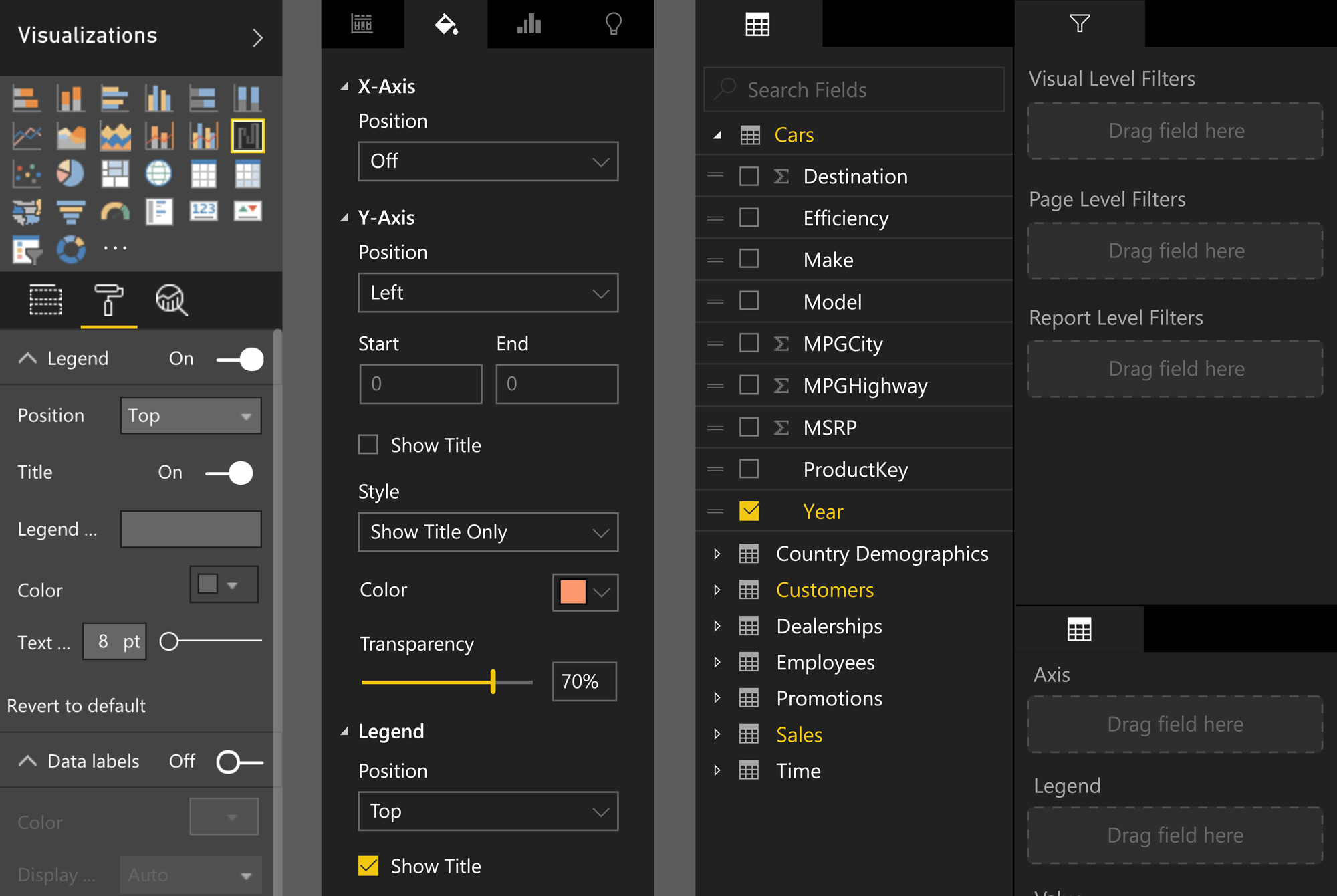
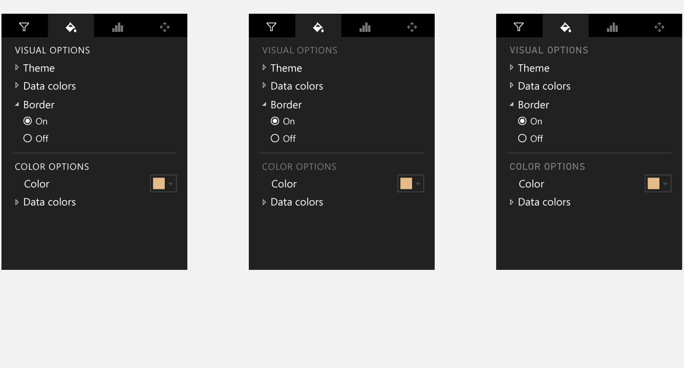
Previously we had to house the ability to add visuals to the report canvas inside of the panes, because we could not render a ribbon inside of the web product. This forced us to use pivots underneath, which are contextual and appear and disappear depending on whether or not a visual is selected. This combination of factors confused users and obscured vital features like visual formatting. The pivots also combined formatting and the data wells, leading to a cramped and confusing experience. The panes simply mixed too many types of controls in one place.
The new configuration splits data and formatting controls, and the stacked labels ensure we don’t have to truncate labels, as you see in the old design.
Type as IA
Microsoft software is a wash of Segoe: labels, interactive strings, buttons are all set in the same typeface, and often in a single weight. This consistency is sometimes detrimental in UI situations, where the functionality of a string needs to be immediately obvious and color or underlining isn’t always an option. I built a set of rules around using a second typeface in our interfaces, DIN, which was only used for non-interactive labeling. This added a clear layer of informational hierarchy within our UI that both simplified design decisions and served as a clear signal to users as to the utility of the text strings in the product.
- I speak about this situation in much great depth in The Value of Multi-Typeface Design
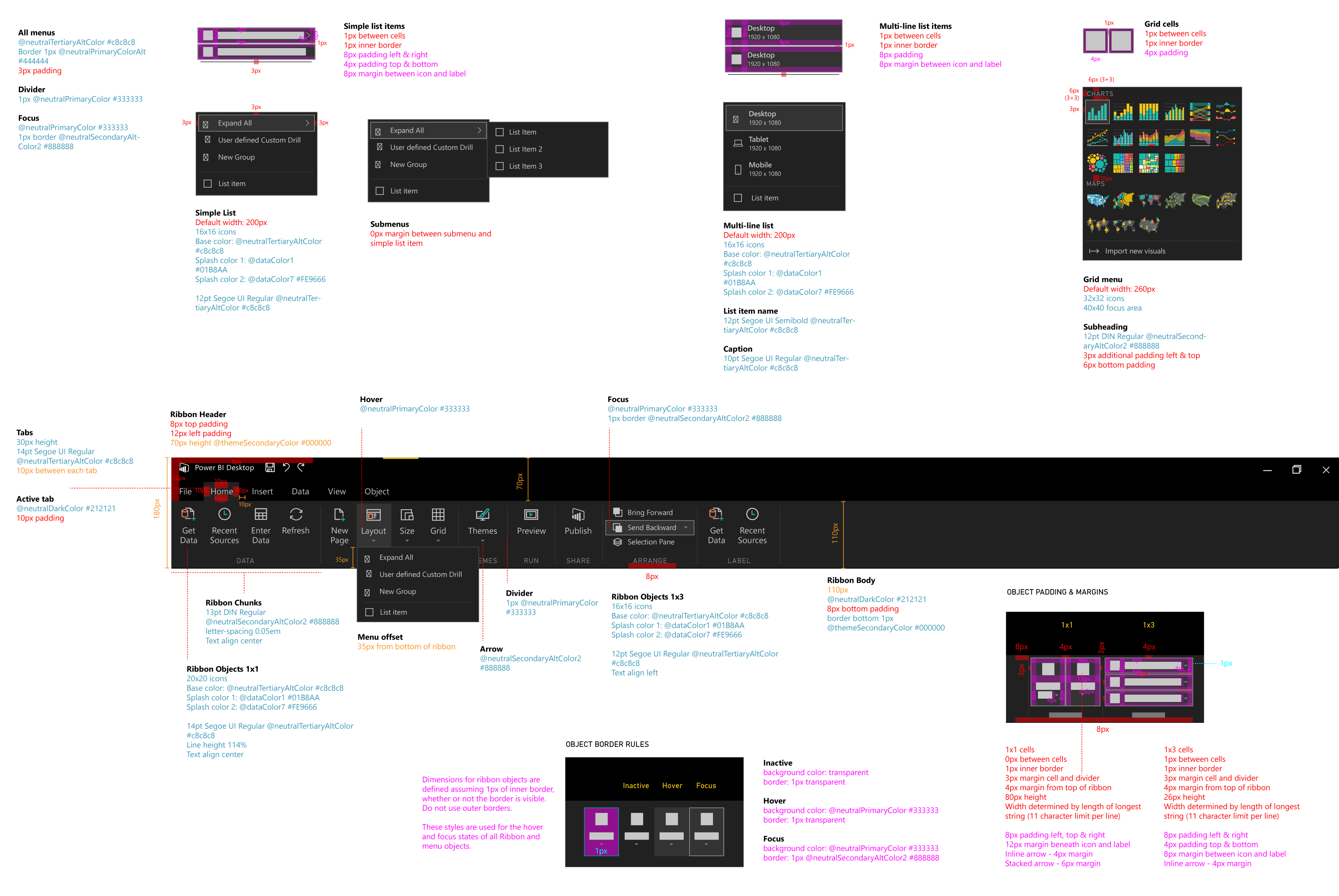
As we moved to a web-friendly ribbon, I saw an opportunity to be one of the first products to adopt the new Windows 10 style icons in a Ribbon framework. I consulted with other groups at the company who had conducted research on icon sizes and color systems, and crafted a solution for Power BI, which was by far the most ambitious at the company.
After the research was completed, I crafted intricate and comprehensive redlines for every component of the ribbon system.
UX overhaul
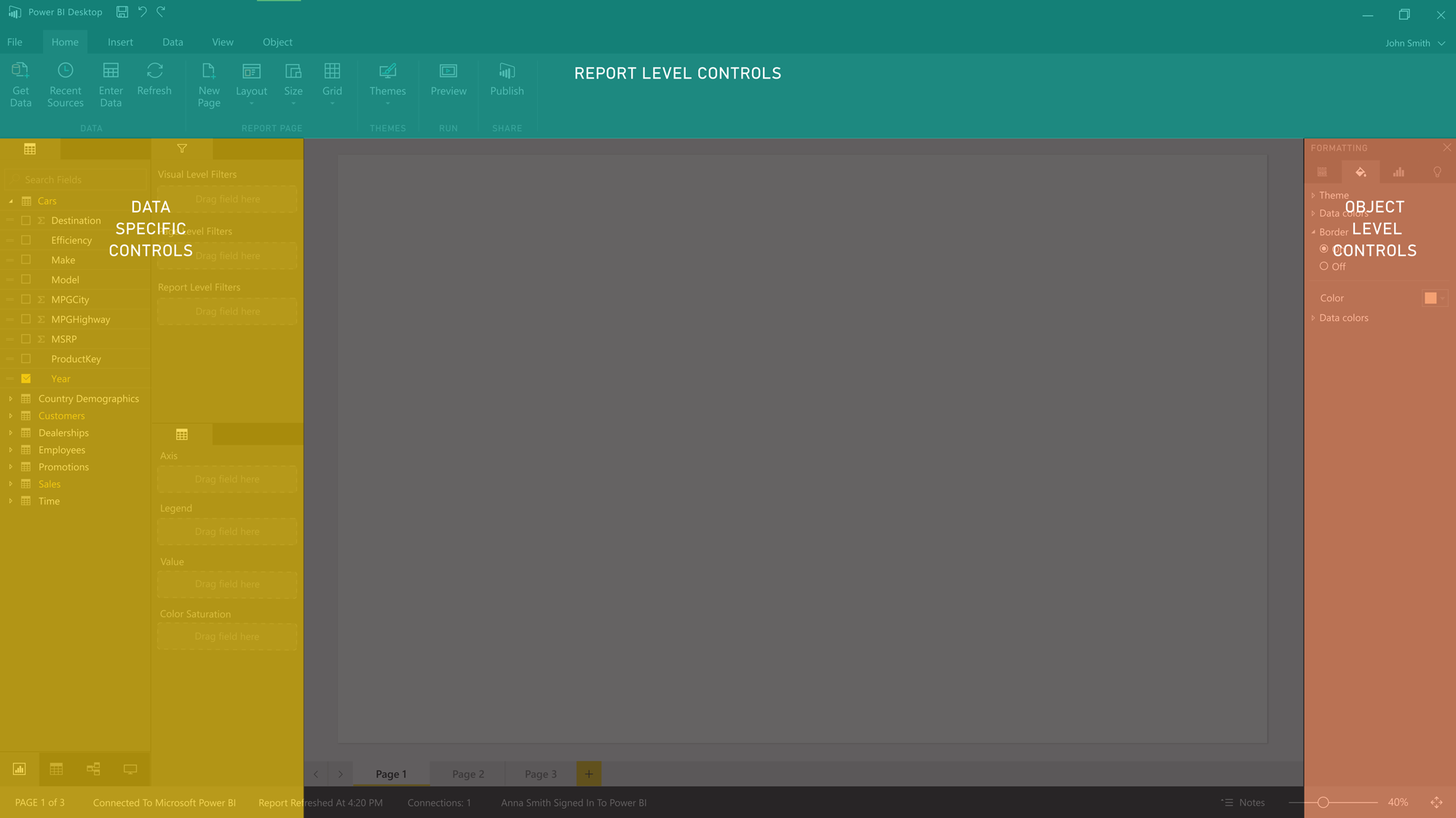
More important than the visual improvements we undertook was the overall app reconfiguration I led alongside product. I tried dozens of configurations for our key UI elements, and the final arrangement establishes a logical, consistent eye-flow for users and groups controls by their functionality. Reading left to right, the user sees their data, and anything that relies on drag and drop functionality with the field list in close by. Controls that affect the entire report, from adjusting the canvas or adding visuals is housed in the Ribbon. Object specific controls are kept in an optional pane on the right side.
Field list iterations
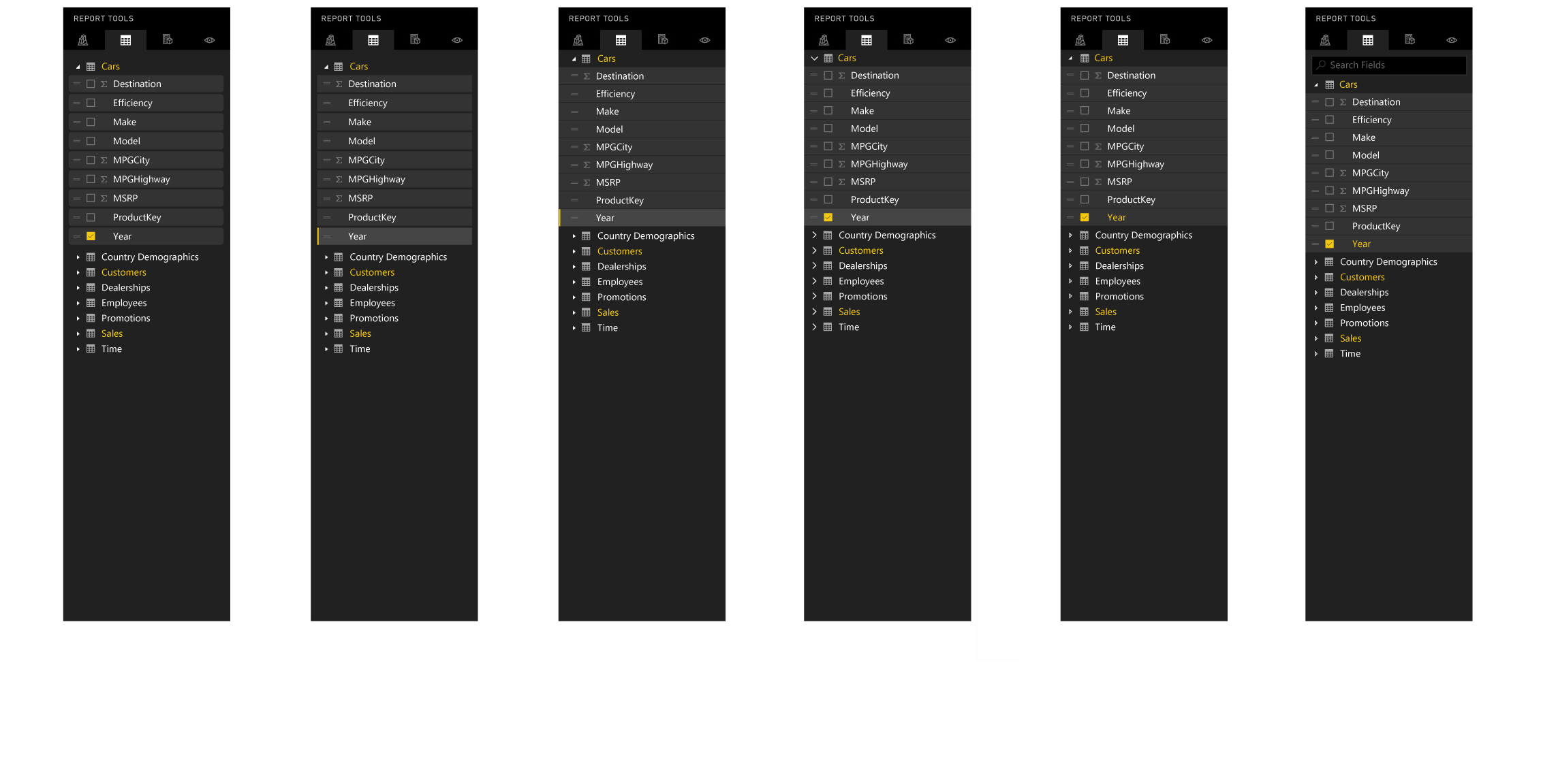
The field list is a complex mixture of functionalities. Users can activate measures from the list by checkbox interactions, or they can drag and drop the list items into the field wells. Making the draggable nature of the list items clear while keeping the checkboxes and the list clean and legible was a challenge and many options were considered and tested.
Smarter wireframing
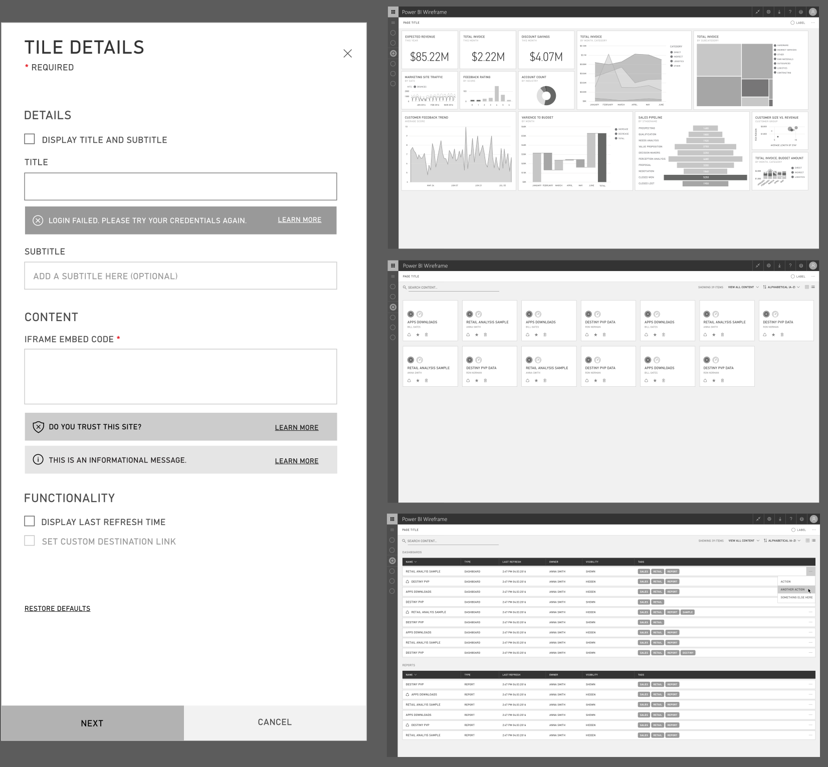
To help our designers resist the urge to design in hi-fidelity too soon, I created a wireframe kit in both Illustrator and Sketch. This gave designers a kit of parts that was based on our Style Guide components, but is styled distinctively to remove any confusion when presenting to stakeholders. The results are both easy to follow and obviously unfinished, preventing breaks in process where stakeholders might attempt to move forward with a design before proper sign-off happened.
The kit also helped the designers quickly construct flows that were accurate in scale and components to the eventual production result without the time drain that occurs when designing in high fidelity.
Process
I worked alongside our director to establish our design process as a team and crafted visuals to help communicate messaging for the product and engineering teams to explain what we as a design org needed to produce the best outcomes for our users.

Org Structure
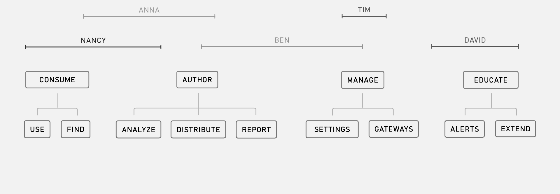
I was involved in moving the entire Power BI organization away from product-based staffing towards an activity-based model. This model mapped against our personas and put the focus on features solely on the tasks we wanted to enable users to perform, and less about stuffing any one product itself with new features.
Making this adjustment prevented issues where features developed on one wing of the product would then need to be used on other surfaces. Other teams were notified too late that a new feature would impact them and had to scramble to accommodate it, delaying other work.
The new model works based on user activity, across any of the wings of the product, improving cross-team collaboration and ensuring more cohesive experiences for users.
