
Modernizing Reblogs at Tumblr
A
The following is an abbreviated version of a case study recapping the work I led at Tumblr to modernize the Reblogging feature to make it more functional for all users, and especially the Gen Z demographic. Gen Z cited UI/UX as the #1 thing they’d change about the platform, even amongst those who cited it as their favorite social platform.
This was a multi-month long project that was n opportunity for the UX practice at Tumblr to drive product decisions based on user sentiment, feedback, and testing.
B
At Automattic I took on Head of Design responsibilities, overseeing the company’s growth framework and mentorship programs for designers. My first role at the company was leading the internal design systems team. I then led Product Design for Tumblr after their acquisition, integrating their rebrand into the app experiences and reviving their design practice after years of regression.
C
Head of Product Design, Tumblr

Why Reblogs?
Reblogs, replies and community were an area we had a lot of room for improvement on, and user sentiment proved it was the vital feature for the platform. Touching a feature as sacred as reblogging is not something I did lightly, and the majority of the lift for this project was assembling the case for the need and benefit of the update, and ensuring we would not lose the spirit of the feature in the process.
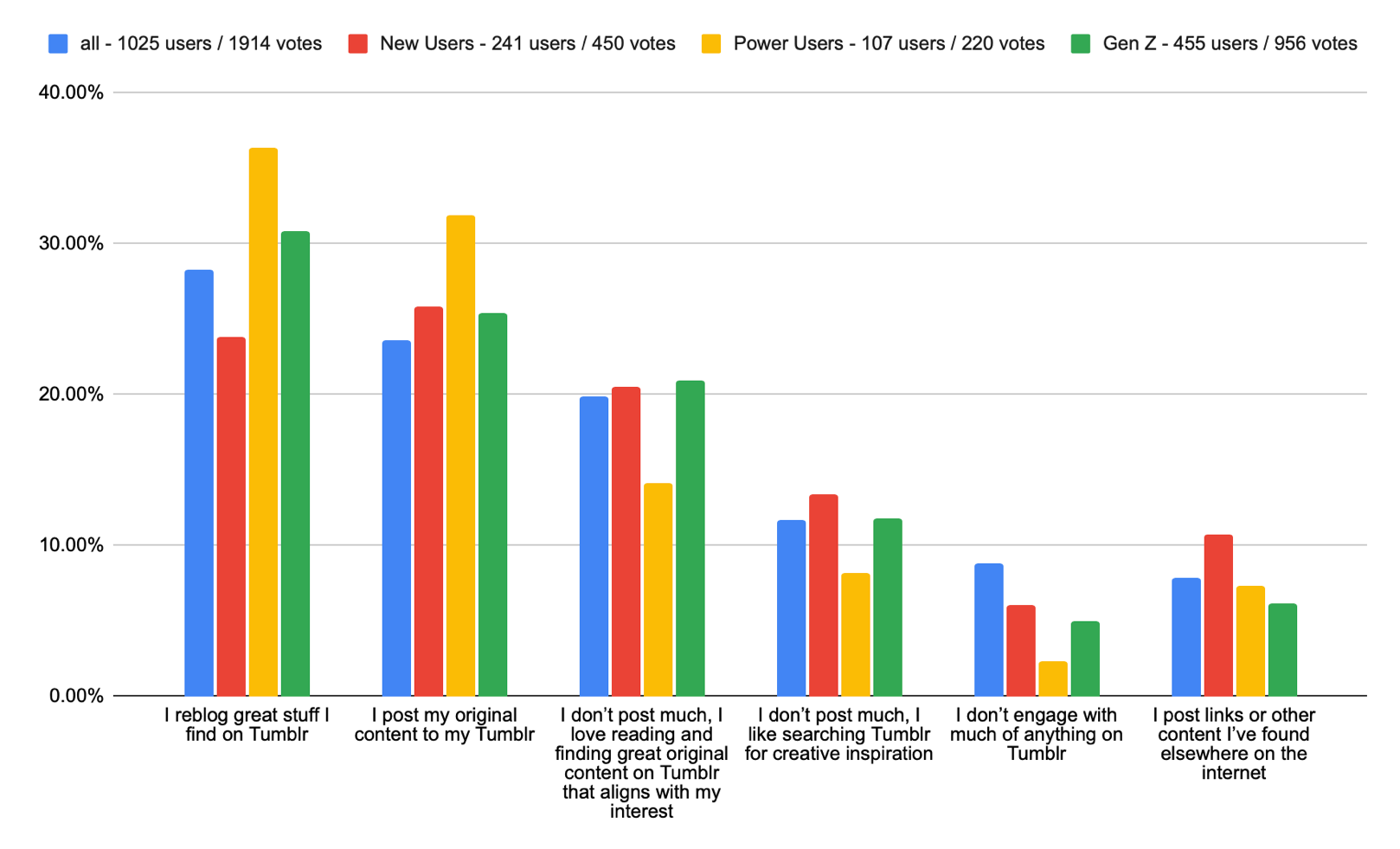
How do users use Reblogs?
When we asked users how they post content on the platform, reblogging was the top response.
Similarly, when we asked what features they used most often, reblog was second only to following, and replies wasn’t far behind. The community aspects of the platform are clearly important to users across most of our user groups, yet their UX and presentation has barely been touched in years.
Reblogs are vital to the experience on Tumblr.
- They extend the reach of individual posts
- They allow users to curate and create their own spaces on the platform
- They allow for new creative expressions
- They facilitate discussion
Reblog Chain Example
The following is an example of the power Reblogs have to re-contextualize content on Tumblr, and it also illustrates how lucky a user has to be to actually experience these serendipitous moments of community.
… and the conversation spun out into an existential conversation around religion and the vastness of time, and there’s some poetry tossed in for good measure. This represents the power Tumblr offers as a platform, and reblogging brings as a feature.
There was so much wonderful content on Tumblr that we were actively obscuring from users by not making it easy for users to find these different branches of conversation, and to hop between them.

UX Problem: Reblogs were buried in the jumbled Notes Panel
The notes view holds all the activity, from likes, replies and reblogs a post has, and popular posts can have hundreds of thousands of interactions logged in their notes view. With no way to filter across all the activity on a post, the more interesting interactions, like reblogging with comments added, get buried and become an effort to discover.
This pain was confirmed by user feedback
“I’d be more active if it was easier to communicate. So much of the conversation around my posts happens in comments added to reblogs + tags (which users write whole sentences in), but it’s still a little clumsy to view all that information across platforms (web, iOS) compared to platforms like Twitter.”
- Direct user feedback fueled this discussion and prompted us to explore how we could make it easier for new and existing users to access our most valuable asset—the Tumblr community
Project goals
Our goals were:
- To make it easier to see different types of activity on any given post
- To improve the clarity of Reblog labeling UI
- To make the Notes view a more useful surface
- To differentiate between Replies and Reblogs
- To allow filtering by different types of Reblogs
We hypothesized that by solving these UX problems, we would see an increase in Notes View opens, and in increase in the total number of Reblogs, and Replies per user.
Surface improvement 1: Post Footer
We wanted to give users a clearer signal that “high quality” interactions were happening on this post, beyond low effort signal such as “Likes.”
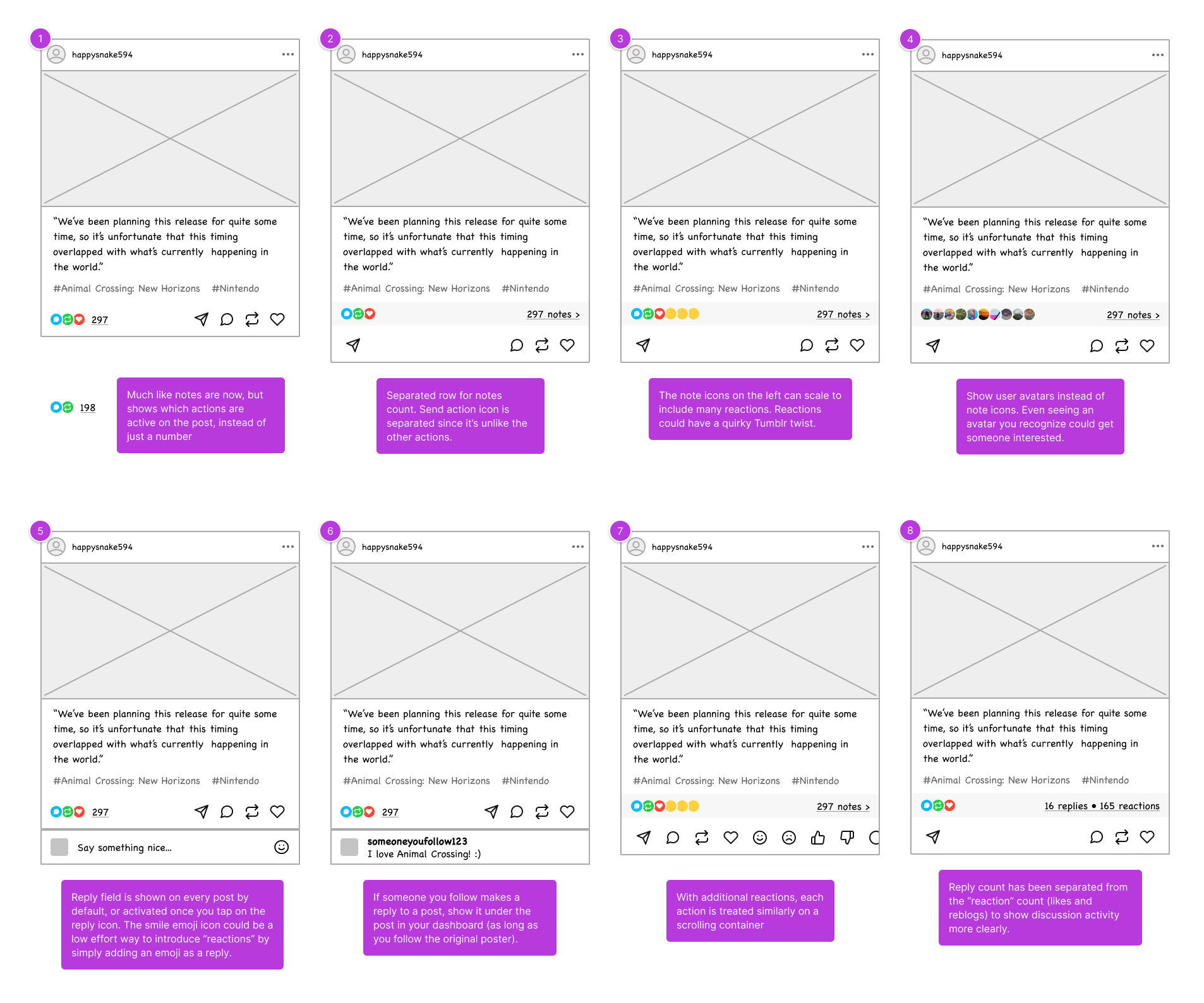
Surface improvement 2: Notes View
The Notes view itself was the main surface was wanted to revamp. Were there ways to make it easier to parse through the activity on a post? The first step was to split out the different post actions into tabs.
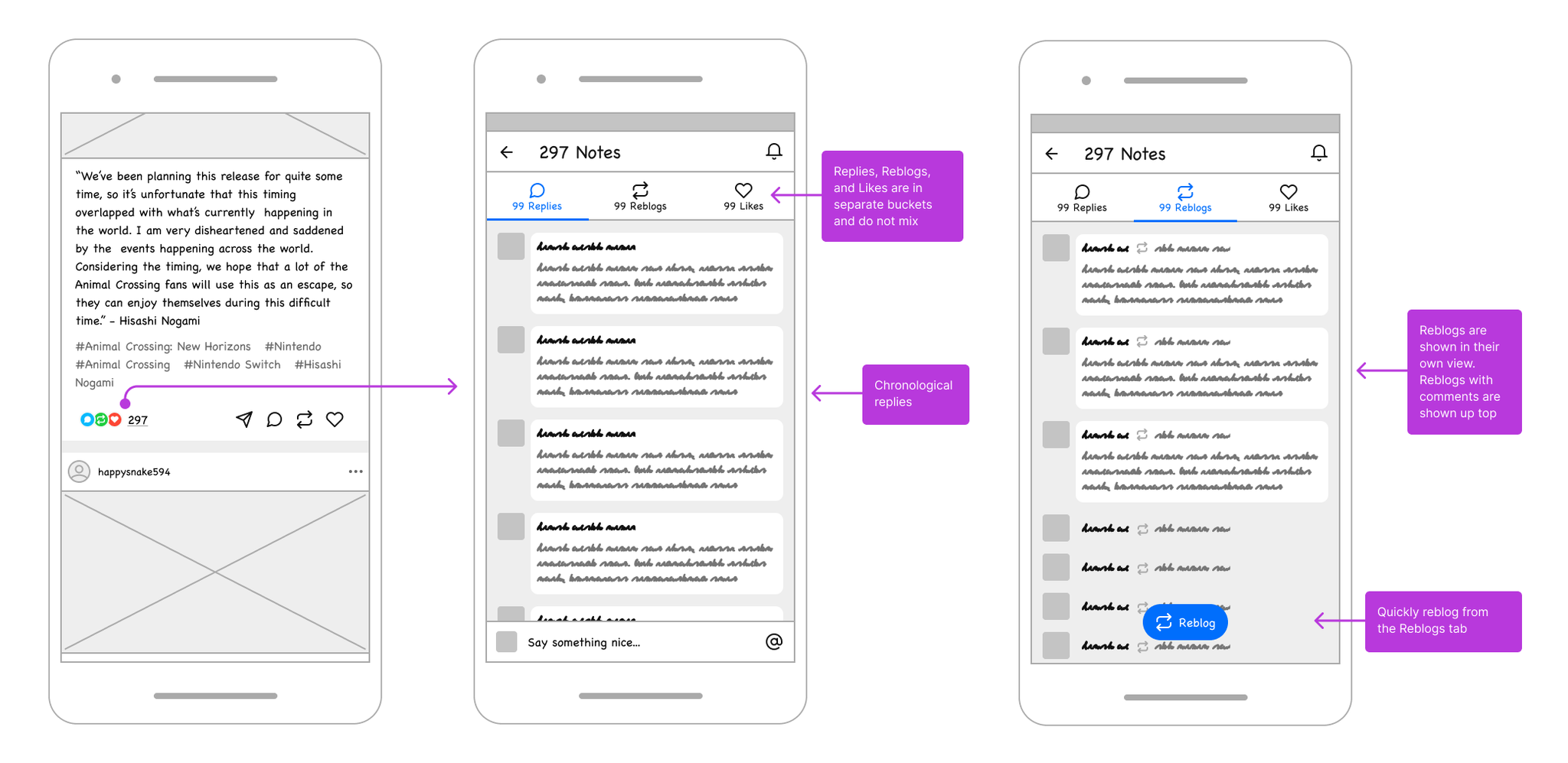
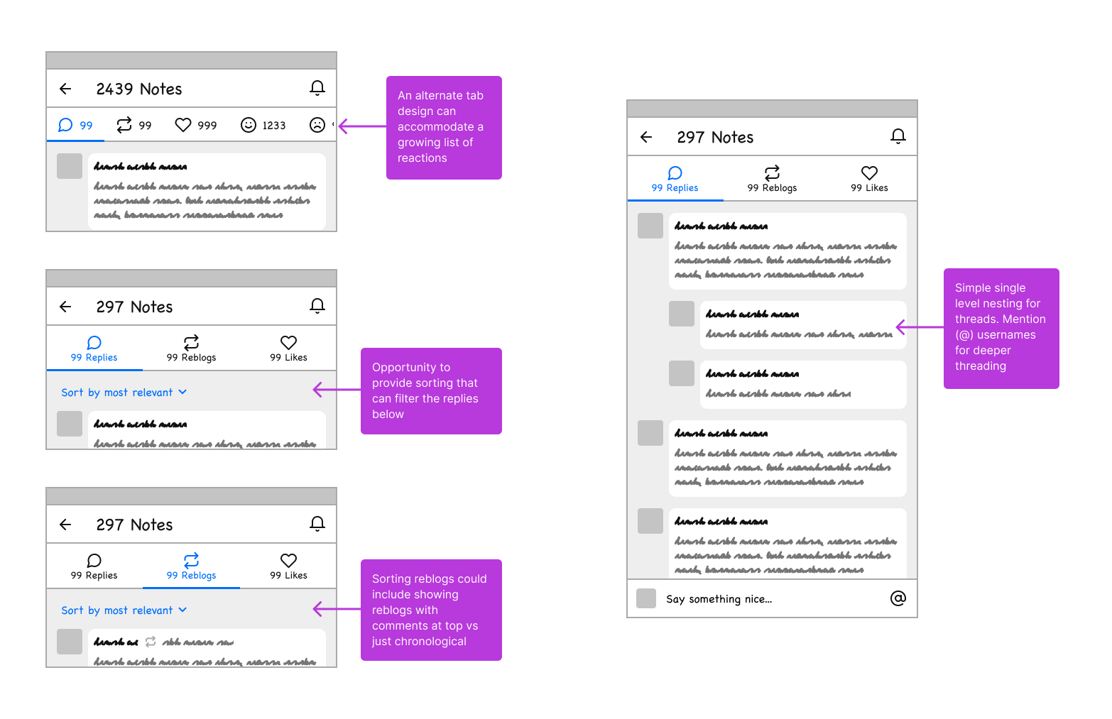
Tabbing the Notes view allowed us to clearly differentiate between types of interactions on a post and make it easier to discover great replies and reblogs. We also tested options like bubbling up reblogs with comments to the top of the Notes View.
We added filtering options in each tab to allow users to seek out specific types of reblogs and added visual nesting to the list view.
Research & testing
After our initial round of sketches we did a series of interviews with users where we had them test prototypes and asked them questions on the design options.
Some of the notable sentiments that emerged were:
- Users loved that the different type of post actions (Likes, Replies Reblogs) were separated in the new designs. There was overwhelming sentiment that this matched their mental model of using the platform, and users with ADHD and other accessibility related needs said it eased their cognitive load to using the platform.
- Users described the design as “clean” and were reminding of the way text messages work.
- The filters under each tab were not used by every tester, but those who did choose to interact with it were very enthusiastic about the extra control it offered them to sort and filter the view.
Shipped designs
After 6 months of design, testing, and development, the Post Footer and Notes View updates were shipped to Tumblr users in 2022. The final designs were informed not only by our initial explorations, but from feedback and ideas from users as we tested.
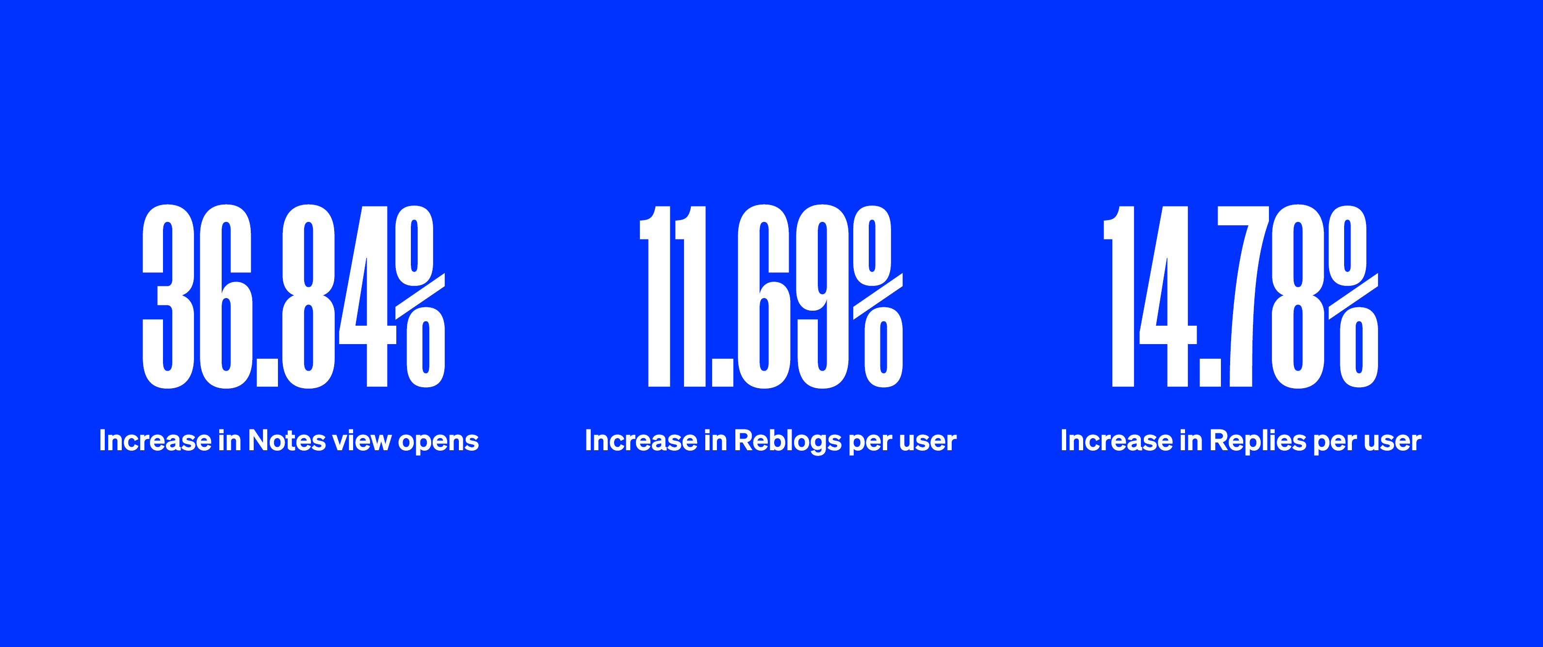
The final impact: massive growth in engagement
We saw dramatic increases in our key metrics after launching the initial Notes View redesign. We had double digit increases to our target metrics, and loads of positive qualitative feedback from users as well, some of which you’ll find below.
Working on Tumblr’s product experience was an honor for me, and I’m very proud to have driven a refinement on a feature and interaction model that’s so important to the sustainability of the platform.
“I love this! Looks great and is so much easier for me to read and navigate, especially with the new filtration system.”
“Wow. This actually rules! It’s pretty much all I could ask for”
“This new update is awesome on mobile. Finding what people tag is easier then ever”
“tumblr’s notification feature now showing me all the tags in reblogs is all i ever wanted in life. no longer do i have to click on each reblog looking for funny comments in the reblogs of my shitposts. now i scroll freely and giggle”