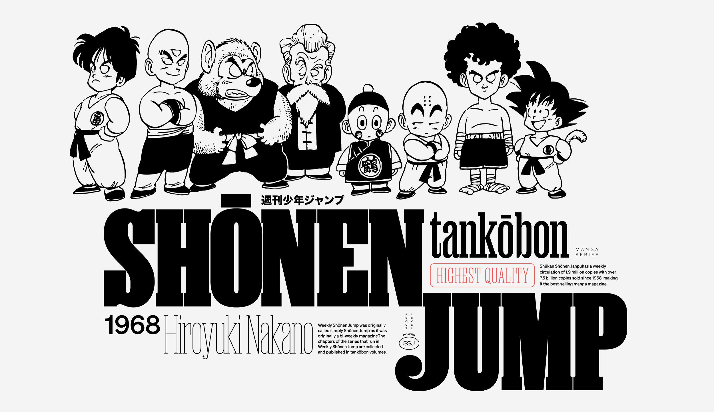
If it weren’t for Dragonball, I never would have become a designer. I taught myself Photoshop and web design through teenaged hijinks involving my favorite anime, and I still come back to it from time to time. I wanted to take this handsome condensed slab for a spin and since these monolithic type styles look so great in black and white, manga imagery felt appropriate, and specifically Toriyama’s cherub-esque figures.
I started this sketch by deciding to deal with the descender in “Jump” by pivoting the word off of the lower serif of “Shonen.” I started figuring out what “hero words” would show off the characters in the typeface I found most compelling and placed them alongside the large type, and the composition started to fill out from left to right. I added the shapes to bring some softer visuals to break up all the vertical emphasis from the condensed typeface.